Critique Notes
Something that I've found horribly frustrating about other comic artists' art blogs is that they very rarely post what happens in critique. There might be some complaining that their peers/classmates 'just don't like manga!' or even 'just don't like me!' but that isnt really helpful to anyone. I decided to set an example and I'm going to share with you the notes taken during my Foiled critique yesterday.
I find that taking notes during critique helps me improve faster, because I have a visual reference. I'm the sort of person who, if I don't write down what was said, will only remember the bad things. This makes it very easy to become depressed and discouraged. If you're going to start taking notes during your crits, I encourage you to write down the positive as well, so you know what to focus on and can keep track of what you're doing right.
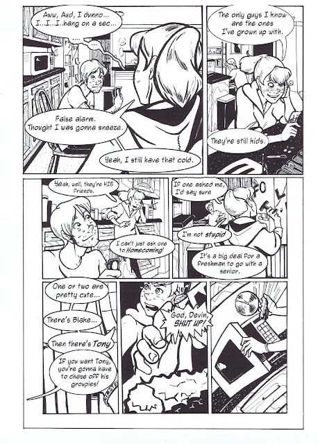
My classmates have seen all stages of Foiled progress, and something that frustrates me is how fickle people can be. Things that they liked just one critique prior become things they can't stand. You need to keep in mind that you can't please everyone, so sometimes it's best just to go with your gut. One thing I absolutely don't disagree with is the lettering. It's a good thing I waited to do a lettering tutorial, because I'm going to have to redo all of it. The font I used this this time was Zeo 2.0 because it has lowercase, but I think I'm going to revert to either Anime Ace or my old favorite, LetterOMatic. All these fonts are available free on the Blambot website. I copped out with the word ballloons because I didn't plan for them when inking, so I did them digitally. I'm going to try to work out a little Photoshop magic and see if I can't composite some hand drawn balloons (I'll be working on those either today or tomorrow) with my inked pages. Either way, I feel compelled to share the results of that experiment with you guys. As long as my handwriting is awful, I plan to letter digitally, but since I'm taking a handlettering course this fall, that will hopefully be a shortlived crutch.
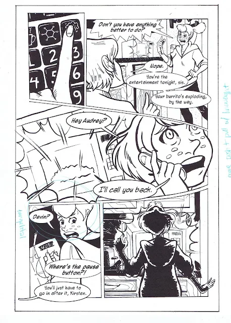
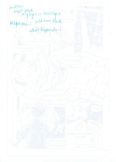
I don't know if this was written down, but a couple people really hated the halftone on the three pages in the middle, and didn't understand at first that that was done to indicate that Kirsten and Devin were in pitch black rooms. This was a bit frustrating because I'd actually asked about whether or not I should even do that two critiques prior, and was told to. I don't think I'm going to take it out entirely, but several panels won't have it, and I'm going to darken the shadows on Kirsten and Devin to try and indicate that they're in the dark. I'd been hesitant to do the halftone in the first place because I didn't plan to do it anywhere else in the comic, and felt that it might break continuity, and was told that it'd be fine. Unfortunately, it DID break continuity for the people who were bothered by it, so I need to find a better way to integrate it into the comic. I get the feeling though that introducing any new media for just a few pages will always break continuity at some level, reminding the audience that 'hey, we're reading a comic!'.
I find that taking notes during critique helps me improve faster, because I have a visual reference. I'm the sort of person who, if I don't write down what was said, will only remember the bad things. This makes it very easy to become depressed and discouraged. If you're going to start taking notes during your crits, I encourage you to write down the positive as well, so you know what to focus on and can keep track of what you're doing right.
My classmates have seen all stages of Foiled progress, and something that frustrates me is how fickle people can be. Things that they liked just one critique prior become things they can't stand. You need to keep in mind that you can't please everyone, so sometimes it's best just to go with your gut. One thing I absolutely don't disagree with is the lettering. It's a good thing I waited to do a lettering tutorial, because I'm going to have to redo all of it. The font I used this this time was Zeo 2.0 because it has lowercase, but I think I'm going to revert to either Anime Ace or my old favorite, LetterOMatic. All these fonts are available free on the Blambot website. I copped out with the word ballloons because I didn't plan for them when inking, so I did them digitally. I'm going to try to work out a little Photoshop magic and see if I can't composite some hand drawn balloons (I'll be working on those either today or tomorrow) with my inked pages. Either way, I feel compelled to share the results of that experiment with you guys. As long as my handwriting is awful, I plan to letter digitally, but since I'm taking a handlettering course this fall, that will hopefully be a shortlived crutch.
 |
| 'Too heavy grain' |
I don't know if this was written down, but a couple people really hated the halftone on the three pages in the middle, and didn't understand at first that that was done to indicate that Kirsten and Devin were in pitch black rooms. This was a bit frustrating because I'd actually asked about whether or not I should even do that two critiques prior, and was told to. I don't think I'm going to take it out entirely, but several panels won't have it, and I'm going to darken the shadows on Kirsten and Devin to try and indicate that they're in the dark. I'd been hesitant to do the halftone in the first place because I didn't plan to do it anywhere else in the comic, and felt that it might break continuity, and was told that it'd be fine. Unfortunately, it DID break continuity for the people who were bothered by it, so I need to find a better way to integrate it into the comic. I get the feeling though that introducing any new media for just a few pages will always break continuity at some level, reminding the audience that 'hey, we're reading a comic!'.


Comments
Post a Comment