Intro to Comic Craft: Storytelling within the Comic Page; Composition,Shot Choices and Layout
In last week's Making Comics and Zines class, several students brought up questions regarding storytelling, shot choices, and composition. These are areas I wish to grow in as well, and I thought it might be helpful for everyone if I share some basic definitions and examples of comic craft, storytelling tools, and compositional techniques. This is a fairly dense post, so if you're not able to read it all now, I recommend book marking it for later!
It helps to keep in mind that comics borrows much of it's vocabulary from plays and movies. When honing your comic craft, you have one foot in illustration, another in film, but you need to keep in mind that all actions should go towards serving the story- from character design to choice of materials, to your shot choices. I'll go over a few that are relevant, and I highly recommend you check out my Sources and Recommended Reading sections to continue your journey. This is a rich field, and this post barely scratches the surface, but it may give you the vocabulary you need to get started.
The best advice for ANY creator is to consume media. Listen to podcast dramas. Read comics- and read widely. Watch movies. Your brain will absorb information and inspiration. Once you're armed with the vocabulary, you can start to dissect what you consume, and put that information towards your own creations.
It helps to understand the basic vocabulary of comics as a whole so that you can start thinking about the works you consume analytically, and consider your own work and choices critically.
Unless otherwise noted, all art used in this post is my own.
Inflected Panel
An inflected panel has innate context and meaning, and may be able to stand on its own, without text, as part of the story. An inflected panel frequently features the characters engaged in some sort of action, particularly if the action has importance to the story, such as one character pointing a gun at another.
Uninflected Panel
An uninflected panel has no set meaning or context without the dialogue or narration. It could be a shot of a hand reaching for a doorknob, or a vase of flowers- the text gives the shot context.


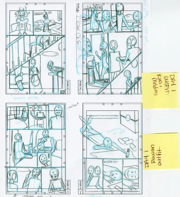
Thumbnails can be any size, but most are small (hence thumbnail) to encourage revision and the ability to capture ideas quickly, as they come to you. I use premade thumbnail templates printed on inexpensive copier paper, and each thumbnail is probably 2"x3". These scale nicely to a full size comic page.


I complete my roughs at 6"x9", and once I've finished the entire chapter, I scan them all, make further corrections digitally in Photoshop, convert them to bluelines, and print those bluelines onto Montval watercolor paper at 11"x15".

For Uninked Watercolor Pages: This is my final stage before I apply watercolor, so I try to get my pencils as tight and clean as possible. I use HB lead at this stage, as it's less prone to smearing when water is applied. When I stretch my pages, the water will dissolve the dye based ink I used in printing my bluelines, leaving just the pencil lines.
For Inked Comic Pages: Pencils are just another opportunity to tighten my work and revise important things like expressions, before inking. I prefer to use graphite pencil at this stage, as it's a bit easier to erase cleanly than nonphoto blue lead, and is less likely to cause the ink to smear.


Often the final traditional media step in a comic page's development. From here on, many creators scan their originals, and begin lettering, bordering, creating word balloons, adding color, and making corrections digitally.
As my readers know, I'm a watercolor artist, so this is not the final stage of refinement for my work. For those interested in learning more about the watercolor process, from start to finish, I highly recommend jumping over to my Watercolor Basics series.
Act/Arc
Chapter
Scene
Spread
Page
Tier
Panel
Types of Comics and Storytelling Conventions:
4koma
A popular choice for gag a day or comedic manga
Strip/Newspaper Strip:
Gag a Day:
Also a subset of newspaper strips, but quite popular as webcomics
Examples:
XKCD
Saturday Morning Breakfast Cereal
Perry Bible Fellowship
The Oatmeal
Gag Cartoons:
Often referred to as, or lumped in with, political cartoons.
Political Cartoon
Single page comic:

Tells the entire story on a single page. This is applicable to any genre, from instructional to horror to comedy.
Silent Comic
A comic that tells the story without dialogue or narrative. Heavily reliant on setting, character acting, and expressions to convey the story.
Infinite Scroll
A format popular on Tapastic and Webtoons, infinite scroll comics take advantage of unlimited downward space on webpages (facilitated by scrolling) to tell a story without pagebreaks. May be separated by scenes, arcs, or chapters.


Layouts in this format tend to be a bit looser, with lots of negative space surrounding the panels. These spaces can be used to indicate the passage of time.
Instructional or Recipe Comic:

A comic with the intention of teaching or instructing. Need to portray action and materials clearly and accurately. Often useful when teaching those with learning disabilities or younger children.
For more, check out They Draw and Cook
Comic in a sequential story:


Generally part of a longer narrative, frequently broken up into chapters. Similar structure to a play, a movie, or a novel.
Everything from the materials you use to the shot choices you employ will depend on what type of comic you're creating, and what you hope to convey to the audience.
Designing Individual Panels:
Shot Choices:
Selecting Your Camera Angles
Your mind's eye and your pencil control your camera angles, and while you can opt to change them at any step of your comic making process (some artists will even redo entire chapters of their work after it's been released), I recommend finding the right shots and camera angles during your thumbnailing stage. This is your opportunity for experimentation with the least amount of effort, so consider drawing and redrawing tricky panels until you hit on something that resonates and suits your story.
Objective Camera Angles:
Most common view you will see in movies and comics.
Gives the audience the viewpoint of being in the scene with the characters, but still safely removed.
So long as the actors never look directly at the 'camera' (reader), the illusion is maintained. As soon as the character looks directly at the camera, the fourth wall, and often the reader's immersion, is broken.
Breaking this fourth wall can be used for comedic effect.
Subjective Camera Angles:
Audience sees the scene as though they were the subject. Part of the action, and has the possibility of greater emotional influence on the reader. They're experiencing the story through the character's point of view. Can be useful for immersion, and many horror films use this to build anxiety and tension.
Point of View/POV Camera Shot:
Shot so you see what the character would see, but may be shot in such a way that it reveals more of the scene, such as over the shoulder shots. Helps get the reader into the character's head. In these shots, characters may look directly at the 'camera' (as they're looking directly at a character) without breaking the fourth wall. This camera angle is still objective, since the viewer is an unseen observer, and the characters are not interacting directly with the viewer.
For more useful shot options, check out this film glossary
Common Shots Used in Comics:


Bird's Eye View- An aerial shot often used to show the location or environment, or to cover actions that take place over a large area
Close Up- Head of person, or entirety of a small object
Extreme Close Up- Shows only a small portion or detail of a character's body, or a tiny object
Medium Shot- Shows character from waist up
Medium Close Up- Between a Close Up and a Medium Shot
Long Shot- Shows character in his or her entirety, filling most of the frame
Extreme Long Shot- Crowd scene, landscape, citycape, or shot where the focus of the image is zoomed out and small
Insert Shot (often an uninflected shot)
Dutch Angle- Panel has been skewed for effect. A panel can be dutched regardless of the shot choice. This is usually done to create a feeling of tension or unease.
In comics, you want to vary your shot choices.
Composition:
Rule of Thirds
'The basic premise is that you divide your camera’s frame into thirds and plant key objects along these lines to make the composition work better. This often works really well and, if you’ve not learnt much about photography yet, is a great way of dramatically improving your photos, making them more interesting.'


You're breaking your image plane into thirds horizontally and vertically, leaving you with nine rectangles. These lines, and the intersections, provide opportunity to create interest. These intersection points are where you should put your main subjects, or areas of interest. This grid is also useful for environments and landscapes- you can align your sky at the 1/3 or 2/3 horizontal mark. By placing your points of interest along these intersections, your image becomes balanced, and creates interest, energy, and tension.
You can, of course, break the rule of thirds, and it's good not to rely on it too much. Composition, in comics, should serve the story, and should be used to heighten emotion, create conflict, add to tension, set the reader at ease, or make them uncomfortable.
Visual Weight
Areas of importance that naturally draw the eye. Faces, human eyes, and writing all carry visual weight
Balance
Think of this literally- are the objects or action across the image balanced between the halves? Symmetrical images make balance apparent.
An unbalanced image often creates and evokes tension, a balanced image makes the viewer feel at ease. Balance can be boring, as visually, all issues are resolved. Both can be used within a comic page as storytelling devices.
Too much balance can come across as unnatural, staged, or fake, which can also be exploited for storytelling purposes.
Eye-lines:
These can be useful for positioning characters around the environment, as it creates a relative standard. This is also one of the methods the viewer will subconciously use to determine whether the perspective feels off, as faces carry the most visual weight in an image, and are generally what the reader notices first.
Eyelines can also refer to where the characters in your panels are looking, and can be useful in directing the reader's attention as well.
When a character is looking at something other than the viewer, we spend less time looking at the character, as it's more difficult to read the expression. This gaze can be useful in creating conflict and tension, or can be useful in creating a triangular composition, as eyeline can serve as a leading line.
More on how to use eyelines for storytelling and composition:
How to Use Eye-Lines to Influence Your Viewers-Composition
Triangles:
A fantastic composition tool as they're relatively common and easy to manipulate to suit the needs of your composition. Triangles are a good way to combine several compositional techniques to make a more interesting image. They're useful for grouping three areas of interest in an organized way. This can be useful for organizing characters in panels in a way that's easy to read and understand. This is best done when characters are of differing heights.
Triangles are also useful for focusing attention in illustrations that have a lot of background or environmental information.
Single Point, Single Point of Interest
A single point of interest in the image plain. Often used for portraits. When dealing with a single point of interest, positioning is important, and it pays to play around with the rule of thirds to find an engaging composition. In illustration and photography, a point of interest should contrast with the frame in some way, but in comics, a single point of interest is a frequent choice for characters mid-dialogue. While it is a safe choice, it's also a boring choice, hence Wally Woods' 22 Panels that Always Work.

Horizons
Frequently referred to as the horizon line, these are particularly important when planning environments and utilizing perspective grids.
Horizons, horizon lines, and perspective lines give the reader a better understanding of the environment the characters are inhabiting, and the world the story takes place.
In composition, 'when a frame is divided by a single dominant line, this line is usually a horizon' (source), and these are common in outdoor imagery. In images where little is going on, the line becomes the dominant part of the photo, creating a divide between sky and landscape.
Frame Within a Frame
Can frequently refer to the use of windows, doorways, arches, or natural elements to create a frame within your panel borders. Creates depth, drama, and structure, focusing the reader's attention to a single area.
There are various types of framing devices one can use- foreground frames (in front of the subject), background frames (behind the subject but still framing). Frames are useful for leading the eye, creating depth, and creating paths for the reader to visually explore.
Dynamic Tension
Using energy, movement, and momentum already in the frame to draw the viewer's eye out of the picture. This creates dynamic tension. This is done using multiple diagonal lines moving away from one another, paths moving in opposing directions, or body language that contrasts between two or more subjects.
Depth
Although you may not wish to create depth in every panel you draw, creating depth allows for reader immersion, and lends towards creating a believable world. You can create depth by utilizing perspective grids to create full, believable environments, utilizing frame within frame compositions, using the rule of thirds to help divide your picture plane, utilizing converging lines to create the impression of distance, and use dynamic tension to create space outside the picture plane.
Negative Space
Negative space simply refers to the area that surrounds the main subject or subjects in your photograph. The technique of using negative space effectively is about creating the right relationship between the main subject and a background that almost feels like it is receding.
Positive Space
Positive space...refers to the primary subjects of a photograph.
Leading Lines:
The viewer's eyes are naturally drawn along diagonal, horizontal, parallel, and vertical lines- these can be used to direct the viewer's gaze to the subject. When these lines are paths, rails, buildings, or streets, it can make us feel like we're part of the image.
Use leading lines and paths when you're guiding the viewer's gaze to or away from a subject. You don't want to lead them directly out of the frame either.
For panels that focus mainly on character, negative space can be a useful tool to add interest to the panel, without distracting from the content. When planning such panels, slow down and see if you can frame the subject in an interesting way, using items from the subject's environment.
Hopefully now you feel a little more empowered to tackle your own comic! Pay close attention to your favorite comics and films, and see how they handle certain situations. When you're just developing as a comic artist, it's fine to look to your favorite comic artists and directors for shot inspiration, just as it's fine to continue looking to these sources as you develop as an artist.
When it comes to storytelling and composition, much of comic's vocabulary comes directly from film, and many of the techniques used to heighten emotion and draw the viewer in work well for comics.
Although practice makes perfect, and the more comics you make the more these techniques become second nature, it helps to start by studying film- not only analyzing what works and what doesn't work while watching television and movies, but to do a little research into cinematography. A great place to begin are shot choices, and what they mean, or how they're interpreted by the viewer. It also helps to read a wide variety of comics, and analyze what the artist is doing on the page, in the panel, and WHY they're doing it.
When it comes to designing comics, keep in mind that in film, the director controls the movie's flow, but in comics, the artist AND the reader control the flow together. Readers can easily take in a whole page at one time, an entire spread of two pages, or reread a panel several times over. Scott McCloud has written about the collaboration between the creator and the reader in Understanding Comics, discussing the importance of the gutter as an opportunity for storytelling and suspense, the vitality of the page turn,
For every thou shall must not, there's an exception to the rule that shines, so rather than give you a list of do's and don't's, I'm going to speak generally, and share some great resources. Every comic type, every comic genre and subgenre has best practices and subversions, and I would rather help you find what works for your comic, and share my theories and guiding practices that I use for 7" Kara, than tell you what to do. Your best resource is your own taste- what are films and comics doing in the genre you wish to work? What layouts do they utilize, how frequently do they use spreads, is it typically inflected or uninflected panels? Although comics share a language, every genre has its own dialect.
Note: Your storytelling, and storytelling devices should serve the reader, and cater to the reader's comic knowledge and reading comprehension.
Note: Composition is used to serve storytelling, and add clarity and interest. Composition over storytelling may result in beautiful illustrations, but often creates a break between immersion and the reader.
Sources Used in this Post
Understanding Comics-Scott McCloud
12 Pro Tips to Improve Your Artistic Composition
Comic Book Grammar and Tradition
More Thoughts on Scroll Comics
Compositional Tools:
How to Use Negative Space in Photography for More Powerful Images
How to Use Leading Lines in Photography to Improve Your Composition
How to Use Balance in Photography Composition
How to Use Eye-Lines to Influence Your Viewers-Composition
How to Use Triangles to Improve Your Composition
The Hugely Important 'Single Point' in Composition
Use a Frame within a Frame to Add Depth and Context to a Photo
How to use Dynamic Tension to Make Your Photos More Dramatic
How to Add Depth to a Photo
A Beginner's Guide to Composition
Improve Your Composition with the Rule of Thirds
Shot Tools:
Camera Angles: Objective and Subjective: How to Grab Your Audience's Attention
Film Glossary
(list of useful shots)
Making Comics with Salgood Sam
Recommended Reading:
5 C's of Cinematography
Directing the Story
Story
Understanding Comics
Drawing Words and Writing Pictures
Comics Lab
The Five Most Abused Rules of Composition
How to Use the Rule of Thirds in Art
It helps to keep in mind that comics borrows much of it's vocabulary from plays and movies. When honing your comic craft, you have one foot in illustration, another in film, but you need to keep in mind that all actions should go towards serving the story- from character design to choice of materials, to your shot choices. I'll go over a few that are relevant, and I highly recommend you check out my Sources and Recommended Reading sections to continue your journey. This is a rich field, and this post barely scratches the surface, but it may give you the vocabulary you need to get started.
The best advice for ANY creator is to consume media. Listen to podcast dramas. Read comics- and read widely. Watch movies. Your brain will absorb information and inspiration. Once you're armed with the vocabulary, you can start to dissect what you consume, and put that information towards your own creations.
It helps to understand the basic vocabulary of comics as a whole so that you can start thinking about the works you consume analytically, and consider your own work and choices critically.
Unless otherwise noted, all art used in this post is my own.
Basic Comic Vocabulary:
 |
| This is a single page comic. It is intended to encapsulate the entire story. |
Inflected Panel
An inflected panel has innate context and meaning, and may be able to stand on its own, without text, as part of the story. An inflected panel frequently features the characters engaged in some sort of action, particularly if the action has importance to the story, such as one character pointing a gun at another.
Uninflected Panel
An uninflected panel has no set meaning or context without the dialogue or narration. It could be a shot of a hand reaching for a doorknob, or a vase of flowers- the text gives the shot context.
Page
A single page from a comic. Can encapsulate the entire story, or be a part of a whole
Tier
All the panels that are in a single row, and are related to one another. I often think of tiers as Posing a Question, and Answering the Question, but it may also help to consider them as a Sentence, and the page as a Paragraph.
Panel
A single illustration on the comic page, usually bordered by gutters or heavy black lines.
Scene
May be several panels, or several pages, depending on the comic. A scene is a discreet unit of the story whole.
one of the subdivisions of a play: such as. a : a division of an act presenting continuous action in one place. b : a single situation or unit of dialogue in a play the love scene.
Arc
A collection of scenes or chapters that comprise a unit of the whole story that could standalone.
A story arc (also narrative arc) is an extended or continuing storyline in episodic storytelling media such as television, comic books, comic strips, boardgames, video games, and films with each episode following a dramatic arc. On a television program, for example, the story would unfold over many episodes.
 |
| This is a comic page from a longform comic |
Borders
Not every comic panel will need borders. Borders serve many purposes, creating a discrete unit of art, indicating a constrained amount of time (borderless panels seem to go on forever, and are intended to imply a timeless feeling). Borders can be sketched in lightly, broken by dashes, or inked in heavily, depending on the needs of your comic.
Balloons/Bubbles
Most frequently used to imply speech or thought.
Symbolic Icons
Emanata
Found close to the head of the character, and used to convey feelings.
Grawlix- The symbles used to imply cursing
Process:
Bluelines


Either created with leads (can be any color, so long as it's distinct from graphite or ink) or digitally (check out this tutorial on how to do it in Photoshop) and serve as an underdrawing, sketch, or guideline. These bluelines can later be dropped digitally using the process outlined in this tutorial.
Pencils
The next step of refinement, for some artists, this may be the final step before color process. This may serve to tighten up the bluelines, to make corrections, or just another stage of refinement. In multi stage, multi comic processes, thumbnails through pencils are completed by a Penciler.
Inks
These include technical pens, brush pens, brushes, and nibs, as well as digital inking processes done in programs such as Photoshop, Clip Studio Paint, or Illustrator. In multi stage, multi artist comic processes, this is completed by an Inker.
Flats
The basic application of color to a comic page. The intention is to fill every area with either a discrete color (for quick color replacement) or with an approximation of the correct color. In multi stage, multi artist comic processes, this stage is completed by a Colorist.

The basic application of color to a comic page. The intention is to fill every area with either a discrete color (for quick color replacement) or with an approximation of the correct color. In multi stage, multi artist comic processes, this stage is completed by a Colorist.

Shading
Shading and highlights added to the flat colors to make the art more dimensional. Useful for implying light.

Shading and highlights added to the flat colors to make the art more dimensional. Useful for implying light.

Lettering
Dialogue, text, and narration either added by hand or digitally using a pre-created font. In multi stage, multi artist comics, this stage is completed by a Letterer.
Comic Stages:
Concept
A rough idea of what the comic will contain, what sort of people the characters are, what the conflict will be.
Synopsis
A summary of the entire story, with major events and plot points sketched out.
A rough idea of what the comic will contain, what sort of people the characters are, what the conflict will be.
Synopsis
A summary of the entire story, with major events and plot points sketched out.
Script
Depending on the writer and the comic, a page for page breakdown of the story's events. Some writers will also flesh out individual panels, shot choices, character expressions, and background elements.
Depending on the writer and the comic, a page for page breakdown of the story's events. Some writers will also flesh out individual panels, shot choices, character expressions, and background elements.
Character/Set Design
Character descriptions and design notes including personality traits, clothing preferences, and favorite colors, when relevant.


Layouts:

Sort of like a proto-thumbnail, this is the stage where I sketch various possible page layouts directly on my script. This allows me to manipulate various elements independently, and hopefully hit on the best thumbnail possible, and the small format makes revision a breeze. Once I've hit on a layout I like, I solidify it with it in thumbnails:
Thumbnails

Thumbnails can be any size, but most are small (hence thumbnail) to encourage revision and the ability to capture ideas quickly, as they come to you. I use premade thumbnail templates printed on inexpensive copier paper, and each thumbnail is probably 2"x3". These scale nicely to a full size comic page.
Roughs
Once my thumbnails are completed, I scan them, do any rough corrections or revisions, and break them into individual comic pages. These are scaled up to 6"x9", converted to bluelines, and printed on copier paper, one comic page per sheet.
At this stage, I use my nonphoto blue pencil to sketch my anatomy and perspective grids, and use a mechanical pencil with B lead to tighten my lines up.
At this stage, I use my nonphoto blue pencil to sketch my anatomy and perspective grids, and use a mechanical pencil with B lead to tighten my lines up.


I complete my roughs at 6"x9", and once I've finished the entire chapter, I scan them all, make further corrections digitally in Photoshop, convert them to bluelines, and print those bluelines onto Montval watercolor paper at 11"x15".
Pencils

For Uninked Watercolor Pages: This is my final stage before I apply watercolor, so I try to get my pencils as tight and clean as possible. I use HB lead at this stage, as it's less prone to smearing when water is applied. When I stretch my pages, the water will dissolve the dye based ink I used in printing my bluelines, leaving just the pencil lines.
For Inked Comic Pages: Pencils are just another opportunity to tighten my work and revise important things like expressions, before inking. I prefer to use graphite pencil at this stage, as it's a bit easier to erase cleanly than nonphoto blue lead, and is less likely to cause the ink to smear.


Inks

Often the final traditional media step in a comic page's development. From here on, many creators scan their originals, and begin lettering, bordering, creating word balloons, adding color, and making corrections digitally.
As my readers know, I'm a watercolor artist, so this is not the final stage of refinement for my work. For those interested in learning more about the watercolor process, from start to finish, I highly recommend jumping over to my Watercolor Basics series.
Hierarchy of a comic
Comic (entire work)Act/Arc
Chapter
Scene
Spread
Page
Tier
Panel
Storytelling:
Types of Comics and Storytelling Conventions:
4koma
 |
| Azu Manga Diaoh |
Yonkoma manga (4コマ漫画, "four cell manga" or 4-koma for short), acomic strip format, generally consists of gag comic strips within four panels of equal size ordered from top to bottom.
A popular choice for gag a day or comedic manga
Strip/Newspaper Strip:
 |
| Calvin and Hobbes by Bill Watterson |
Most newspaper comic strips are syndicated; a syndicate hires people to write and draw a strip and then distributes it to many newspapers for a fee. Some newspaper strips begin or remain exclusive to one newspaper. For example, the Pogo comic strip by Walt Kelly originally appeared only in the New York Star in 1948 and was not picked up for syndication until the following year.[11]
Newspaper comic strips come in two different types: daily strips and Sunday strips. In the United States, a daily strip appears in newspapers on weekdays, Monday through Saturday, as contrasted with a Sunday strip, which typically only appears on Sundays. Daily strips usually are printed in black and white, and Sunday strips are usually in color. However, a few newspapers have published daily strips in color, and some newspapers have published Sunday strips in black and white.
 |
| Perry Bible Fellowship by Nicholas Gurewitch |
A gag-a-day comic strip is the style of writing comic cartoons such that every installment of a strip delivers a complete joke (or other kind of artistic statement). It is opposed to story or continuity strips, which rely on the development of a story line across a sequence of the installments.[1] Most syndicated comics are of this type.[2] Another term for this distinction is non-serial (gag-a-day) vs. serial strips.[3]
Also a subset of newspaper strips, but quite popular as webcomics
Examples:
XKCD
Saturday Morning Breakfast Cereal
Perry Bible Fellowship
The Oatmeal
Gag Cartoons:
A gag cartoon (a.k.a. panel cartoon or gag panel) is most often a single-panel cartoon, usually including a caption beneath the drawing. A pantomime cartoon carries no caption. In some cases, dialogue may appear in speech balloons, following the common convention of comic strips.
Political Cartoon
 |
| Political Cartoon by Ellis Rosen |
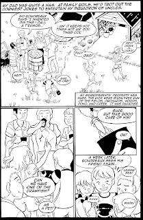
Single page comic:

Tells the entire story on a single page. This is applicable to any genre, from instructional to horror to comedy.
Silent Comic
 |
| Momotaro, 2010 |
A comic that tells the story without dialogue or narrative. Heavily reliant on setting, character acting, and expressions to convey the story.
Infinite Scroll
A format popular on Tapastic and Webtoons, infinite scroll comics take advantage of unlimited downward space on webpages (facilitated by scrolling) to tell a story without pagebreaks. May be separated by scenes, arcs, or chapters.


 |
| Cheese in the Trap |
Layouts in this format tend to be a bit looser, with lots of negative space surrounding the panels. These spaces can be used to indicate the passage of time.
Instructional or Recipe Comic:

A comic with the intention of teaching or instructing. Need to portray action and materials clearly and accurately. Often useful when teaching those with learning disabilities or younger children.
For more, check out They Draw and Cook
Comic in a sequential story:


Select pages from Pretty Paladin Critical Missy, a comic in the Chainmail Bikini gaming anthology.
Generally part of a longer narrative, frequently broken up into chapters. Similar structure to a play, a movie, or a novel.
Everything from the materials you use to the shot choices you employ will depend on what type of comic you're creating, and what you hope to convey to the audience.
Designing for Your Comic Goals/Story:
Designing Individual Panels:
Shot Choices:
Selecting Your Camera Angles
Your mind's eye and your pencil control your camera angles, and while you can opt to change them at any step of your comic making process (some artists will even redo entire chapters of their work after it's been released), I recommend finding the right shots and camera angles during your thumbnailing stage. This is your opportunity for experimentation with the least amount of effort, so consider drawing and redrawing tricky panels until you hit on something that resonates and suits your story.
Objective Camera Angles:
Most common view you will see in movies and comics.
Gives the audience the viewpoint of being in the scene with the characters, but still safely removed.
So long as the actors never look directly at the 'camera' (reader), the illusion is maintained. As soon as the character looks directly at the camera, the fourth wall, and often the reader's immersion, is broken.
Breaking this fourth wall can be used for comedic effect.
Subjective Camera Angles:
Audience sees the scene as though they were the subject. Part of the action, and has the possibility of greater emotional influence on the reader. They're experiencing the story through the character's point of view. Can be useful for immersion, and many horror films use this to build anxiety and tension.
Point of View/POV Camera Shot:
Shot so you see what the character would see, but may be shot in such a way that it reveals more of the scene, such as over the shoulder shots. Helps get the reader into the character's head. In these shots, characters may look directly at the 'camera' (as they're looking directly at a character) without breaking the fourth wall. This camera angle is still objective, since the viewer is an unseen observer, and the characters are not interacting directly with the viewer.
For more useful shot options, check out this film glossary
Common Shots Used in Comics:


Bird's Eye View- An aerial shot often used to show the location or environment, or to cover actions that take place over a large area
Close Up- Head of person, or entirety of a small object
Extreme Close Up- Shows only a small portion or detail of a character's body, or a tiny object
Medium Shot- Shows character from waist up
Medium Close Up- Between a Close Up and a Medium Shot
Long Shot- Shows character in his or her entirety, filling most of the frame
Extreme Long Shot- Crowd scene, landscape, citycape, or shot where the focus of the image is zoomed out and small
Insert Shot (often an uninflected shot)
Dutch Angle- Panel has been skewed for effect. A panel can be dutched regardless of the shot choice. This is usually done to create a feeling of tension or unease.
In comics, you want to vary your shot choices.
Composition:
Rule of Thirds
'The basic premise is that you divide your camera’s frame into thirds and plant key objects along these lines to make the composition work better. This often works really well and, if you’ve not learnt much about photography yet, is a great way of dramatically improving your photos, making them more interesting.'


You're breaking your image plane into thirds horizontally and vertically, leaving you with nine rectangles. These lines, and the intersections, provide opportunity to create interest. These intersection points are where you should put your main subjects, or areas of interest. This grid is also useful for environments and landscapes- you can align your sky at the 1/3 or 2/3 horizontal mark. By placing your points of interest along these intersections, your image becomes balanced, and creates interest, energy, and tension.
You can, of course, break the rule of thirds, and it's good not to rely on it too much. Composition, in comics, should serve the story, and should be used to heighten emotion, create conflict, add to tension, set the reader at ease, or make them uncomfortable.
Visual Weight
Areas of importance that naturally draw the eye. Faces, human eyes, and writing all carry visual weight
Balance
Think of this literally- are the objects or action across the image balanced between the halves? Symmetrical images make balance apparent.
An unbalanced image often creates and evokes tension, a balanced image makes the viewer feel at ease. Balance can be boring, as visually, all issues are resolved. Both can be used within a comic page as storytelling devices.
Too much balance can come across as unnatural, staged, or fake, which can also be exploited for storytelling purposes.
Eye-lines:
These can be useful for positioning characters around the environment, as it creates a relative standard. This is also one of the methods the viewer will subconciously use to determine whether the perspective feels off, as faces carry the most visual weight in an image, and are generally what the reader notices first.
Eyelines can also refer to where the characters in your panels are looking, and can be useful in directing the reader's attention as well.
When a character is looking at something other than the viewer, we spend less time looking at the character, as it's more difficult to read the expression. This gaze can be useful in creating conflict and tension, or can be useful in creating a triangular composition, as eyeline can serve as a leading line.
More on how to use eyelines for storytelling and composition:
How to Use Eye-Lines to Influence Your Viewers-Composition
 |
| The viewer is drawn to the window, and the silhouette of a cat, by Kara's eyeline |
Triangles:
A fantastic composition tool as they're relatively common and easy to manipulate to suit the needs of your composition. Triangles are a good way to combine several compositional techniques to make a more interesting image. They're useful for grouping three areas of interest in an organized way. This can be useful for organizing characters in panels in a way that's easy to read and understand. This is best done when characters are of differing heights.
Triangles are also useful for focusing attention in illustrations that have a lot of background or environmental information.
 |
| A triangle is created between Kara, Naomi, and Pancake |
Single Point, Single Point of Interest
A single point of interest in the image plain. Often used for portraits. When dealing with a single point of interest, positioning is important, and it pays to play around with the rule of thirds to find an engaging composition. In illustration and photography, a point of interest should contrast with the frame in some way, but in comics, a single point of interest is a frequent choice for characters mid-dialogue. While it is a safe choice, it's also a boring choice, hence Wally Woods' 22 Panels that Always Work.

Frequently referred to as the horizon line, these are particularly important when planning environments and utilizing perspective grids.
Horizons, horizon lines, and perspective lines give the reader a better understanding of the environment the characters are inhabiting, and the world the story takes place.
In composition, 'when a frame is divided by a single dominant line, this line is usually a horizon' (source), and these are common in outdoor imagery. In images where little is going on, the line becomes the dominant part of the photo, creating a divide between sky and landscape.
 |
| Bottom panel |
Frame Within a Frame
Can frequently refer to the use of windows, doorways, arches, or natural elements to create a frame within your panel borders. Creates depth, drama, and structure, focusing the reader's attention to a single area.
There are various types of framing devices one can use- foreground frames (in front of the subject), background frames (behind the subject but still framing). Frames are useful for leading the eye, creating depth, and creating paths for the reader to visually explore.
 |
| Kara is framed by a pop up gingerbread house's open door way. |
 |
| Naomi is framed by an open and lit refrigerator in the first three panels. |
Using energy, movement, and momentum already in the frame to draw the viewer's eye out of the picture. This creates dynamic tension. This is done using multiple diagonal lines moving away from one another, paths moving in opposing directions, or body language that contrasts between two or more subjects.
Depth
Although you may not wish to create depth in every panel you draw, creating depth allows for reader immersion, and lends towards creating a believable world. You can create depth by utilizing perspective grids to create full, believable environments, utilizing frame within frame compositions, using the rule of thirds to help divide your picture plane, utilizing converging lines to create the impression of distance, and use dynamic tension to create space outside the picture plane.
 |
| Note the background is rendered in soft focus, creating an illusion of depth |
Negative Space
Negative space simply refers to the area that surrounds the main subject or subjects in your photograph. The technique of using negative space effectively is about creating the right relationship between the main subject and a background that almost feels like it is receding.
Positive Space
Positive space...refers to the primary subjects of a photograph.
Negative Space Compositions and panels are generally pulled out to show the environment, convey a sense of scale, or a sense of loneliness or abandonment. Often result in very dramatic compositions, but care should be given to lead the eye to the smaller area of positive space, action, or characters, as in comics, our focus is on storytelling.
In a negative space composition, negative space should take up more of the image than the positive space. Negative space compositions generally create quiet images, a feeling of isolation, and depending on the subject matter, feelings of relaxation, importance, and contemplation.
While negative space can imply empty space, it can also be uninflected background- areas without much external action. Negative space mainly refers to surroundings that are not part of the main action, and blend into the background, drawing focus to the main subject. The key difference in an image with negative space and an image without negative space is that in an image with negative space, the background has an area that recedes- it utilizes open space and peaceful areas. Areas without negative space are full of things to interest the eye.
 |
| An image that uses negative space as part of the storytelling (the surrounding pool) |
 |
| An image with no negative space- all areas of the illustration contain action and inflection. |
Leading Lines:
The viewer's eyes are naturally drawn along diagonal, horizontal, parallel, and vertical lines- these can be used to direct the viewer's gaze to the subject. When these lines are paths, rails, buildings, or streets, it can make us feel like we're part of the image.
Use leading lines and paths when you're guiding the viewer's gaze to or away from a subject. You don't want to lead them directly out of the frame either.
For panels that focus mainly on character, negative space can be a useful tool to add interest to the panel, without distracting from the content. When planning such panels, slow down and see if you can frame the subject in an interesting way, using items from the subject's environment.
 |
| The majority of background lines lead to Naomi |
Hopefully now you feel a little more empowered to tackle your own comic! Pay close attention to your favorite comics and films, and see how they handle certain situations. When you're just developing as a comic artist, it's fine to look to your favorite comic artists and directors for shot inspiration, just as it's fine to continue looking to these sources as you develop as an artist.
When it comes to storytelling and composition, much of comic's vocabulary comes directly from film, and many of the techniques used to heighten emotion and draw the viewer in work well for comics.
Although practice makes perfect, and the more comics you make the more these techniques become second nature, it helps to start by studying film- not only analyzing what works and what doesn't work while watching television and movies, but to do a little research into cinematography. A great place to begin are shot choices, and what they mean, or how they're interpreted by the viewer. It also helps to read a wide variety of comics, and analyze what the artist is doing on the page, in the panel, and WHY they're doing it.
When it comes to designing comics, keep in mind that in film, the director controls the movie's flow, but in comics, the artist AND the reader control the flow together. Readers can easily take in a whole page at one time, an entire spread of two pages, or reread a panel several times over. Scott McCloud has written about the collaboration between the creator and the reader in Understanding Comics, discussing the importance of the gutter as an opportunity for storytelling and suspense, the vitality of the page turn,
For every thou shall must not, there's an exception to the rule that shines, so rather than give you a list of do's and don't's, I'm going to speak generally, and share some great resources. Every comic type, every comic genre and subgenre has best practices and subversions, and I would rather help you find what works for your comic, and share my theories and guiding practices that I use for 7" Kara, than tell you what to do. Your best resource is your own taste- what are films and comics doing in the genre you wish to work? What layouts do they utilize, how frequently do they use spreads, is it typically inflected or uninflected panels? Although comics share a language, every genre has its own dialect.
Note: Your storytelling, and storytelling devices should serve the reader, and cater to the reader's comic knowledge and reading comprehension.
Note: Composition is used to serve storytelling, and add clarity and interest. Composition over storytelling may result in beautiful illustrations, but often creates a break between immersion and the reader.
Understanding Comics-Scott McCloud
12 Pro Tips to Improve Your Artistic Composition
Comic Book Grammar and Tradition
More Thoughts on Scroll Comics
Compositional Tools:
How to Use Negative Space in Photography for More Powerful Images
How to Use Leading Lines in Photography to Improve Your Composition
How to Use Balance in Photography Composition
How to Use Eye-Lines to Influence Your Viewers-Composition
How to Use Triangles to Improve Your Composition
The Hugely Important 'Single Point' in Composition
Use a Frame within a Frame to Add Depth and Context to a Photo
How to use Dynamic Tension to Make Your Photos More Dramatic
How to Add Depth to a Photo
A Beginner's Guide to Composition
Improve Your Composition with the Rule of Thirds
Shot Tools:
Camera Angles: Objective and Subjective: How to Grab Your Audience's Attention
Film Glossary
(list of useful shots)
Making Comics with Salgood Sam
Recommended Reading:
5 C's of Cinematography
Directing the Story
Story
Understanding Comics
Drawing Words and Writing Pictures
Comics Lab
The Five Most Abused Rules of Composition
How to Use the Rule of Thirds in Art

Comments
Post a Comment