Relettering and Redoing Word Balloons
Sometimes the crunch in finals means I can't complete work to my satisfaction. Sometimes I just move on with my life, chalking it up as a learning experience, and other times, I use my free time to make the necessary corrections. Since I want these first fifteen pages of Foiled to be published in an anthology, I need to correct the lettering and the word balloons, and I need to do it in a way that I find efficient. I realize that I could have drawn the word balloons in on Photoshop using my tablet, but I find that this doesn't look very organic, and the word balloons will stand out greatly from the images. Since this is the problem I'm looking to correct in the first place, I need a better method. I decided to draw my word balloons on vellum, scan them in, and place them that way.
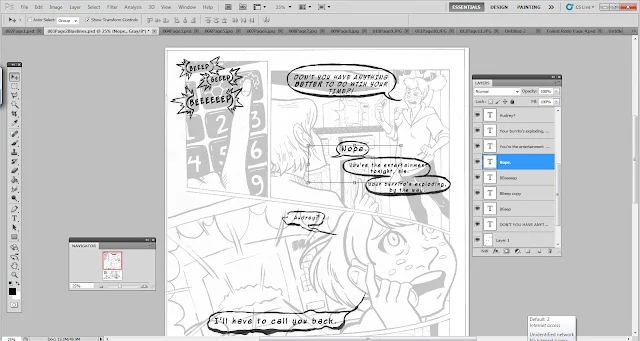
Original Balloons- Done digitally using poor man's method I developed while in undergrad. What's wrong? The balloons themseles are ugly, the lettering is too big.
PART 1: LETTERING

Our unlettered page.
 Copy the original layer. This is the layer that we're going to work with. Turn off the visibility on the original layer.
 Turn down the opacity on this copy layer, so we can see the text when we apply it.
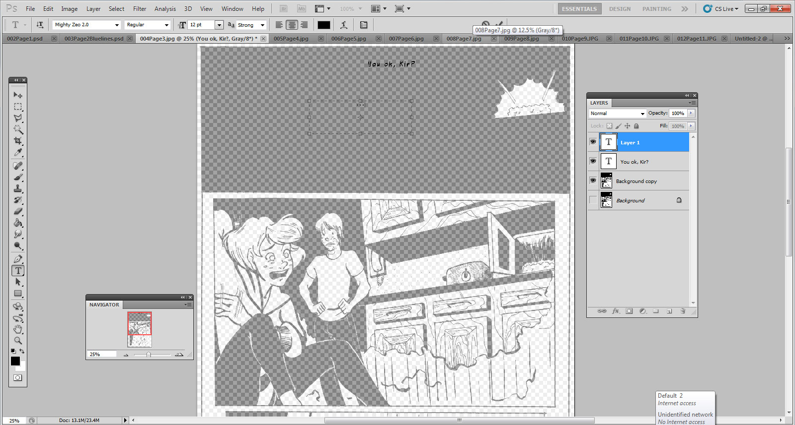
 Begin placing text. I am using Mighty Zeo 2.0 from Blambot at a size 12. I chose Mighty Zeo because it has both upper and lower cases, and I thought an all upper case comic font might feel too 'epic' for this story.
 When placing text, you don't want it to be too distracting, you don't want it to obscure what's going on or what's important in the frame, and you don't want it to come between two people who are making eye contact. You NEVER want to get in the way of line of sight.

 Toggle the opacity as necessary and make corrections to text placement.
 Convert the image to bluelines, and print at size.
 Secure a piece of same size translucent vellum to your printed bluelines.

 Sketch in your word balloons. The whole reason I made the printout was so I could get the proper placement and make my word balloons large enough, so pay attention to where your text is.
 I inked my balloons with a brushpen so I could get the lineweight I wanted immediately, instead of having to make several passes.
 After the ink has thorougly dried (I waited overnight, since the vellum has a slick surface and the ink sits on top), erase your pencil lines and scan.
Look, the page magically changed! Sorry for the inconsistency. As you would do with inks, resize to 11x17, convert to grayscale, and adjust your curves so you can get your darkest blacks and your whitest whites.
 Drag your word balloon layer beneath all your text layers and drag it into place.
 Change your layer settings to "Multiply".
 Reduce the opacity of your ink layer.
 Adjust your text as necessary so that it properly fits into the balloons.
 Create a new layer on top of your ink layer, and begin filling in white beneith the word balloons.


Original Balloons- Done digitally using poor man's method I developed while in undergrad. What's wrong? The balloons themseles are ugly, the lettering is too big.
PART 1: LETTERING

Our unlettered page.


Look, the page magically changed! Sorry for the inconsistency. As you would do with inks, resize to 11x17, convert to grayscale, and adjust your curves so you can get your darkest blacks and your whitest whites.


Comments
Post a Comment