Finished Foiled Pages
So while lettering these pages, I've realized something- your word balloons/text will actually change the black and white balance of a page. Before lettering these pages, I was satisfied with the black and white balance, but lettering the pages has actually made them too busy in my opinion! Besides thickening the bubbles and handlettering it to introduce more variety of shape, what do you guys do to fix this sort of problem?
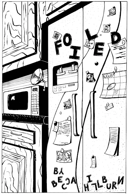


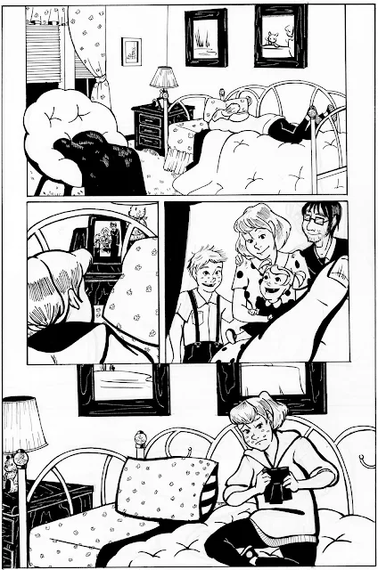


Anyway, I'm not that disappointed by the effect, it's just something to keep in mind for the future. Next time, I'll definitely plan out my speech bubbles better, they tend to overtake the panel. I actually cut out a lot of text, I guess I'm just naturally a chatty girl.
These are due for Studio II tomorrow. I was going to do the lettering tutorial tonight, but I think I'll do that tomorrow, probably on a different piece.


Comments
Post a Comment