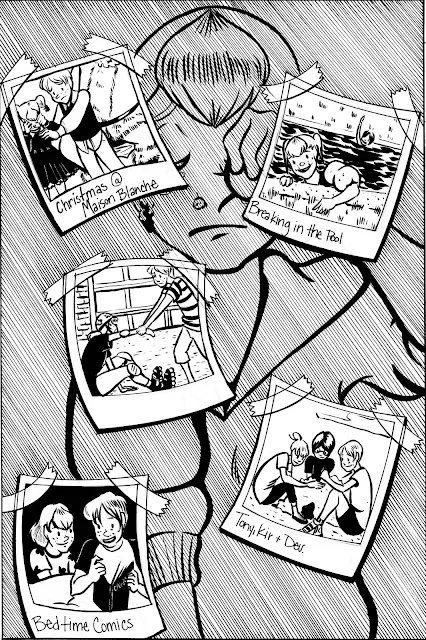
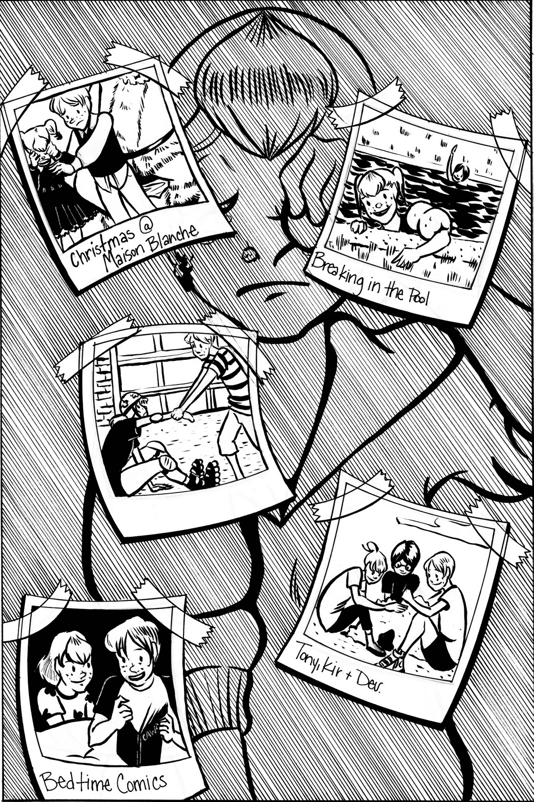
Foiled Revisions
Looking for a little feedback here, trying to refine these pages, but I may just be needlessly nitpicking. I'd love it if you guys could take a look and offer some critique. Even if you're not an artist, you still have a pair of working eyes, and you can tell me if it works or does not work for you.

 Do you find this page to be too busy? Is the dialogue hard to follow/distracting/disruptive of page flow? Do you find the lineweights on the bubbles too thick? The lineweights on the borders too thin?
 Can you tell what's going on? Should I add the page borders back in or eliminate them entirely (they'd need to be eliminated before printing).
 Does the tone work, or does it jolt you from the story? Do they highlights work? More highlights? Fewer highlights? Do the black borders help convey the setting?
 Do you understand what's gone on between the first and second panels? Do you understand what's going on on the page in general?

 Can you tell what the setting is for each panel? Do you have a general idea of what's going on?
 Is this page too wordy? Do you feel like this scene should have been broken up over two pages? Is the action clear?


 Do these three pages read without any dialogue? Can you tell what's going on?


Should I have used tone throughout the comic, instead of just in two pages? Any additional commentary would be appreciated, I'm always looking to improve.


I like it, Becca! Most of these are small changes. Overall I think this looks good—your environments are exceptional, your layouts and individual panels are dynamic and draw the reader along, and overall it reads well. Here’s a few suggestions/responses to questions you posed.
ReplyDeleteI get what you were doing with your name on the cover, (which is fun,) but I warn you that unless you have your name elsewhere on the publication people may have trouble recognizing it as such.
The first page *is* a little bit busy. It’s still readable, but you might wanna look over the dialogue and be sure you need everything. It seems like this page is setting up two things—one, her cold, which is easy to set up with one line, and two, Davin and Kirsten’s relationship…obviously it’s a little harder to tell how much you need to say to set that up.
I think you should make sure the speech bubbles are big and clear, as are the connecting lines. A little of the writing’s touching the edge. As first I was confused who was saying “if you want Tony you’ll have to fight off the groupies” but her line in the next panel clarifies it quickly. The environment is very believable and looks great.
I think it’s pretty clear what’s going on in page two. I like the last panel a lot.
I think the tone, darkness and sparse dialogue on page three are perfect after all first pages. A great, slow, quiet breath.
The second panel on page four is a little unclear, but a sound effect could fix that up super easy. May I recommend “ka-SHOVE”? In general it seems pretty clear. She shoves him out of irritation, and he’s like WHOA YOU SHOVED ME SUPER HARD EVEN THOUGH YOU ARE A WEAK LITTLE GIRL, MY THEORY IS THAT YOUR EXPLODING BURRITO GAVE YOU SUPERPOWERS. LET US NOW TEST IT ON THIS PUNCHING BAG THAT HAS CLEARLY SEEN BETTER DAYS. In caps lock. Because that is how Davin rolls
An outline of a ladder leaning against the roof on page six might make it even clearer. I can tell they’re on the roof already, but a ladder silhouette might make it that much more obvious, if you’re worried about clarity. Plus it should be a quick change, just a few lines.
Also my god Davin you are an idiot HAVE HER TAKE OFF FROM THE GROUND.
The last panel on page six is a little unclear. It took me a couple looks. It’s a hard shot to do, positioning the camera where it is in a shot like that. If you don’t want to redraw the whole panel, you could just change the like to “GET BACK UP HERE KIRSTEN! THIS IS YOUR DESTINY!”
I’m of two minds about page seven. I would have automatically broken it in two pages in an attempt to draw it out, but I actually kind of like how fast it
The action is clear, though the comical style of the action in the last panel is a bit odd given the serious turn the dialogue has taken. Might want to get a second opinion, but I think it undermines the emotion of the scene. When the tensions between them boil over and Kirsten finally lashes out at Davin, I feel like it should hurt both the audience and Davin a little (not seriously hurt him or anything, but maybe signs of a bruise.) Might actually look at some mainstream comics for reference if you aren’t already. If there’s one thing superheroes know how to do, it’s painfully punch someone.
The following pages are great, everything is very clear, comprehensible and dramatic.
I think the screen tone works fine, you’ve got a good balance of lights, darks and midtones through the whole thing, and I don’t think it’s disruptive. If you asked me to name one thing and one thing only to change about this comic it’d be the last panel on page seven. I feel like that should really have more oomph.
I made notes via WebNotes, tell me if you like it or not. http://webnotes.net/?BeKcyx
ReplyDelete