Intro to Comic Craft: Placing Text Digitally
In Monday's post, we talked about selecting a font for your comic or webcomic. Today, we're going to talk about blocking and placing your text within your comic panels.
Before You Start Lettering:
It helps to understand a few things about comic lettering, and how comic pages are read.
For today's homework, I recommend you read (or reread) these tutorials by Nate Piekos.
Blocking Your Text
Also referred to as 'stacking'
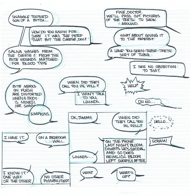
An example of dialogue blocking, with dialogue taken from The Red Dragon. Original post here
An example of dialogue in a variety of speech balloons, practicing blocking and creating containing balloons. Original post here.
When creating your blocks of text, you're aiming for:
- Easily digestable chunks of text
- Text should conform to an oval shape
Placing Your Text:
- Crossing tails
- Obscuring action
- Obscuring faces
- Blocks of text
- Text hoagies
- Placing long words at the end of your dialogue/speech bubbles
I letter in Photoshop, but you can also use InDesign or Illustrator, or any other graphics program you're comfortable using.
If you find your font is too thin, and there isn't an option to bold your text, you can add a stroke in the Layer Styles menu.
I recommend that you set your stroke to the same color as your font, unless you're trying to achieve a special effect/special connotation.
Throughout my lettering process (placing my text, adding balloons, final editing checks), I move my text several times, so I treat this stage as a rough sketch for lettering.
On a Comic Page:
For my lettering process, I usually roughly place and block my dialogue for the entire chapter, then go back and add my word balloons.
For each panel that contains text, I create a folder. I recommend you name your folders for organization (Panel 1, Panel 2, Panel 3, ect). You can also organize dialogue by character (ex Kara Panel 1, Meldina Panel 2).
I'm lettering on 15"x11", 600 DPI scans, and I typically letter in sizes from 14-18.
When lettering dialogue in comics, you have approximately five options for text placement:
Each of the four corners of the panel (assuming it's a rectangular panel)
The center of the panel.
Your placement will affect how you format your text. For your upper and lower left hand corners, you want to set it to left alignment, for your upper and lower right hand corners, you want to set it to right alignment, and for your center panels, you want to use center alignment.
You also want to consider the reading flow for the page. For Western comics, readers read from left to right, and you don't want to break that flow.
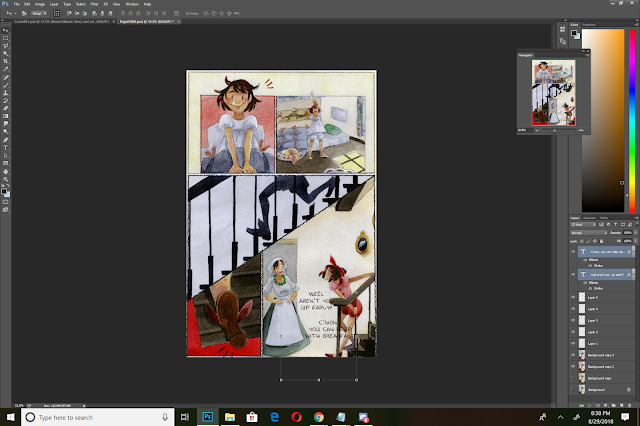
The reading flow for the final version of this page is admittedly, a bit convoluted. If I'd brought the text down in panel 4, it would read more clearly, but would obscure the action of the panel.
In Action:
Initial Placement:
On this page I wanted to keep the action clear and uninterrupted, so I placed the dialogue lower in the last panel. Dialogue slows the action of a page, and often breaks the reader's flow, so when possible you want to place it so it won't obscure action or movement.
Adjusting Dialogue for Word Balloons
You will probably have to tweak and adjust your text quite a bit before you hit on something that works.
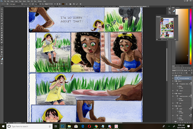
You want to avoid splitting words up, such as this hyphenated example with 'something'.
Longer words need to be on one line.
For darker panels, you may want to do your lettering on a lighter panel, then move it over to the intended panel.
In this example, I'm lettering the dialogue for panel 5 in panel 1, as there is more contrast.
I'm using the visibility as an opportunity to format the dialogue for best fit- I want to place my dialogue in the upper left hand panel, so I need to left align my dialogue. Your alignment (left, right, center), will change how you structure and format your text.
Adjusting Text for Labels
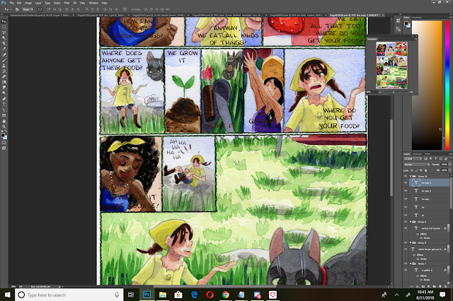
For this panel (3rd panel), we have two considerations- labeling the food, and Naomi's dialogue.
I opt to use the same font for the labels, although this would be an excellent opportunity to switch to a Serif Font (that has a tendency of looking 'official'). Using another font makes the labels stand out as separate text from the dialogue, but in this instance, I'm confident that my word balloons will keep my dialogue distinct.
My labels are difficult to read as is, so I try to place them so they're not obscuring the produce, but are a bit more legible.
Adding Laughter/Adjusting Text for Effect:
I want Kara's laughter to have a fun, spontaneous feel. Having it lined up would give it a mechanical feel, so I need to skew the individual ha's to make it more spontaneous.
I begin by placing my 'ha's and using the move tool to free transform them slightly.
Page with Completed Dialogue Placement
When Placing Dialogue:
Mostly it's about placing your text blocks in a way that's attractive and understandable for your readers. Keep in mind native reading flow, as well as the flow of the page. Don't cover important areas such as the face, important gestures, or line of action.
In our next installment of Intro to Comic Craft, I'm going to cover adding in word balloons.
Second Opinions and Outside Resources:
I highly recommend you check out Nate Pieko's (Blambot founder and letterer) guides for lettering
Comic fonts for Comic Artists
Blambot
Other Useful Font Resources
DaFont
Google Fonts
More on Lettering:
Guestpost: Selecting and Using Fonts for Webcomics
Pre-Lettering Pages
Relettering and Redoing Word Balloons
Super Easy Lettering Hack
7 Awesome Free Comic Lettering Fonts for Commerical Use and How to Use them
Comic Book Lettering Tips By Patrick Brosseau
Handlettering:
Lettering Practice and Pangrams
When I was 13- Lettering Process Part 2
Lettering Practice- Dialogue and Blocking
A Guide to Hand Lettering Your Strips
Klein Letters: How It All Began
Klein Letters: Lettering, Continued: The 1970's
Klein Letters: Computer Lettering
Klein Letters: Computer Lettering, continued
Klein Letters: Hand Lettering Basics
How To: Cartoon Lettering for Comic Books: Art Techniques
The Art of the Comic Book: Learn to Write and Draw Professional Comic Books: Lettering with Speedball Pens
Text, Type, and Font Basics:
Web Typography 101
4 Key Considerations When Choosing Web Typography
An Introduction to Software for Text Design


Comments
Post a Comment