Skate On By- SCBWI Illustrators Contest Process
I've always had digital steps to my traditional process. There's always scanning and resizing, corrections and bluelines done digitally. But this year, I've begun working even more mixed media- with several of my pieces starting life entirely digital, or the majority of my sketching and planning done digitally. The reason for this is simple- it's very easy to correct things digitally. I can easily salvage a head that I liked, but was too small, or too large, reposition a hand that has a beautiful gesture but not quite the intended angle, slide a panel over just a smidge to make room. I've never tried to hide the digital aspects to my process, and I've written about my comic making process extensively over the years.
As an illustrator and member of the Society of Children's Book Writers and Illustrators, I've participated in the Illustrator's contest every year of my membership. Although the contest is aimed at picture book illustration, given the lack of other options, I've always submitted a comic spread. The pieces are judged on their readiness for publication, and I know I'm significantly lowering my chances by submitting a comic spread, as none of the judges have been involved with the kids comics industry. It's still a risk I'm willing to take, as I would prefer to be known for what I love, and I can only hope that someone looking for a comic artist for kids comics will take notice.
The SCBWI Midsouth's Illustrator's contest has a few rules:
- $20 application fee at registration
- Mounted on black foamcore or matboard
- Max size of 18"x12"
- Can be any medium
We were given this prompt:
As soon as Emma saw Ruby she knew they would NEVER be friends.
Which is from the picture book Ruby the Copycat, and is a continuation on last year's prompt.
I had a lot of difficulty getting out of last year's mindset, and brainstormed all sorts of options- having the two girls as swamp animals (a bullfrog and a alligator), cat and mouse, and finally settled on humans, as while I'm decent at drawing anthros at conventions, I'm fairly awful at drawing cute animal characters for children's books, and wanted to play to my strengths.
Prior Entries
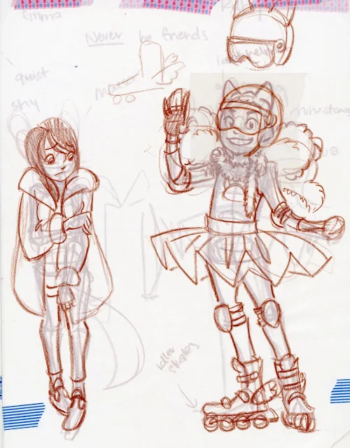
Character Generation:
Original Designs:
Revision:
Thumbnail Sketch:
You guys may recognize this thumbnail from my Intro to Comic Craft post on creating rapid iterations of a thumbnail from base sketches.
Tight Thumbnail:
This was completed digitally, converted to bluelines, and printed onto two sheets of printer paper.
Tight Rough:
These were refined with blue lead (Color Eno in soft blue) and graphite, then scanned as a whole.
These were again converted to bluelines, and printed onto Moulin du Roy watercolor paper.
Pencils:
Based on feedback I've gotten from a couple of kidlit comic editors, I've been pushing my non-Kara kidlit comic art towards simple+inked watercolor. Before inking, I needed to pencil this and refine a few details!
Before beginning my pencils, I inked my borders using Sakura's Calligrapher Pens. These pigment based, broad line pens are great for borders on watercolor comics.
Inks:
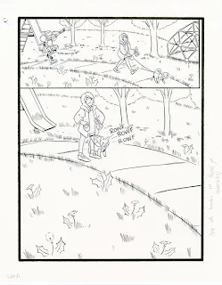
This spread was inked as individual pages. I used a Sakura Pigma FB- one of my favorite small, pigment ink brush pens.
Although this is the final page, I scanned and stitched together the inks so I have the option of playing with this digitally in the future.
Watercolor:
I have a video tutorial for this spread coming up in the future!
Painting spreads always requires special considerations, and considerable space. I use an uncut sheet of 24"x36" gatorboard, and stretch each half individually, trying to place them as close as possible. When painting a spread like this, you want to try and paint the two sides as close to identical as possible, at least around the join, to make stitching the spread together easier.
Toning Individual Panels:
Yellow, Grey, Ultramarine
Blocking in Background and Major Shapes:
I wanted to keep the grass light and cartoony, as I have a tendency of overworking grass and it becoming swampy. I decided to limit my grass to about three layers.
Blocking In The Trees:
Trees are always something I struggle to draw and paint, so I worked closely from photo reference, paying close attention to the lighting in the photos.
For the trees, I worked from yellow-sap green-phtalo blue
Blocking in the Characters:
I wanted Ruby's design to feel like a little girl who dresses herself, but also a girl with a vision- she envisions herself as an ice skater (hence the tutu).
For Emma, I wanted to depict a more subdued girl- someone who usually keeps to herself, so while I didn't go entirely muted with my color selection, I kept it more primary- a nice orange, a dark red, and bluejeans.
Blocking in and rendering characters is when the piece really starts to come alive!
Removing the blue tape and removing the watercolor from the board:
Trimming the watercolor for mounting:
This piece needed to be mounted on a piece of mat or foamcore for submission, so I trimmed the original down (quelle horror, I know), and used double stick tape (even worse, apologize) to adhere it to my matboard (which was recycled from last year- I'm just the worst).
The finished, stitched together scan:
Although a clean, stitched together scan wasn't necessary for submission, as I'm forever building my kidlit art and kidlit comic portfolio, it was certainly necessary for me. I have a tutorial on stitching together a double page spread coming soon as part of my Intro to Comic Craft series!


Comments
Post a Comment