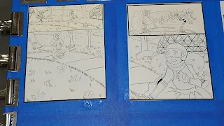
Intro to Comic Craft Stitching Together a Double Page Spread
In most comics, a double page spread is fairly unusual. It can really mess up the pagination of your comic, and has to be carefully planned in order to fit. As someone who does kidlit comics and all ages comics though, I like using double page spreads as an opportunity to explore large spaces, large concepts, or create an opportunity for the reader to relax for a moment and get pulled into the world. Some chapters of 7" Kara have multiple double pages spreads (shock and horror, I know!), particularly Chapter 7, when Kara is immersed in Naomi's human world for the first time.
This spread from Chapter 6 began its life as two watercolor pages stretched on one large board- a common situation for my double page spreads. I have a couple videos that demonstrate the process for painting watercolor spreads for those curious- but it only differs from painting regular pages in a couple ways-
1. Your Stretcher Board is double size, so the painting's footprint is HUGE
2. Although there's a space between the two pages, you're trying to continue your painting across that gap, so it's easier to stitch together.
This will probably only be relevant to creators who:
- Work in traditional media
- Work at a size that would necessitate splitting your spread over two pages
So for this type of spread, this is really a crossover post- a little Watercolor Basics, a little Intro to Comic Craft, but I hope regardless of your camp, you will enjoy!
Painting Pages- Working on a Double Page Comic Spread
Watercolor In Progress: Painting 7 Inch Kara
Now that our spread is painted, we need to digitize it and stitch it together for display and sharing as a webcomic page. Generally, for print, I don't worry too much about stitching a spread together- there's usually a fold to hide all but the most glaring errors, and I simply focus on color correcting the pages so they make sense as a continuous image. For web desplay (such as sharing the spread as a webcomic), I keep two considerations in mind:
While these are two pages, they're shared and displayed as one image
I need to remove the center seam, and stitch the pages together so that they are as seamless as possible.
These techniques are also applicable if you have to scan a large image in pieces and need to stitch them together. Photoshop does have a Merge function under Automate, but it doesn't always work well, and sometimes you're doing your stitching manually.
In this example, we're going to begin with a piece that's already nearly assembled- the two individual comic pages have been merged onto one document, the color correction has been completed, and we just need to make a few corrections to finish this piece.
Favorite Techniques:
Clone (utilizing the Clone Tool)
Manual Clone- Select the area you want to duplicate on your image, copy and paste it onto a separate layer, erase excess until it blends in.
Things to correct:
Remove center seam
Fix the stairs
When making corrections, do NOT correct the original- always make copies, and hide or lock your originals. This sort of correction can be quite destructive, so you want to protect your originals. Also, always make your corrections on a new layer- you may need to erase or soften edges.
Correcting the center seam is simple- you can either copy and paste areas of grass and drag them over, or you can use the clone tool to clone areas you like to cover the seam. Fixing the stairs is a little more difficult- there's a lot of light and shadow, stairs require more precision than grass, and sloppiness will stand out more.
For the stairs, I used a combination of copying over areas that worked, playing with Multiply, and cloning areas, as well as reestablishing the lines on the stairs using a custom Pencil Color brush.
The Finished Spread:
Let's take an in depth look at stitching together a double page spread with my SCBWI 2018 Illustrator's Contest entry.
Double Page Spread Painting Progress:
As you can see, most of the process is completed with about a 2" gap between the pages, forcing me to extrapolate information. I wasn't as careful as I should have been- lining up your spread so it's continuous makes it much easier to paint as though it is actually continuous.
 |
| The finished kidlit art comic spread |
Opening Our Base Scans:
The first step in stitching together a double page spread is to get your spreads in a single file. I open both spreads and create a new, huge document that's more than large enough to contain both files. This allows me room to reposition my halves.
Make sure you save your original two halves on seperate layers. We will want to work with a file that's one continuous layer at some point, but remember- never alter your originals.
Creating the Master File
We also want to crop the scanned border from around these pages.
Stitching Pages Together
The black border between the pages was a mistake- I wasn't thinking as I was inking, and I knew I wouldn't be able to correct it without damaging the painting surface, so I opted to wait until post to fix it. For the original, I simply trimmed it out with a paper trimmer, and in Photoshop, I can simply overlay the second half on top.
Although I tried to paint carefully, there's still a noticable difference at the seam that will need some care and correction.
Alignment Corrections
NOTE: You NEVER want to make corrections on the original- only on copies!
I create a new folder and drag my two halves into it, then copy that folder. I turn off visibility on the original, and merge the folder so the two layers are now one layer.
Now I have the file I'm going to start working with.
Cloning and Masking
The Clone Tool is great for correcting small areas, the selection tool and copy is great for correcting larger mistakes
I make a copy of my working layer
This is a pretty simple fix- I select an area on the right half, copy it, and drag it over so that the inked edge meets. I then erase what isn't working- what stands out as 'wrong' to the viewer.
This tree was pretty problematic- normally I would use the clone tool to sorta fill in that gap, but since the area I was working with was narrow but long, I couldn't get enough material for a believable clone. Instead, I copied an area from the right side of the tree, stretched it to patch the area, and erased the excess.
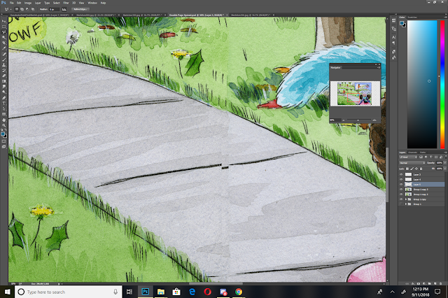
The sidewalk presented the same problem as the stairs from Chapter 6- noticable discrepencies AND lineart that doesn't match up.
I use both strategies- the clone tool and copying sections, to try and improve alignment and make the stitch less noticable.
I ended up futzing around with the sidewalk a lot, as it presented quite a challenge to get right.
Now that I have the image mostly stitched together, I can do some color correction and color adjustment, which I'll cover in my next post, as it's a fairly sizable topic.
Stitching an image together takes patience and time, but it isn't a challenging task. I encourage you guys to experiment with your own methods for correction, and share them with me using the handy form in the sidebar to the left!
As always, this post was made possible thanks to the generosity of my Artnerds on patreon.com/nattosoupPatreon! If you enjoy what I do, and find it helpful, why not join us? Artnerds get early access to near-daily videos, as well as backer exclusive comparisons.


Comments
Post a Comment