Intro to Comic Craft: Creating Thumbnails/Iterations Quickly and Easily in Photoshop
Some writers say it's easier to Rewrite than it is to Write. I've found, in my comic creation process, it's often easier to Redraw (revise, or cleanup) than it is to initially Draw- it's easier to work from an existing sketch, even if its rough, than it is to come up with new iterations on a blank sheet of paper. In today's tutorial, I'm going to show you a quick thumbnail and layout generation technique, using Photoshop- although ANY graphics program should work for this technique.
When to use this method:
This method is great for quickly hammering out a variety of compositions or layouts without dedicating significant time to any of them, and without destroying the originals.
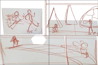
Base Sketches:


Saving Versions:
 Creating Iterations:
Using rough transform tools and resizing your base panels, you can create a variety of basic sketches from the elements above:


As you can see, these are REALLY rough. But they also give an idea of panel placement and layout, without a lot of redrawing. I cranked these five out in about ten minutes, and I can spend thirty minutes refining all of them so that they better express the thumbnail, and then choose my best option from there. I can also completely redraw elements using this as a base. I also have the option of refining only the most likely candidates, or passing these by a beta reader to help me select which ones to refine.
Refining These Sketches Into Thumbnails:
Colorpicking and Selecting a Brush:


V1: Refinement:


V2 Refinement:


V3: Refinement

V5 Refinement:


It seems that every version starts to tell a slightly different story, so it's time to get some feedback, decide on the sort of story I want to tell, and select a layout that best tells that story.
Two stories going on here:
Ruby zooms past Emma, scaring Emma's dog
Ruby, zooming past Emma, accidentally shoves her, causing her to fall


Creating a Comparison:
I rescaled all of my options and laid them out on my screen for a quick visual comparison.

Figure out what works and what doesnt:
My Personal Notes:
Either story is valid, but the dog story might mean more to kids reading it, and makes more sense considering you're using just one spread to tell a story. For the dog stories, thumbnail 2, with reworking, might be the bset option. It has an establishing shot that shows the setting (a park), the characters (Emma and her dog, Ruby on rollar skates), an action panel (the second), and the result panel (the third, if you drew the dog cowering more).
For the shove storyline, thumbnail 3 might work best, also with some tweaks. Panel 1 shows the action, foregoing establishing setting (which wouldn't be necessary if this were say, mid chapter), but although Panel 2 gives an indication that Ruby has way moved on from the scene of the crime, it breaks the pagebreak. This isn't the biggest problem, since neither character are split by that pagebreak, but it might be best to give panel 1 more room, and do a better job establishing setting in panel 2 and 3. Panel 3 inplies that Ruby realized something is wrong, and did look back to see if Emma was ok, giving her a bit of redemption, since she didn't just hit and run.
Sending the thumbnails off for critique:

Visually Narrowing Down the Playing Field:

Self Critique:

What can I carry into Thumbnail 2 from the other thumbnails?
Panel 3, Ruby looking back to see what the commotion is about
Panel 3, dog cowering more, maybe fully behind Emma, paws over his head?
Panel 2: maybe pull in more, show Emma's expression as Ruby passes?
Note: Draw Ruby with her helmet- so she probably can't see or hear very
Am I giving too much space to the third panel?


When to use this method:
- When you're working off or without a script
- When working from the script isn't quite working for you, or giving you the storytelling you want
- When there are multiple directions you can go with a story, and you want to feel them out before committing
- When pitching a project to a client
- When you don't quite have a feel for the project
This method is great for quickly hammering out a variety of compositions or layouts without dedicating significant time to any of them, and without destroying the originals.
Base Sketches:


Saving Versions:

Using rough transform tools and resizing your base panels, you can create a variety of basic sketches from the elements above:

V1

V2

V3

V4

V5
Refining These Sketches Into Thumbnails:
Colorpicking and Selecting a Brush:


V1: Refinement:


V2 Refinement:


V3: Refinement

V5 Refinement:


It seems that every version starts to tell a slightly different story, so it's time to get some feedback, decide on the sort of story I want to tell, and select a layout that best tells that story.
Two stories going on here:
Ruby zooms past Emma, scaring Emma's dog
Ruby, zooming past Emma, accidentally shoves her, causing her to fall

V1
Scaring Dog

V2
Shoving

V3
Shoving

V5
Scaring Dog
Creating a Comparison:
I rescaled all of my options and laid them out on my screen for a quick visual comparison.

Figure out what works and what doesnt:
My Personal Notes:
Either story is valid, but the dog story might mean more to kids reading it, and makes more sense considering you're using just one spread to tell a story. For the dog stories, thumbnail 2, with reworking, might be the bset option. It has an establishing shot that shows the setting (a park), the characters (Emma and her dog, Ruby on rollar skates), an action panel (the second), and the result panel (the third, if you drew the dog cowering more).
For the shove storyline, thumbnail 3 might work best, also with some tweaks. Panel 1 shows the action, foregoing establishing setting (which wouldn't be necessary if this were say, mid chapter), but although Panel 2 gives an indication that Ruby has way moved on from the scene of the crime, it breaks the pagebreak. This isn't the biggest problem, since neither character are split by that pagebreak, but it might be best to give panel 1 more room, and do a better job establishing setting in panel 2 and 3. Panel 3 inplies that Ruby realized something is wrong, and did look back to see if Emma was ok, giving her a bit of redemption, since she didn't just hit and run.
Sending the thumbnails off for critique:

Visually Narrowing Down the Playing Field:

Self Critique:

What can I carry into Thumbnail 2 from the other thumbnails?
Panel 3, Ruby looking back to see what the commotion is about
Panel 3, dog cowering more, maybe fully behind Emma, paws over his head?
Panel 2: maybe pull in more, show Emma's expression as Ruby passes?
Note: Draw Ruby with her helmet- so she probably can't see or hear very
Am I giving too much space to the third panel?
Refinement:
Although this is a thumbnail, I worked at scale, but kept my sketches simplified, as I still plan on refining this in a 'roughs' stage.


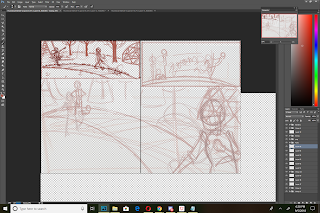
Final Thumbnail:

I resized my thumbnail for print, reducing it from 12"x18" to 7.7"x15", and split the whole image into two halves for the printed blueline roughs stage.
This process allows an artist to work seamlessly from concept to finished rough, but its up to the artist to create opportunities for feedback and self critique.
This process allows an artist to work seamlessly from concept to finished rough, but its up to the artist to create opportunities for feedback and self critique.


Comments
Post a Comment