Guest Post: Joseph Coco and Let's Play TV
Joseph Coco is a graduate from the University of New Orleans, with a masters degree in Computer Science. His focus was bioinformatics, a field and interest he still pursues. He is currently employed by SCAD, but spends his free time developing Let's Play TV, a webservice he hopes to launch in the near future. Let's Play TV basically functions as a Hulu for videogame playthroughs. This is of particular interest to the reclusive comic artist, who may have enjoyed playing videogames in a past life, but now find time too hard to comeby to justify playing games anymore. I've asked Joseph to talk about the planning and development of the site itself.
So I'm Joseph Coco. I’m coming from a scientific computing background but I originally wanted to develop video games. After years of college I decided my first major freelance project should be a website which allows users to watch videos of gamers playing video games, known as Let’s Play TV.

The basic idea is that gamers of my generation, I'm 24, and older don't have time to play video games like we did when we were younger. We have jobs, families, kids... so why not watch other people play video games? There's already thousands of let's plays out there, many of which are on YouTube but some crop up onto Vimeo, uStream, or Justin.tv. And frankly, the internet as entertainment is mediocre without curation. So after watching many terribly played games with Nattosoup I decided it would be worthwhile to start a web-service which aggregated all this content and correlated meta-data with it.
I don’t plan on generating content myself, so I have to provide a useful, transparent service. Before I invested any time developing or designing I set up a test environment and researched what services and data were available to me. I created a rough of what the data might look like
on the site and then went straight to designing.

I’ve never designed a website before. Hell, I haven’t designed much at all, but I decided it would be best to tackle the larger hurdles early on. I took several art classes in high school and have read a few books, but I work with designers so I could have gotten someone to do it for me. I decided it would be exciting to learn Fireworks, and more importantly, I wanted to invest my own time in this until the site is on its feet.
The first thing I did was begin sketching, I considered using a wire frame tool but quickly realized they didn’t provide any substancial features and that pencil and paper was better. Unfortunately, I threw away my sketches because I'm an anti-clutter kind of guy, but luckily I never take out my office trash. So here are my crumpled sketches of the homepage and LP page.

I decided to use Fireworks instead of Photoshop, which I am much more familiar with, because it allows me to easily build a template for a content management system. I discovered that Fireworks requires the use of images slices for interactivity and quickly dropped the idea, so ultimately I will end up exporting the CSS but manually laying elements onto templates.
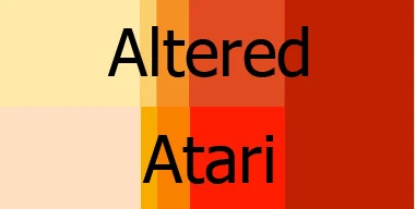
In terms of design, I wanted the site to have a familiar feel but didn’t want to create something radical or silly like mimicking an RPG’s menu system. Modern websites have some good philosophies, so I stole a lot of the design straight from Hulu. After all, this is a video-watching site and Hulu seems successful. I decided on a general theme of Atari, largely because I like its color pallete, which I’ve discovered does not work well for a website--far too many bright colors--so a friend altered it and I’m playing around with it to see which works best.
Most websites don’t use custom fonts because older browsers don’t easily support the addition of fonts on a site and also there are some legal issues with publishing fonts. I’m going to explore said issues later because I’m not sold on any of my fonts, but right now I’m using Atari’s System font and Orange Kid from Earthbound as well as some other generally usable fonts and Bitter from Google Web Fonts.
After I had the basic aesthetics of the site in my head I went straight to designing the interactive components on the homepage because I decided they would be the primary form of navigation. ResearchGate, a social community for researchers, sold me on their stats semi-interactive component to show potential users the community's discipline breakdown.

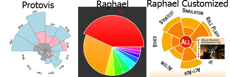
I decided it would be good to not only show what genres are most expressed on the site, but to allow filtering via this component. The graph didn’t do this obviously, but I could tweak it, so I tried to steal the javascript only to learn that some numbers were being computed, likely via PHP code which I didn’t have access to, and injected into the code. So if I wanted their graph I would have to write the formulas to compute the dimensions of each piece--screw that. My intention in stealing was to get started fast and then write something of my own, but why bother if it’s difficult? I looked around at some visual libraries having all the features I wanted. I discovered the Nightingale's rose from Protovis. But one of the major features of my circular navigation widget is tooltip support and Protovis doesn’t have this feature for my needs. For technical reasons, (little JS SVG support) I couldn’t easily add tooltips to Protovis, so I switched over to Pie from Raphaël which I just butchered into a Nightengale’s Rose. I realize I could have just used a pie graph and cut out the popularity measure which I don’t believe would have significantly impacted usage, but ultimately a pie graph looks boring and a nightengale’s rose is cool.
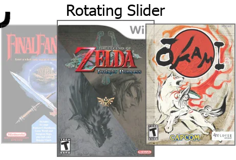
The nightengale’s rose is a secondary component to the silder, a must have on most any media website. I decided I wanted to go with one which showed multiple, but not all, possible images at once and not to provide pagination. I found a fantastic gallery at smashing apps which featured many sliders but ultimately went with Brian Osborne’s simple jQuery Feature Carousel and ended up bastardizing it after much experimentation with other sliders/carousels.
My final thoughts on interactive components is not to search for something to exactly suit your needs but rather grab the first thing close to it and seek out HTML5 solutions before delving into Javascript or Flash.
With that aside I have the meat of the front page, but unless you’re Google you need more than one point of entry to your site. So I began designing other components.
Roll-out menus with visual queues for the content. I decided to make the menu wood because I liked wood and it went along with the Atari theme. It worked quite well though it took far too long to find a good picture on Google Images.

A search bar featuring faceted search. I want search to be used as both a means to discover as well as find a particular item which is why I’m putting less emphasis on autocomplete and more on the results page. More on that later.

And some suggested categories of Let’s Plays which will eventually be customized per user based on machine learning algorithms. I figured three columns is most comfortable to display image, title of game, LPer, short description, and console image, though I may drop the the latter two and increase the number of columns.

The interior pages of the site are similar except Search and LP. Search should have quick, asynchronous access to video previews, which will constitute grabbing a random video from the LP and playing at a random time. The search results are each tucked into an interactive button-like contraption which slides over and populates the video and information content area when the obscenely large play button is clicked.

Again, I think search should be used for discovery, which is why when you click on any of the categorical information from a video game or LPer it brings you to a search screen of all other content within that category.

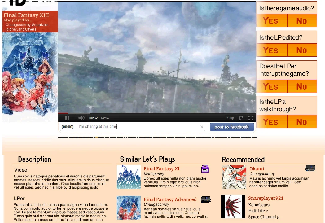
The LP page is different but plain enough. When you’re watching a LP you want to know a few things: how do I interact with the video, what am I watching, who else has played this, and what are some similar videos. An image is a great indicator of what is playing but I decided to also overlay the title of the game and the who else has played it. Additionally, questions appear on the other side of the player regarding the LP and a social sharing box underneath. It seems like a common trend to make highly interactive components appear as if they are above or stacked on other elements. I like the idea so I just made a white gradient for this effect.
For some of the other pages I decided I liked the aesthetic of having a slice of white behind, but not properly aligned with, titles/subtitles. No particular reason or functionality other than to draw attention. On the LPer page my love of images to represent things shines through again via the gallery of LPs which have hover expanding captions. Eventually they will be less tiles and more free-flowing images which consume a canvas, thus having larger images if you’ve played less games. The best example of this is Gilt Groupe’s old site, but I can’t find any pictures of it.

Speaking of images, I’m hoping to host the images of Amazon’s S3 service, so bandwidth likely won’t become an issue because the images will be on Amazon and the videos on Google.
My Queue page is very similar to Hulu except with recommended items on the side.

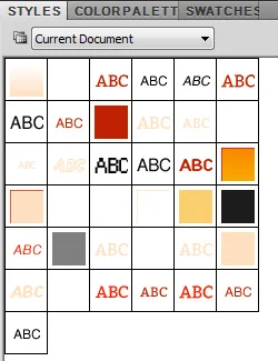
I ended up with a fairly small styles palette. I’m very glad I used the styles palette because I’ve been changing colors and fonts as I go (dramatic color changes in the near future. I believe I'm going to make the background a dark color and play off that) which only takes a few clicks instead of having to change each individual item.
So after I designed the site I made it fake interactivity in Fireworks with hover-overs, clicks, and states, then I exported all the pages to HTML files, altered them to include the homepage interactive javascript components I created, and finally put all the files in my public Dropbox so it appears to be a legitimate website. The hardest part is explaining to people that it’s just a mock-up to represent the design. If you have any feedback or would like to help upload content when it’s ready please comment below or send it Nattosoup’s way, I guarantee it will get to me.
So I'm Joseph Coco. I’m coming from a scientific computing background but I originally wanted to develop video games. After years of college I decided my first major freelance project should be a website which allows users to watch videos of gamers playing video games, known as Let’s Play TV.
The basic idea is that gamers of my generation, I'm 24, and older don't have time to play video games like we did when we were younger. We have jobs, families, kids... so why not watch other people play video games? There's already thousands of let's plays out there, many of which are on YouTube but some crop up onto Vimeo, uStream, or Justin.tv. And frankly, the internet as entertainment is mediocre without curation. So after watching many terribly played games with Nattosoup I decided it would be worthwhile to start a web-service which aggregated all this content and correlated meta-data with it.
I don’t plan on generating content myself, so I have to provide a useful, transparent service. Before I invested any time developing or designing I set up a test environment and researched what services and data were available to me. I created a rough of what the data might look like
on the site and then went straight to designing.
I’ve never designed a website before. Hell, I haven’t designed much at all, but I decided it would be best to tackle the larger hurdles early on. I took several art classes in high school and have read a few books, but I work with designers so I could have gotten someone to do it for me. I decided it would be exciting to learn Fireworks, and more importantly, I wanted to invest my own time in this until the site is on its feet.
The first thing I did was begin sketching, I considered using a wire frame tool but quickly realized they didn’t provide any substancial features and that pencil and paper was better. Unfortunately, I threw away my sketches because I'm an anti-clutter kind of guy, but luckily I never take out my office trash. So here are my crumpled sketches of the homepage and LP page.
I decided to use Fireworks instead of Photoshop, which I am much more familiar with, because it allows me to easily build a template for a content management system. I discovered that Fireworks requires the use of images slices for interactivity and quickly dropped the idea, so ultimately I will end up exporting the CSS but manually laying elements onto templates.
In terms of design, I wanted the site to have a familiar feel but didn’t want to create something radical or silly like mimicking an RPG’s menu system. Modern websites have some good philosophies, so I stole a lot of the design straight from Hulu. After all, this is a video-watching site and Hulu seems successful. I decided on a general theme of Atari, largely because I like its color pallete, which I’ve discovered does not work well for a website--far too many bright colors--so a friend altered it and I’m playing around with it to see which works best.
Most websites don’t use custom fonts because older browsers don’t easily support the addition of fonts on a site and also there are some legal issues with publishing fonts. I’m going to explore said issues later because I’m not sold on any of my fonts, but right now I’m using Atari’s System font and Orange Kid from Earthbound as well as some other generally usable fonts and Bitter from Google Web Fonts.
After I had the basic aesthetics of the site in my head I went straight to designing the interactive components on the homepage because I decided they would be the primary form of navigation. ResearchGate, a social community for researchers, sold me on their stats semi-interactive component to show potential users the community's discipline breakdown.
I decided it would be good to not only show what genres are most expressed on the site, but to allow filtering via this component. The graph didn’t do this obviously, but I could tweak it, so I tried to steal the javascript only to learn that some numbers were being computed, likely via PHP code which I didn’t have access to, and injected into the code. So if I wanted their graph I would have to write the formulas to compute the dimensions of each piece--screw that. My intention in stealing was to get started fast and then write something of my own, but why bother if it’s difficult? I looked around at some visual libraries having all the features I wanted. I discovered the Nightingale's rose from Protovis. But one of the major features of my circular navigation widget is tooltip support and Protovis doesn’t have this feature for my needs. For technical reasons, (little JS SVG support) I couldn’t easily add tooltips to Protovis, so I switched over to Pie from Raphaël which I just butchered into a Nightengale’s Rose. I realize I could have just used a pie graph and cut out the popularity measure which I don’t believe would have significantly impacted usage, but ultimately a pie graph looks boring and a nightengale’s rose is cool.
The nightengale’s rose is a secondary component to the silder, a must have on most any media website. I decided I wanted to go with one which showed multiple, but not all, possible images at once and not to provide pagination. I found a fantastic gallery at smashing apps which featured many sliders but ultimately went with Brian Osborne’s simple jQuery Feature Carousel and ended up bastardizing it after much experimentation with other sliders/carousels.
My final thoughts on interactive components is not to search for something to exactly suit your needs but rather grab the first thing close to it and seek out HTML5 solutions before delving into Javascript or Flash.
With that aside I have the meat of the front page, but unless you’re Google you need more than one point of entry to your site. So I began designing other components.
Roll-out menus with visual queues for the content. I decided to make the menu wood because I liked wood and it went along with the Atari theme. It worked quite well though it took far too long to find a good picture on Google Images.
A search bar featuring faceted search. I want search to be used as both a means to discover as well as find a particular item which is why I’m putting less emphasis on autocomplete and more on the results page. More on that later.
And some suggested categories of Let’s Plays which will eventually be customized per user based on machine learning algorithms. I figured three columns is most comfortable to display image, title of game, LPer, short description, and console image, though I may drop the the latter two and increase the number of columns.
The interior pages of the site are similar except Search and LP. Search should have quick, asynchronous access to video previews, which will constitute grabbing a random video from the LP and playing at a random time. The search results are each tucked into an interactive button-like contraption which slides over and populates the video and information content area when the obscenely large play button is clicked.
Again, I think search should be used for discovery, which is why when you click on any of the categorical information from a video game or LPer it brings you to a search screen of all other content within that category.
The LP page is different but plain enough. When you’re watching a LP you want to know a few things: how do I interact with the video, what am I watching, who else has played this, and what are some similar videos. An image is a great indicator of what is playing but I decided to also overlay the title of the game and the who else has played it. Additionally, questions appear on the other side of the player regarding the LP and a social sharing box underneath. It seems like a common trend to make highly interactive components appear as if they are above or stacked on other elements. I like the idea so I just made a white gradient for this effect.
For some of the other pages I decided I liked the aesthetic of having a slice of white behind, but not properly aligned with, titles/subtitles. No particular reason or functionality other than to draw attention. On the LPer page my love of images to represent things shines through again via the gallery of LPs which have hover expanding captions. Eventually they will be less tiles and more free-flowing images which consume a canvas, thus having larger images if you’ve played less games. The best example of this is Gilt Groupe’s old site, but I can’t find any pictures of it.
Speaking of images, I’m hoping to host the images of Amazon’s S3 service, so bandwidth likely won’t become an issue because the images will be on Amazon and the videos on Google.
My Queue page is very similar to Hulu except with recommended items on the side.
I ended up with a fairly small styles palette. I’m very glad I used the styles palette because I’ve been changing colors and fonts as I go (dramatic color changes in the near future. I believe I'm going to make the background a dark color and play off that) which only takes a few clicks instead of having to change each individual item.
So after I designed the site I made it fake interactivity in Fireworks with hover-overs, clicks, and states, then I exported all the pages to HTML files, altered them to include the homepage interactive javascript components I created, and finally put all the files in my public Dropbox so it appears to be a legitimate website. The hardest part is explaining to people that it’s just a mock-up to represent the design. If you have any feedback or would like to help upload content when it’s ready please comment below or send it Nattosoup’s way, I guarantee it will get to me.
Here is an index of all the pages if you want to make sure you didn’t miss any:


Comments
Post a Comment