Web and Print Design
Lately I've been trying to do a little design work to bring some coherency to my blog, twitter, website, and business cards. Even though I just ordered a new set of cards, I'm already thinking about what's going to be on the next set. It takes me a really long time to do graphic design, so I'm glad I've already started generating ideas, especially since I want to generate new artwork to go on them.
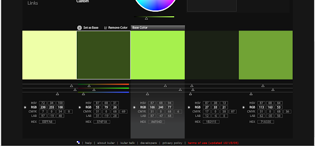
Right now I'm trying to come up with a color palette that will work for all these things. Using Adobe's Kuler, I can generate swatches with hex easily. Here's what I'm looking at so far:
I'm going with spring greens and grey because it connotates both 'fresh' and 'fashion forward' to me. It works well for Ready Set Go because it the green references the bud in the comic's logo, and the green can be a reference to Remi, who is fresh out of highschool and still very 'green', while the grey can be a reference to Julia, who's motives are always questionable.
I have swatches and some redesign notes for my business cards in my sketchbook. I may edit this entry to add those in, just because I enjoy sharing my work process with you.
EDIT:
Here's three new potential palettes I've come up with after reading The Well Dressed Home by Anette Tatum. I realized that the greens and greys on their own were a bit limited and boring, and wouldnt allow enough wiggle room to design for Foiled as well as Ready Set Go, so I've added in scarlet and orange.
I like the bottom theme best, but I'm not sure if that orange should be more red. Thoughts?


Comments
Post a Comment