I don't think I've ever posted the process for a marker render, let alone a marker render commission. For this post, I'm cobbling together two commissions, mostly because I'd started taking screencaps with one, got really into marker rendering it, and the markers were done before I'd taken any pictures. For the second, I didn't have any early process shots, but I was able to get lots of marker render shots. Of course there are some differences in how I went about thinking about the individual piece, but for the purposes of this post, the differences are very minor.
Something that people don't realize is that a commissioned piece takes A LOT of work. I try to involve the commissioner as much as possible and get as much input as I can during the early stages, because changes later in the piece are significantly more difficult and time consuming. A marker piece with a detailed background is more than double the work of a marker piece with a simple background, and consumes far more marker ink in a variety of shades. This post is a prelude to the price increase in my commissions that's coming in March, a behind the scenes look at why artists charge what they charge. What you're not seeing in this post are the years of self study, of self denial, the lost social life and social skills, the hours spent in classes, and the money spent paying for these classes. I feel like this blog in general gives a fair look behind the scenes of a grad student's life.
(Images and more below the break. WARNING: This is a long, image heavy entry)
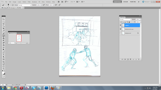
Here's a screencap of the thumbnail I sent to the commissioner. It's fairly small and fairly quick, she wanted to draw her and her boyfriend in front of an abandoned house. The reference she sent me originally was a midshot of herself and her significant other. The best kinds of commissioners send me exactly what they want me to draw- an image of the background (if possible, or several images if I need to cobble a scene together) front facing views of the persons I'm supposed to render, examples of poses, and examples of outfits. The more precise a commissioner is, the easier it is for me to satisfy them. This thumbnail needed correcting, she didn't like that her back was to the viewer, so I needed to devise a variation of the pose that showed the pair in profile. I feel like it doesn't work as well storytelling wise, but I understand and agree with the changes. To achieve these corrections, I reworked the pose below, and Photoshopped the second pose into the image:
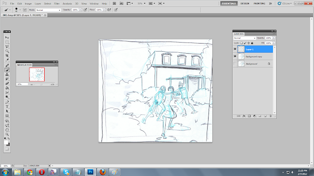
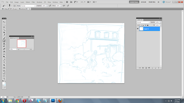
When the basic composition has been agreed upon, I scan it, change it to bluelines, and print it out again. I create the rough over this. For most commissions that require a perspective grid, I usually create two roughs- one with the background utilizing the perspective grid, the other with the figures, and then composite the two in Photoshop. The end result of that looks like this:
These roughs are all done on 8.5"x11" copy paper, so the images are pretty small. I add in a lot of detail when I'm doing the tight pencils before I ink the image. Unfortunately, I don't have any examples from those steps, my camera seems to have eaten them.
After the piece is inked (this usually takes about five hours) I let the ink cure overnight. Plate Bristol has a clay finish on it, and if you try to marker with Copics immediately after inking, even Copic-safe ink will smear and ruin the piece.
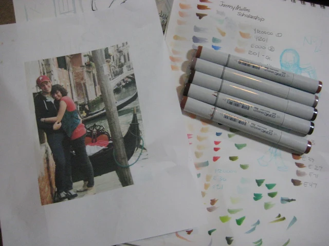
The woman who commissioned this piece included really great reference and told me exactly what she wanted. Working from the photo made my job a lot easier, as I didn't have to try and guess the effect sunlight and reflected light would have on the subjects.
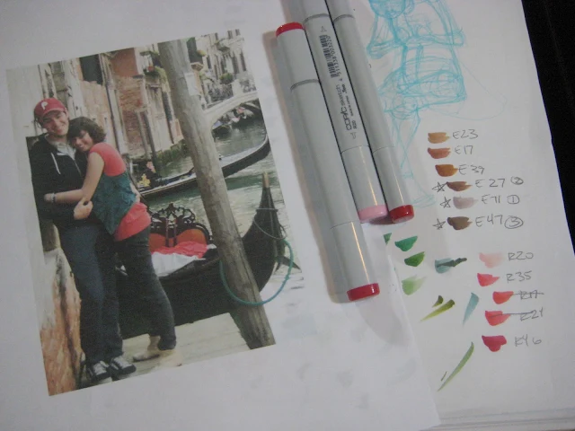
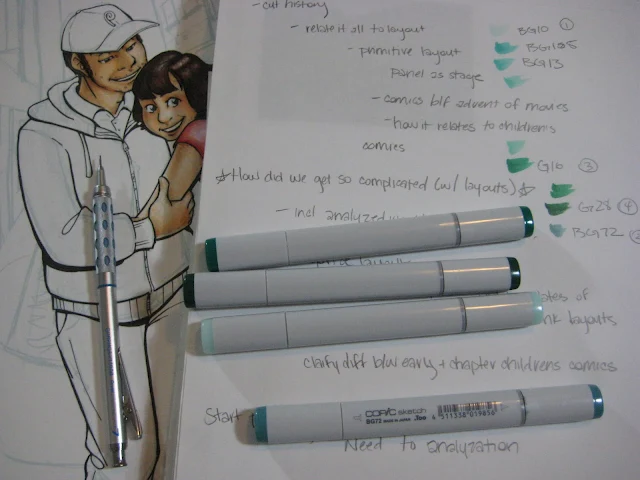
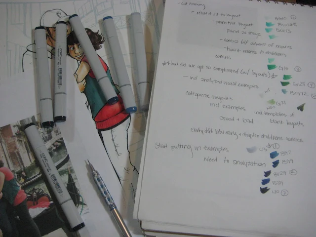
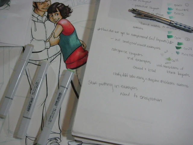
I usually start by making a color chart of the colors I'm THINKING about using, and then numbering or starring the colors I've decided to use. So that you guys can follow along, I've used the Copic numbers found on the top of my Copic Sketch markers. I almost always start with the skin.
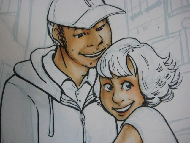
I work from the very lightest to dark, so I begin by putting down an overall layer of Pale Chiffon as a skintone base.
After putting down an overall base coat, I may go over it again to start putting in shadows.
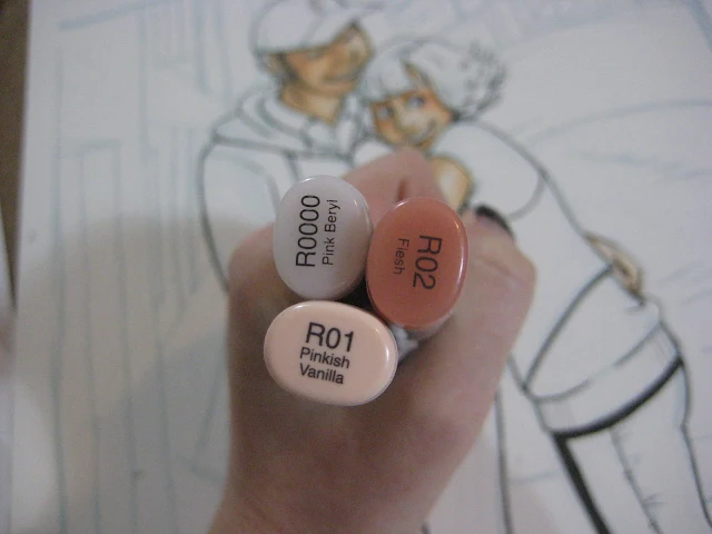 |
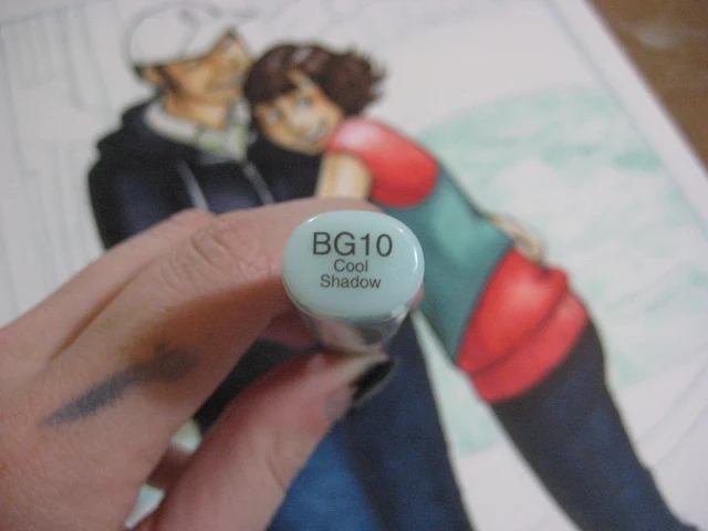
| When I show three markers like this, it means that all there were used in conjunction to achieve the desired effect (in this case, adding some blush to the cheeks, lips, nose, and joints). The lightest color (the Pink Beryl) is used to blend out the darkest color (Flesh) and the second darkest color (Pinkish Vanilla) |
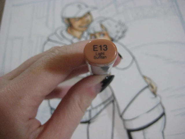 |
| With Light Suntan, I add in cast shadows (such as beneath the hair). |
 |
| Now I'm selecting the browns to render her hair. |
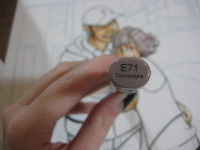 |
| Again I work from lightest to darkest, leaving the white of the paper to be the whitest highlight. |
 |
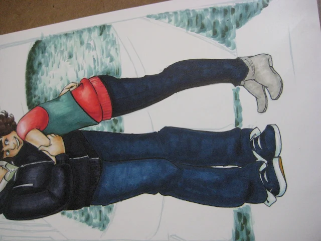
| Her shirt was a little tricky, as I don't have that exact shade of reddish pink to blend to. |
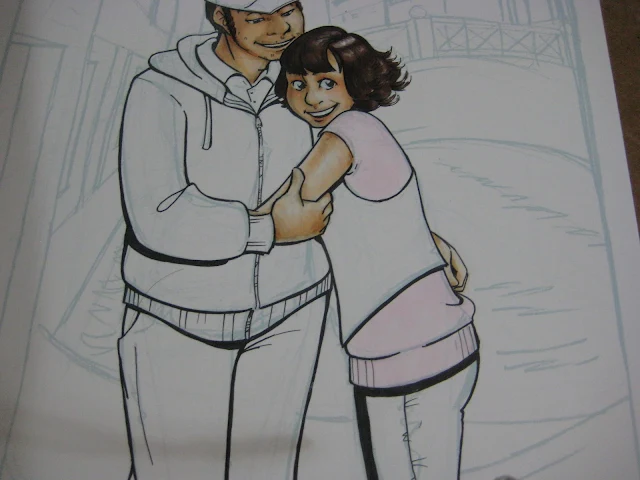 |
| I lay down a base coat of my lightest pink, which will also be used for blending. You want to blend into the last color you put down for the best effect. This means you blend using the marker you put down before the one you're currently using. |
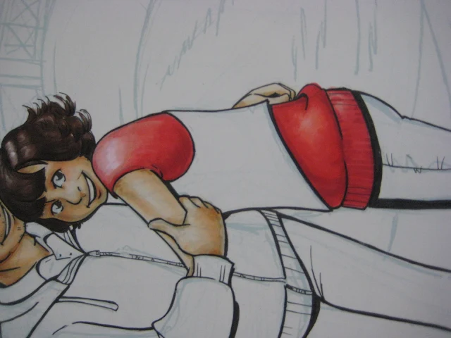 |
| I neglected to take a picture, but at this point, I'm using Strong Red to add the core shadows. |
 |
| Now it's time to render the vest. Again, I don't have the exact color, so I have to blend an approximate. |
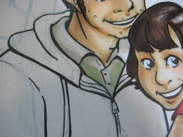 |
| Maybe it's just me, but the photo looked like his shirt had a green detail beneath the color. Not beneath it enough to look like a shadow, but like stripes of green on a white or cream polo shirt. |
 |
| Time to render his jacket. Our brains know it's 'black', but optically, its not. It's a very dark blueish grey optically, so those are the colors we'll use. |
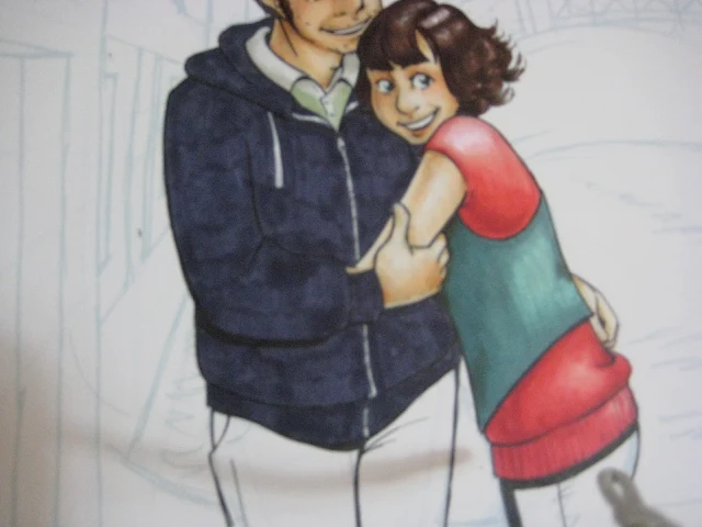 |
| I know it looks splotchy now, but we'll render that out. |
 |
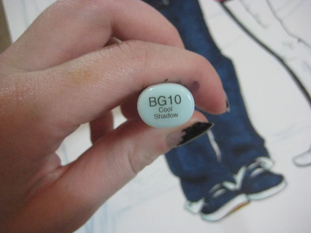
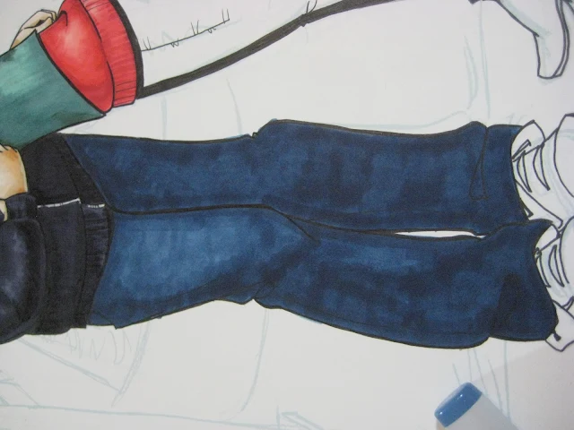
| Now it's time to render the jeans. His are slightly lighter than hers, so we'll begin with a lighter base color. |
 |
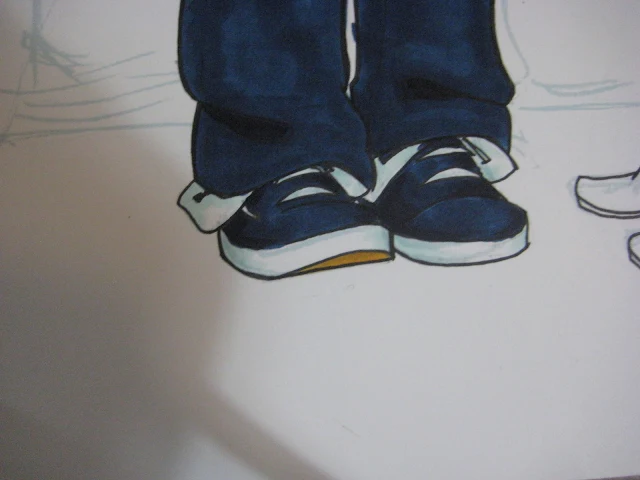
| And now for the shoelaces. |
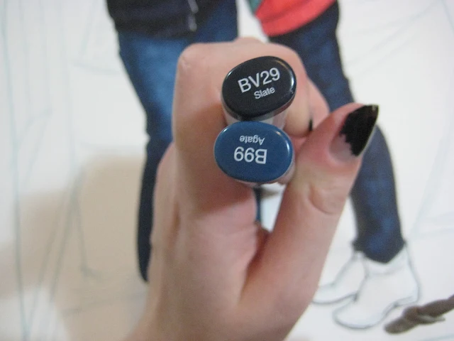 |
| And her jean colors. |
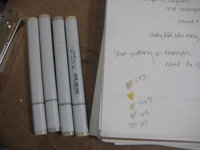 |
| Testing colors for her boots. |
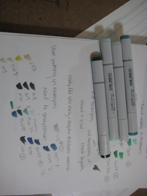 |
| And starting on the background. I'll begin with the water, it seems like the most fun. I'm working with the lineless rendering technique I've introduced earlier. |
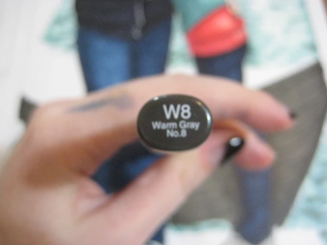 |
| In the photo, the boat looks black, but that's just how our brain reads the color. Really it's a warm shade of grey. |
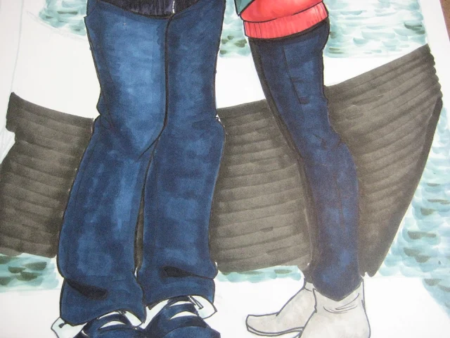 |
| I lay down the marker in wide strokes, taking advantage of this technique's tendency to look like slats of wood. |
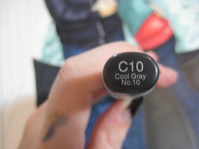 |
| And I use cool grey for the interior of the boat. |
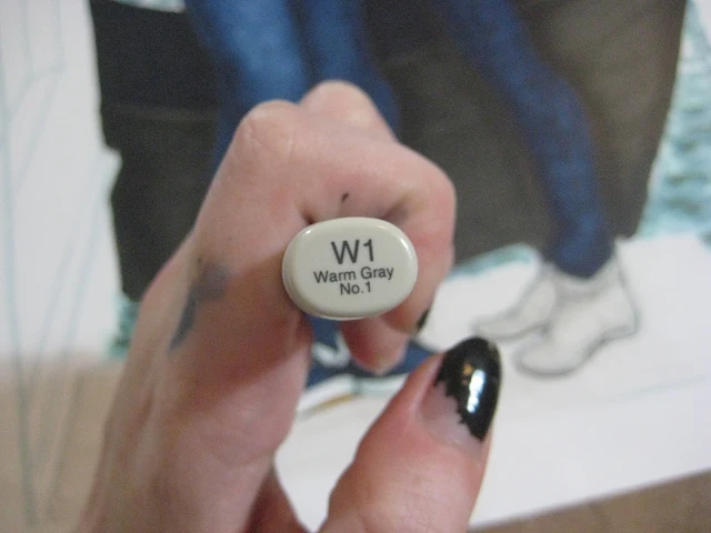 |
| Warm grey for the weathered wood of the dock. |
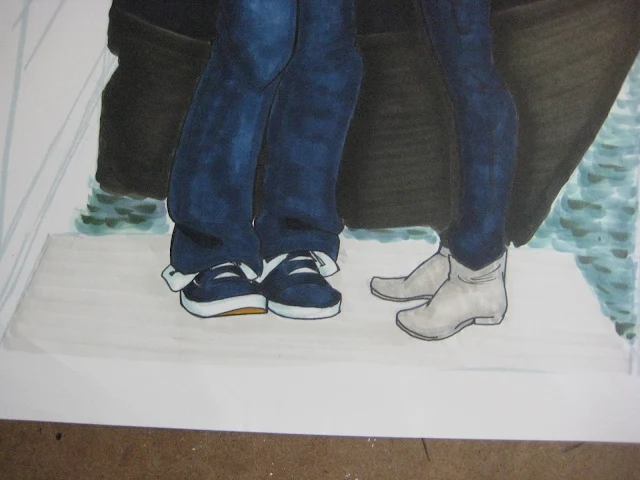 |
| Again applying the marker in wide continuous strokes to achieve a wooden slat effect. |
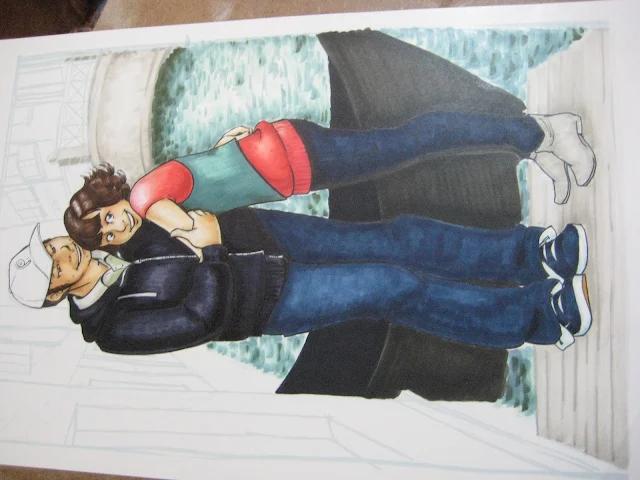 |
| And I add in details with a darker warm grey, probably a W3. |
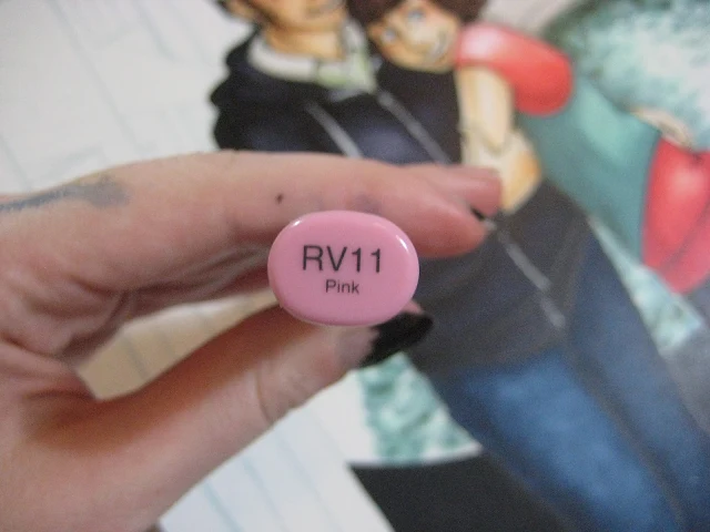 |
| Going back to do his fading red baseball cap. |
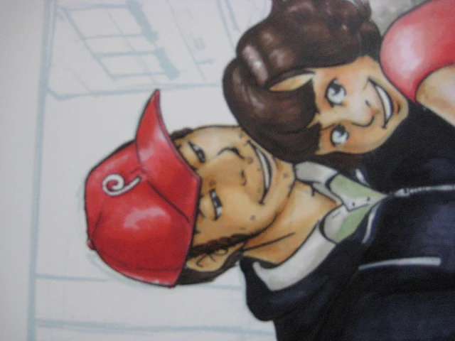 |
| The core shadow was done in Strong Red (sorry, I forgot to take that photo) |
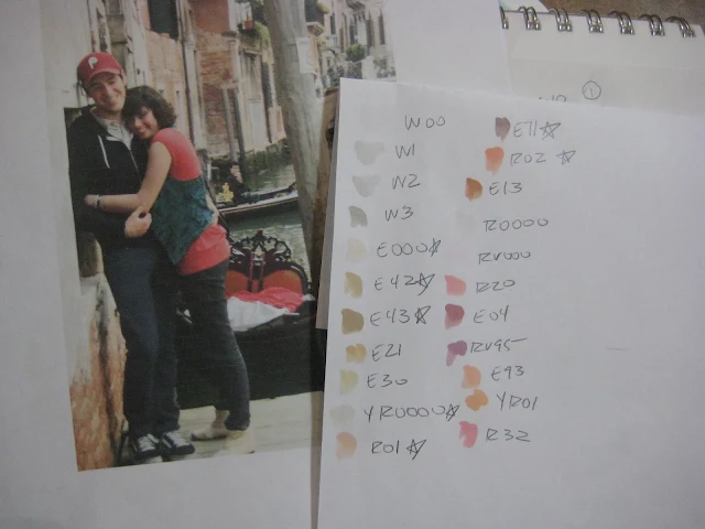 |
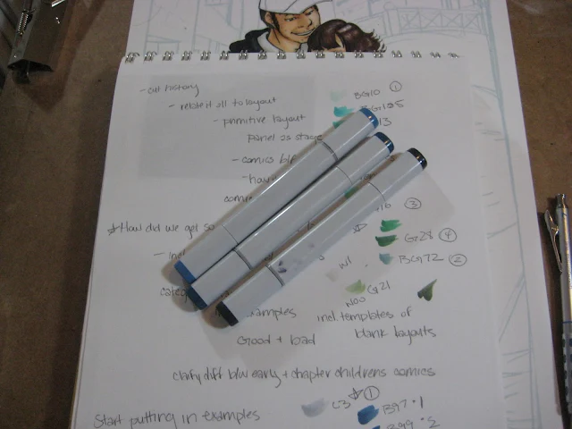
| Here's the swatches for the background. I tested a lot of markers to find just the right ones. The starred swatches are what I ended up using, and I tossed the rest back in my marker case. |
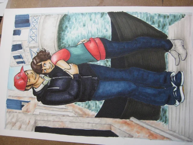 |
| It looks like I just whipped that background out, but honestly, I just got into rendering it and forgot to take process pictures. |
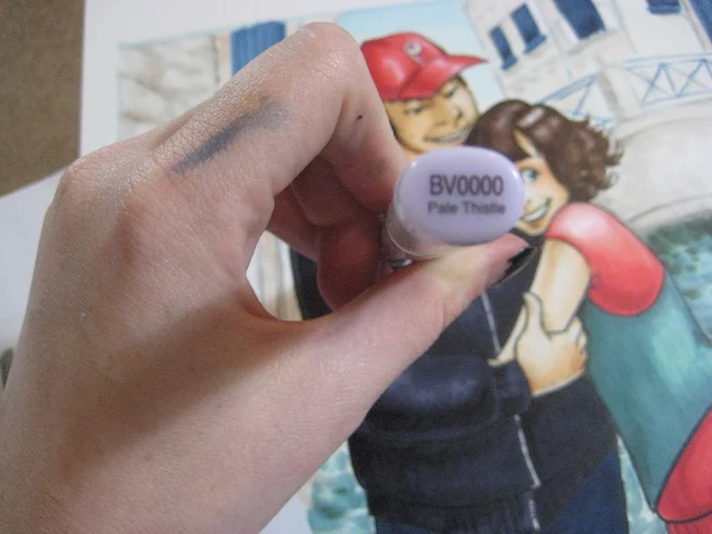 |
| I use a cool violet to put in shadows on skin and other warm objects. |
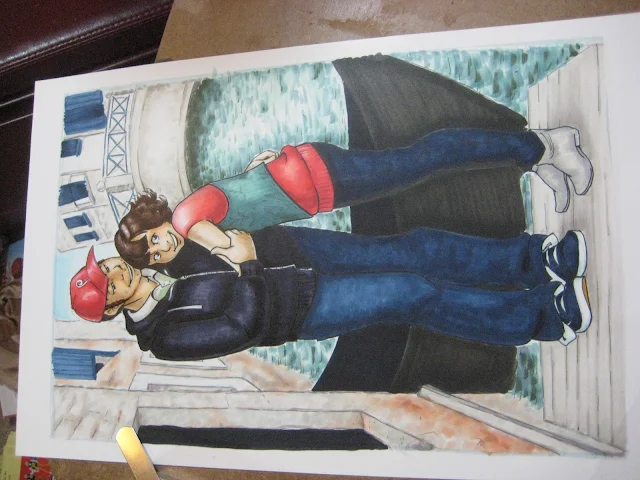 |
| I go in and add some detail lines with a Multiliner in a size .2. All told, this probably took me about 8 hours in one evening to render, used a good amount of Copic ink from several markers, and takes a fair amount of practice with Copics to get to this point. | |
|
|
|













Whoo! Nice to see the whole process! I really liked how the background turned out. :D It's a really sweet picture Becca, nice job. :D
ReplyDelete