Guest Post: Sarah Benkin, Textures
When Becca asked me to do a post for her blog, I thought I’d do one on textures since a lot of people (like seriously, almost four of them) have asked me how I do mine. I know that this blog’s readers are at varying points in their artistic development, so I tried to cover a lot of ground. Hopefully, this post will have some good information both for beginners and seasoned inkers.

Here is a portion of my brush collection. (Yeah, see that classy store-brand grape flavored drink mix? Mmmm-hmm. Comic artists dine on only the choicest foodstuffs, yaknow.) There are more, but these are the ones I find myself still using. Some are leftover from my painting career and some have been bought more recently. I’m a bit of a pack rat with brushes. I almost never throw one away, because when a brush is spread and stuck with ink and generally too trashed to make clean, pretty lines, it can still make a good texture brush.
To demonstrate some of the different marks these brushes can make, let’s take out a few examples.
We’ve got a big, round tipped horsehair brush:
A flat Blick golden watercolor brush:

An old, stiff horsehair brush with a rounded top:

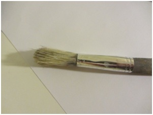
A totally trashed brush, barely more than a stick:

One of those big Japanese sumi ink brushes:

A fan shaped synthetic brush:

A fan shaped watercolor brush:

And a small sable-synthetic mix with a long tip:

Awright, let’s start with the round, flat topped horsehair brush.

When I dipped it in ink and twisted it around on the paper, it came up with these interesting, uneven shapes. They’re just marks on the paper, not any sort of drawing right now, but looking at them we can see how they might suggest anything from stylized feathers to the edge of embroidered clothing. This technique is a bit unpredictable in the shapes it makes, but in a highly stylized drawing it can still produce some interesting patterns. You can also get more control by carving away with white ink and adding with black. And of course, the more you practice with a tool, the more comfortable you get with it and the more control you have.

As the ink starts to run out, the texture starts to form more of a uniform tone and feathering becomes easier. Brushing over the same spot again and again creates a soft feathery edge.

I made this criss-cross texture with some watered down ink. It’s worth noting at this point that you can always make big swaths of texture and then cut them out, either digitally or traditionally, and paste them down in a particular shape or area in a line drawing.
 |
| You should always watch classic MST3K while drawing. It will give your inks GREAT POWAH. |

Flat brush was next. I tried a few different things with this. On line 1, I made a simple flat stroke, letting the drybrush and stripey texture show as the ink ran out. (A “drybrush” effect is created by dipping the brush in ink, then wiping most of the ink off on scrap paper until the bristles start to spread. The result is a more textured, varied line.) On line 2, I lifted the brush up and set it down a little randomly, to show the bristley edges.
On line 3, I varied the pressure regularly to create a wave texture. Developing a sense of touch is very important to inking, and it’s an aspect of inking that’s rarely talked about. Probably because it’s something that usually just develops naturally over time. Still, being sensitive to the amount of pressure you’re putting down is what allows you to feather a brush, use drybrush effectively, control line weight and handle just a ton of different effects.
Line 4 is just more drybrush, when the ink was almost gone. Notice how the square edges of the brush fade but don’t quite disappear.

Underneath that, I used a bit of feathering.

I love to feather with this brush, because the wide, even pattern of bristles is great for making something look shiny. Just let the thinner lines meet in the middle like this, and it creates the impression of light hitting a cylindrical, metal form like a can or ribbed pipe. It looks even smoother when it reduces.

Here’s some effects I got with the rounded horsehair brush. Thought I’d make this a little more fun by actually doodling something with these. Those “grasses” at the bottom are the result of putting a little ink on the brush and smashing the side into the paper, over and over again. Look closely and you’ll see there’s a rough texture to the side of the brush that might also be used for the edge of a seashell, or bark.

By making some long strokes with varying pressure on this brush, I was able to make a barklike texture on the tree. This is just a loose, sloppy sketch meant to demonstrate markmaking But it’s worth noting
that the shape of the tree, even at this loose stage, is still fairly readable because there are clear areas of light and dark that give it form. This is *extremely* important to remember when applying texture to a form. The principles of giving volume to a form with light all still apply here, and you’re going to need to communicate that with dark, dense areas of texture, lighter midtones areas of texture, and bright areas with little or more often no texture at all.

The wrecked, barely-more-than-a-stick brush was next. For the most part it produced a thick, chunky messy line, but the bristles were still perceptible. Because all of the bristles were broken, leaving behind only tiny, short bristles on the end of the brush, it acted more like a pen or marker than a brush, which normally has give. Drawing with it felt like using a brush pen.

Here I used it to recreate the sketchy line in Picasso’s iconic sketch of Don Quioxte. Obviously I’m no Picasso, but the sketch is still a perfect example of how an image doesn’t have to be “clean” to be compelling, beautiful or iconic. Textures by their nature are messy. Even if you generally draw in a clean style, you’re going to have to be comfortable with a little mess, slop, and expressionistic line when you apply textures. And frankly, even if you have a clean style you shouldn’t be *afraid* of mess. All good art has a messy stage. Trying to keep things clean and neat from start to finish will hold you back.
Next in line is the Japanese brush. These brushes are most associated with clean, smooth lines like these:

And these lines can produce some beautiful effects. Notice how I split the tip of the brush into two and three parts here and there to make slightly uneven parallel lines. As before, varied pressure produces lines of varied thickness.
But. Butbutbutbutbut. Let’s try using it to produce some rougher, more unpredictable marks.

Aww yeah. Now we’re cookin’ with gas.
On this page, I tried rolling the brush, slapping it down and dragging it, scribbling with the tip and making a long, dry stroke with split bristles. The way you hold the brush, the length of your strokes, these things are what will determine how your mark turns out.

To make this mark, I pushed the brush down on its side into the paper and dragged it down, wiggling it a little as I did so. The resulting lines imitate the look of the bristles. Wouldn’t lines like these be useful when drawing plants and tall grasses? Or maybe you could dip the brush in white ink and make curling, licking flames. Think about all the different ways you might use marks like these when you’re experimenting with brushes and pens.

Here I let the tip dry out a bit and scribbled around with it. What might a mark like this be used to make?

The fan shaped synthetic brush was next. Something nice about this brush is that the bristles spread evenly. When they’re mostly dry, they produce a feathery sort of mark. When they’re wet, they can produce a stripey sort of mark. But even wet, you can get that feathery look by smashing the bristles back into a fan shape with your fingers. If you’re worried about getting your fingers all inky then…uh…don’t be. Ever.

See how the stripes look relatively even but still retain an organic unevenness? What sort of things in nature do that?

Wriggling the brush when applying the stripes might evoke the look of ruffles on clothing, an example of something in nature (well, in the world around us anyway) that’s relatively even but might still look uneven in three dimensional space.


There’s a lot of different marks you can get with a fan brush.

When you dip a fan brush in ink, its bristles split in unpredictable ways.

By pressing the tips of the brush against the paper and curling it upwards, you can produce some interesting effects.

The less ink you have on the brush, the lighter and farther apart the bristles will spread.

This mark was made by pressing the brush down flat, over and over in a circle. With a little finesse, the negative space in this mark might describe radiating light.

Play around with whatever brush you’re using and wiggle it. Any effect you can produce, you can produce again in a drawing. I might use a mark like this to describe a canyon wall, for example. But there’s plenty of other possibilities.

Cross hatching can be used with any kind of brush. Different brushes produce different effects

Next in line is the long sable/synthetic brush. Honestly, this is pretty close to the brush I use for most of my outlines. The long tip just meant it could hold more ink. But that made it a good brush to demonstrate a few techniques that require more control than the sort of stuff I’ve been showing you so far.

In this example, I just made a few, short, flat strokes. I let them get smaller and thinner as I went away from the darker area. Try to do this with some of the marks I demonstrated earlier! Making the same mark over and over again, smaller and thinner, is key when it comes to creating lights, darks and midtones of the same texture.

Last brush, the watercolor brush! Look at all the markmaking I’ve done so far and see if you can figure out what techniques I used to get all these crazy marks. You can do it! I believe in you!
Stay tuned for part II, where I’ll finally show you how to apply all this to a real live (inanimate) drawing!
Part II—Dresses and Snails
All right, all right. All this playing around and experimenting is all well and good, but applying these marks to a drawing, that’s what you *really* want to see, isn’t it?
I decided to use some of the marks I worked out in the earlier experimentation in an image. That fan brush really put me in mind of ruffles, so I thought I’d draw a nice fancy dress
Cross hatching is great to use in fabric!

I used every single brush I demonstrated earlier in making this drawing, and I used a lot of similar marks. See if you can pick them out.
That said…I use one brush for most of my inking. Bringing together a bunch of textures into one comprehensible image, like any aspect of drawing, takes practice. Don’t worry if the whole thing looks chaotic at first. Just keep trying, keep observing from life and photographs, and keep in mind that balance is key.
This is just a sketch to demonstrate markmaking of course, but even so, you can see how I let a few containing lines balance out some thicker areas of texture
Balance is important in any textured drawing. You need to let the light balance the dark, the dense areas balance the open areas, and the loser areas balance the tighter ones. Most importantly, you need to have some areas of dense detail balanced with areas that have little or no detail.
I carved back into this sketch here and there with a white pen, you can probably see some of the areas I did this in.
Okay, now that we’ve loosened up a bit let’s start applying some of these textures to a drawing!
We’ll work from a photo. That way we can focus more on how the image is rendered than the image itself.
Let’s just find something on the stock photos section on Deviantart.

Animals are always good subjects to practice on. Not only do they have a lot of cool textures, but they’re fun and full of personality. At the same time they are *not human,* which is key. I think every artist relates to drawing humans a little differently than they do to drawing everything else.
Snail! Snail riding on the back of a mommy snail! Perfect! Let’s draw the little cutie.

Doop doop a do, drawing the snail. I’ve only put in the bare bones line drawing here, so the inking process will be the most important part. I generally try to keep the pencil stage fairly basic and make a lot of decisions while inking, but that doesn’t work for everyone. Someone without a lot of inking experience or confidence in their inking might benefit from more detailed pencils. But for the purposes of exercise, it’s good to keep the pencils minimal. Spend about five minutes or less on them if you can.
I picked out a few areas of shadow first. I built up my spot blacks from a bunch of scribbley marks, rather than just laying them down pure black.

Awright, starting in on a little texture on the mama snail’s body. Used the rounded tip horsehair brush to put in some dry, soft grays, just to give the shells a nice mottled look. Observing from the photograph, you can pick up a lot of cool textures. And converting a color photo to black and white can help you observe some of these textures without the distraction of color.

See? Look at that awesome shell! There’s a ton of textures and patterns going on there! It’s a perfect opportunity to roll my brush, so I’ll try that!

Woops. That doesn’t look very good, does it? Not to worry, mistakes are all part of experimenting, all part of the process. And we can easily fix this up into something nice.
Every drawing, I mean *every* drawing has an ugly stage. Don’t fear it. Embrace it. Embrace the ugly.

See? Told you. Get a load of this ugly. Aww yeah, take a good, long look at this ugly. Take a healthy whiff. That’s the rotting stench of art there, buddy. That’s the stink of beauty waiting to be hatched.
I pressed a few other brushes down on the shell to get that rough, hard-edged texture that you can see on the snail’s original shell. You can tell this shell is going to need a lot of layers of texture to mimic the layered nature of the object itself. See the marks left by the rounded horsehair brush? And by the synthetic fan brush?

I put some grays down here by diluting the ink with some water and applying it with several different brushes. Applying it in layers helped create a bunch of different tones. I also used white ink here to make the shell shiny. …Going over white ink with wet ink is a bit of a struggle. The white ink will spread and melt away into this sloppy gray mess. With patience and perseverance, you can get a decent feel for it and start thinking of it as a kind of “gray paint” but it *will* frustrate you at first.

Little more white ink, little more gray, filling in the blacks on the top snail. I think I’ll make the baby snail a little lighter to contrast with the darker mommy. You would be amazed at the bounty of sins you can cover with pure, beautiful black ink. I’m also making the marks on the baby snail kind of minimal. Broken or open lines suggest harsh light, and that’s what I’m going for.

Little more layering, simple texture on the ground and baBOOM. Snail. Kinda sketchy, but you can see the texture of the shell is reinforced by the placement of light and dark. I made the highlights curve around the shell to reinforce its form, and broke them up here and there to reinforce its texture.
Texture is everywhere. Look at the room around you and you’ll see dozens upon dozens on textures in the walls, your clothes, your skin and hair, the shiny computer you’re looking at, the table it rests on, and the dozens of different objects around you. If you find you have trouble translating these three dimensional objects to two dimensional textures, photographs can help you flatten things and bridge the gap, but hopefully you’ll eventually find drawing from life to be even more helpful. Remember to keep your images balanced, with light balancing dark and dense balancing open, and don’t be afraid of a little mess. *Embrace* the mess. *Love* the mess. Rub the mess between your toes and feel its gooshy goodness. And happy drawing.
Sarah Benkin is a phenomenal friend who was ridiculously generous in providing us with this amazing tutorial. You should go to her blog and encourage her to write more of these fantastic tutorials.


Very cool post. Love all the textures and the tutorial showing the process. I just bought a brush pen so I'm going to experiment with that before I buy anything else. XD
ReplyDelete