Classroom Conundrum- A Watercolor Process
The piece above was created for SCBWI's 2017 Illustrator's Contest. Although it was not selected for a prize, I'm still fairly proud of this piece as it combines multiple things I love. The prompt was provided for us, and while SCBWI Midsouth doesn't seem to have a category for comic artists to participate in (it's Writers or Illustrators), I try to represent comic artists by doing comic submissions.
Before beginning the spread in earnest, I knew a few things- I wanted to do a piece that included linework, and I wanted to explore styles that I don't use often enough. I wanted a piece that could go in my kidlit art portfolio.
Development Process
Brainstorming:
For me, brainstorming usually begins in written form- verbal brainstorming is what comes naturally to me, then visual brainstorming. So I begin with what I know from the prompt- classroom setting, two girls, a rivalry.
Once I established the basics, I branched out a bit, exploring what I know is popular in kidlit art- animal characters.
So rather than decide on a direction right away, I decide to do some visual brainstorming, now that I have a starting point.
Character Designs:
I opted to do designs for everything I brainstormed, and go from there. I began with a somewhat fleshed out, realistically cartoony style to start, so I could hammer out details.
From there, I decided to do dots for eyes anthro using the more detailed designs as a base template.
From there, I revisited the human character designs, but went even cartoonier.
And then I opted to do one more pass at the anthro designs, since animal and anthro characters are fairly popular choices for children's book illustrations, and something my portfolio sorely lacks.
Thumbnails and Revision:
While deciding on my final character designs, I started working on my layouts. For me, layouts are like pre-thumbnails- figuring out my pages, my page composition, the story beats- in a very loose, sketchy form.
I take the best ideas from my layouts and tighten them up into thumbnails. For this, I'm planning around a double page spread.
Roughs:
Once I've developed a clean thumbnail, I scan it, blow it up to 6x9 (12x9 for both), and print the blue lines out onto cheap copier paper. At this stage, I determine my perspective grids and tighten anatomy.
Digital Corrections:
For this illustration, I decided to revise several things at my digital corrections stage, redrawing Ruby (the girl with the guitar), tweaking outfits and expressions.
Once I've finished my corrections I'm ready to print my next round of bluelines.
Printed Bluelines and Inked Borders:
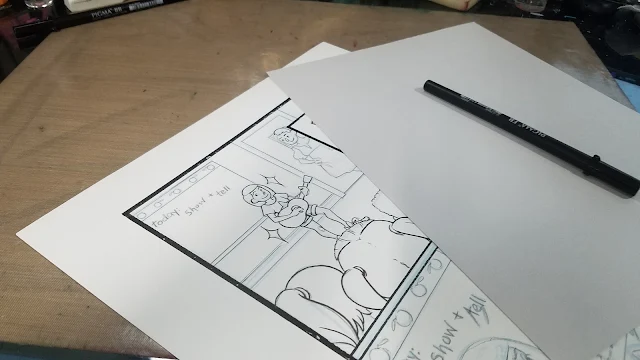
For this round of bluelines, I print on Fabriano Studio- a mixed composition paper that takes ink well and has a nice tooth. I pencil my bluelines before inking to further tighten and correct my illustration.
Borders were inked with pigment based, waterproof Sakura Calligraphy pens.
Inks:
These were inked with Sakura Pigma FB, MB, and BB pens- waterproof, pigment based brushpens that are ideal for illustration.
Watercolor:
For this illustration, I wanted to go with something fairly light and simple that wouldn't distract from the linework. I decided to do just a couple layers of watercolor for every object, rather than full rendering.
Stretching:
Blocking In Major Forms:
Adding Tone and Depth:
Removing the Blue Tape:
Finished Scan:
It was fun to plan and execute a double page spread comic unrelated to my work with 7" Kara, but still relevant to the kidlit art I want to create. I enjoy the challenge presented by creating comics based on prompts with a short turnaround time as it prevents me from overthinking too much. I really enjoyed working with this style, and I look forward to pursuing it in the future, as I continue to develop my portfolio.
As a member of SCBWI, I have learned much about the illustration side of kidlit art, and would like to see my area, Midsouth, continue to grow and provide resources for kidlit comic artists like myself. These resources and opportunities are often few and far between, and it would be nice to be part of a community that nurtures this.
If you like the art shown in this piece, I am available for short term projects, as well as longer term projects. Please email me with a project pitch for a quote.


Comments
Post a Comment