Here's the process work of the now finished
Momotaro Mini Comic. I'm working on a couple tutorials for techniques I've utilized in this comic- mainly how I inked the hair and how I achieved the glow effect using cross hatching, and those will be uploaded a little later on.
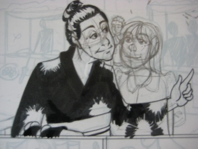
I don't like having too many pots on the stove at one time, so I tend to complete an entire page before moving on to the next. The only exception to this is when I ink borders, I'll do a couple pages at a time occasionally. I also tend to do the panels sequentially, instead of the hardest or my favorite first. In a panel with figures, I'll usually ink the face before everything else, using a size smaller than used to ink the body. This ensures that the features don't become too heavy for the face.
My main tools of choice are tech pens (Copic Multiliner SP's), a Pilot Petit 3 (fude style tip), a Kuretake brushpen refilled with the ink of my choice (generally Bombay or Winsor Newton), and Dr P.H. Martin Bleedproof White (the most opaque correctional ink I've found to date). One of the pages not featured in this process post required paste up to correct a massive problem, and if anyone is interested in how I went about doing that, I'll be glad to do a tutorial on it at a later date.
 |
| So many images will be rotated all sorts of wonky ways. I apologize. First I outline my panels with a .7 tech pen. |
|
|
 |
| Then I begin tightening the bluelines, in this case, I pencilled in my title. I'm going to let the brushpen do most of the work, so it's not pencilled in too tightly, just the general forms. |
 |
| And ink it with my Kuretake brush pen. My intention is to replicate Japanese calligraphy without mocking it. I don't want the lettering to look like kanji, for instance, but I replicate certain characteristics. |
 |
| To make sure the grass was convincing but didn't need to be whited out when it crossed the panel border, I taped off the panel edge. |
 |
| I usually only tighten the pencils on the figures, but sometimes the background needs a little tweaking if it's begun to look wonky from the resize. Things that slip by me at 6"x9" become glaringly obvious at 10"x15". |
 |
| To sell the tear-stained effect, I used a water soluable ink and spritzed it with a water bottle, then blotted it. |
 |
| This comic is full of nightshots, which are ridiculously time consuming. The thing you want to keep in mind with nightshots is that black should be your predominant color. You can add a lot of grey to the image through texture, but you want to keep your stark white to a minimum because it will draw the reader's attention. |
 |
| While the sky is still white, the top panel looks like it's set on an overcast, nasty grey day. |
 |
| It's the black sky sells the fact that this is a nightshot. |
 |
| For the stars, I created a mask using tracing paper, then flicked Bleedproof White onto the paper using a toothbrush. |
 |
| To make snow, I created another tracing paper mask, this time covering the sky. I flicked Koh-I-Nor white technical ink, because it's less opaque than the Bleedproof white, and I'd hoped to have two dimensions of white spots- the sky and the snow. |
 |
| Another instance of taping off. |
Unfortunately, I didn't get shots of the last two pages. Besides an instance of paste up, nothing of note really occured on either page, technique wise.


I think one of my favorites is the panel of tears on the letter. I think its a good technique, and it is interesting calling attention to the fact that ink actually behaves that way, using the same medium as you used to create the rest of the comic, yet here it is not describing something it is not, rather behaving inherently as itself.
ReplyDeleteI really love seeing the process behind pieces, because of course it's one thing to see a work and admire it, but to be able to understand how it was done gives a much greater appreciation. Of course it's good for learning a few tricks, too! (The tear stained effect is very neat.)
ReplyDeleteThank you for posting this!
I really like the detailed process-posts. I'm also very impressed by all the different techniques you've used. Thanks for showing this! You've also reminded me of one thing I currently lack in my arsenal of art-supplies... namely masking tape. Gotta get myself some of that....
ReplyDeleteWow, love seeing the progress! Clever idea to use watersoluble ink for the tear stained letter. Love it. I like how you used tracing paper as a mask for making the stars. That's quite a bit of work. It's wonderful to see how it's coming a long! Very detailed pages and loving how it's turning out. Can't wait to see it all finalized together and read it all in one flow. :D
ReplyDelete