Sorry for the inconvienance, Blogger and Blogspot seem to have a lot of trouble handling image heavy posts.
 |
| When inking faces, I use a pen that's a size smaller than I'll use for inking the outline of the face and the rest of the body to ink the interior features. I always begin by inking the face first, while my hand is still fresh. A stray stroke on a face can ruin it, whereas a stray stroke on a body may go unnoticed. |
 |
| After inking the elements closest to me, I move on to the midground of the picture, inking the little girl. |
 |
When filling in spot blacks, I'll use a brushpen to do the majority of the work, and only use a tech pen to fill in small areas.
|
 |
Sorry for the auto rotation. Again, I outline my letters before filling in black, but this time, the letters are going to be left white (it's a neon sign, and are there even Suncoasts anymore?)

 |
| Sorry for the grainy resolution. I pull back often so I can get an overview of how the composition is coming, and to check and make sure the black balance is decent. This page is a little topheavy (the majority of the strong blacks are at the top, whereas the bottom is kind of empty), but I wanted there to be no mistake where the reader's attention belongs. I've gotten some criticism that the audience misreads the important characters as being the mother with the black shirt and the little girl running, but really, it's the mother and the girl in the star shirt. I thought by having the running girl cut off by the railing, it would indicate that she's not that important, but because she's basically at the center of the page, it makes her the focal point. One solution to this problem is to push her over to the right using Photoshop, but that would create new problems. There is no truely easy solution when it comes to traditional media, only solutions that present enough benefits that they're worth considering. |
 |
| After filling the black glass in the Suncoast store, I add lines to the posters to accomplish two things. 1. To denote that they are behind glass, and 2. To grey them out, so they aren't too distracting from the characters. Your eye is attracted to areas of strong contrast, so you don't want to have too many lines on your most important characters, or they'll become greyed out. |
 |
| I begin filling in the Suncoast sign in earnest. |
 |
| Add caption |
 |
| I begin adding surface details to the ground and the pillars, as well as shadow lines to better ground the figures. |

|
 |
To help balance the blacks, I blacked out the girl's hair in the bottom of the page.
|
 |
As always, Bowie is not impressed by my comic efforts.
|
 |
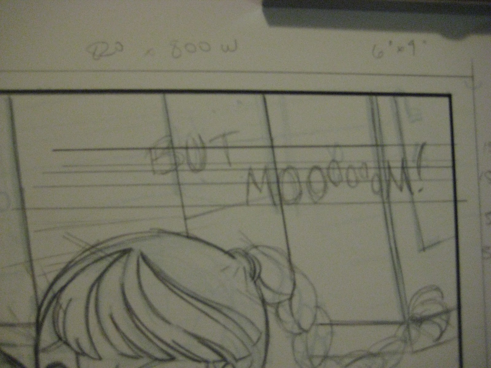
I've already started tightening the pencils on page 2, so I put in the Aimes guidelines and begin pencilling in the lettering.
 |
| The text placement here is actually really bad. If I were doing it digitally, it'd be easier to play around with finding the best location, but handlettering kinda deters me, since every mistake degrades the pencils. I'm going to eventually finish my handwriting font and work with a combination of handlettering and digital letters. Ideally, it'll be hand drawn balloons and my handlettered digital font. |
|
 |
As soon as I have the letters pencilled in, I begin inking them. I still haven't found a size or a pen that I like for lettering on plate bristol, I may end up using a nib like Heidi does. I can't seem to find a pen or nib thick enough to give me the nice thick lines I want at a 5.5 on the Aimes, and there's definitely nothing thick enough for bold. Any suggestions from calligraphers/fellow handletterers? BTW, for inflection, I use a Japanese fude pen because there's some flick to the brush tip (a Pilot Petit 3, for the record)
|
 |
I've done a bit of experimenting with balloon shapes, and after struggling with ovaloid balloons, I think I've finally found a structure I like. The slightly squared corners are really fun and dynamic, and I don't have to be too perfect in drawing it (something my wrist refuses to do for me)
|
 |
On multi-panel pages, I'll usually start at the bottom panel and work my way up to avoid smudging the pencils with my greasy hands.
|
 |
After inking this panel, I went in and added white highlights using Bleedproof White, but I'm dissatisfied with them and how the panel is designed in general, so I'm going to make some alterations.
|
 |
I think this method of adding in highlights is more successful- leaving little islands of white and working around it.
|
 |
I lost control of myself when doing the glass lines in the background of this panel. Some follow the dutch and others do not. I'll probably redo them, because they are bugging the heck out of me.
|
 |
| And finished pages, as a refresher for what they look like. When I make corrections, I'll post those too. |


Thanks for showing your process! Now if only I was half as efficient as you in cranking comics out. XD
ReplyDelete@Aisazia The hardest part for me are the thumbnails, since that's where I do all my thinking. Once thumbnails are finished, the rest is just drawing (which is fun, if frustrating)
ReplyDeletehaha Yeah for some reason I have the hardest time creating(scripting) and planning(thumbnails). Haven't got far enough to draw anything professional. XD I can imagine that drawing the rest is better but I like how my thumbnails come out better than my finished pages sometimes. XD
ReplyDelete