Perspective Grids
Perspective, the bane of my comicing existence. Perspective grids, the answer to my prayers.
Perspective grids are fantastic as they allow you to quickly and accurately set up believable backgrounds and populate them with objects and people. Once you've got some practice under your belt, they're easy and fast, a skill that every artist should hone. I use perspective grids on every single comic page I create. Before I show you how to set one up, I'll provide you with images that use them.
For this tutorial, I'm using a long, cork backed metal ruler, a pad of newsprint (24"by something, it's huge), and conte in two colors- Black and red.
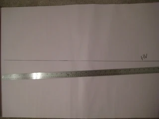
First you're going to determine your horizon line. It's basically the audience's line of sight. You should vary your horizon line position between comic panels, otherwise you'll start having many tangents and your panels will be boring.
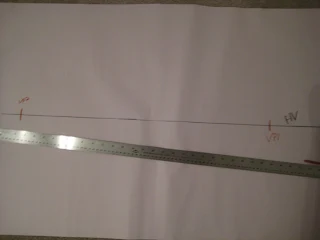
Determine your vanishing points. You can use perspective grids to set up perspective for any number of vanishing points, but for this tutorial, I'm going to stick with just two.
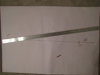
Start drawing lines from your first vanishing point, radiating away from the horizon line.
Do the same from the other vanishing point. Your lines should intermesh.
Perspective grids work for both inside and outside backgrounds. This example will be set inside. I drop a line down where I want the corner to be, and begin to block in the floor. Your left vanishing point will effect objects on the right wall, the right vanishing point will effect objects on the left.
If your cat doesn't find an excuse to get all up in your work, you are clearly going about this the wrong way. The more intrusive your cat, the better you are as an artist. Bowie demands a tummy rub.
And refuses to move after his demands have been met. Unfortunately, my example has a severely skewed left wall- my right vanishing point is too close. To fix that skew, I would move it back. The right wall is fine, so the left vanishing point is fine.
Your input is extremely valuable for this tutorial! Are there any points that I've left unclear? Do I need to go over the basics of perspective? Do I need to do a step by step tutorial for populating a room with objects and people? Do I need to provide additional examples of layouts, vanishing points, and uses? Let me know what I've neglected by leaving a comment! Your input is appreciated.
Perspective grids are fantastic as they allow you to quickly and accurately set up believable backgrounds and populate them with objects and people. Once you've got some practice under your belt, they're easy and fast, a skill that every artist should hone. I use perspective grids on every single comic page I create. Before I show you how to set one up, I'll provide you with images that use them.
For this tutorial, I'm using a long, cork backed metal ruler, a pad of newsprint (24"by something, it's huge), and conte in two colors- Black and red.
First you're going to determine your horizon line. It's basically the audience's line of sight. You should vary your horizon line position between comic panels, otherwise you'll start having many tangents and your panels will be boring.
Determine your vanishing points. You can use perspective grids to set up perspective for any number of vanishing points, but for this tutorial, I'm going to stick with just two.
Start drawing lines from your first vanishing point, radiating away from the horizon line.
Do the same from the other vanishing point. Your lines should intermesh.
Perspective grids work for both inside and outside backgrounds. This example will be set inside. I drop a line down where I want the corner to be, and begin to block in the floor. Your left vanishing point will effect objects on the right wall, the right vanishing point will effect objects on the left.
If your cat doesn't find an excuse to get all up in your work, you are clearly going about this the wrong way. The more intrusive your cat, the better you are as an artist. Bowie demands a tummy rub.
And refuses to move after his demands have been met. Unfortunately, my example has a severely skewed left wall- my right vanishing point is too close. To fix that skew, I would move it back. The right wall is fine, so the left vanishing point is fine.
 |
| I'll use perspective grids for outdoor scenes as well. |
 |
| To get enough space to properly grid out the perspective, I'll often tape on additional pieces of paper. |
 |
| Grids are also useful for planning out large groups of people accurately. |
Your input is extremely valuable for this tutorial! Are there any points that I've left unclear? Do I need to go over the basics of perspective? Do I need to do a step by step tutorial for populating a room with objects and people? Do I need to provide additional examples of layouts, vanishing points, and uses? Let me know what I've neglected by leaving a comment! Your input is appreciated.


Might be valuable to populate the grid a little, put some people and objects in thar. I think people who aren't familiar with perspective grids will want a demonstration of what one can do with them--basically why they would want to use them.
ReplyDeleteAlso stop putting cats on your blog, they're making me sneeze;)