Exploring Thumbnails
Thumbnails are a necessary part of the comic creation process for many comic artists. They give the artist a chance to experiment with layout and composition with few risks. A thumbnail is usually drawn much, much smaller than the original, and provides a visual blueprint for the artist to work from.
Many artists will thumbnail out an entire chapter or arc before starting a single page. This allows them to see how the chapter works as a whole with little commitment. The artist can work loosely, sketching in the merest of stick figures, or tight, figuring out the perspective in miniature before committing to a large page.
My first thumbnails were really rough things, jotted down in haste. Now I actually do two sets of thumbnails- the first is on the script itself to help me figure out layout, there are really rough and maybe an inch by two inches. After I've got the basic layout figured out, I do larger thumbnails at around 2.5x4 inches. If I work really tight, I don't even have to do 6x9" roughs, I can go straight to pencils, but that is a rarity.
My old process:
(I've lost the thumbnails to this, but the roughs are SO ROUGH and SO BAD, that they might as well be loose thumbnails)
The tighter you work early on, the more useful critique you can get before you commit to ink. These roughs didnt supply enough information to really get much comment.
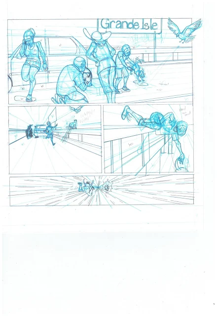
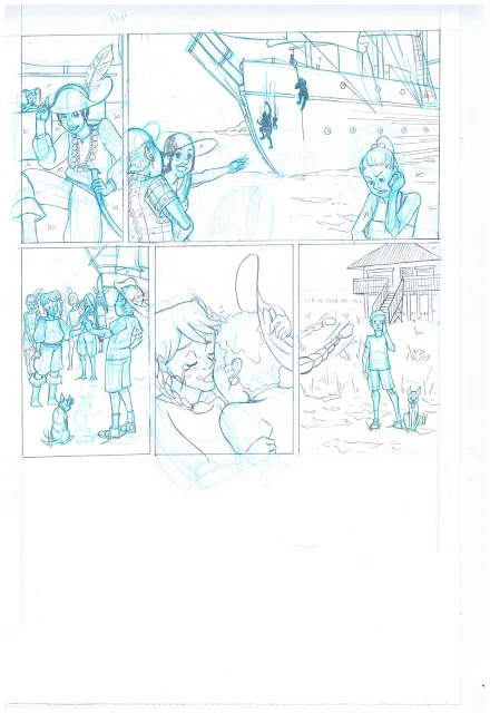
These days, I consider pencils this rough to be just roughs. Now I would print out the bluelines, tighten them up just a bit with graphite, and ink over that.
Even these inks aren't final. I ended up making a lot of changes before Editor's Day to get the art presentable. Lesson: SOLVE YOUR PROBLEMS EARLY ON.
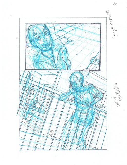
With Foiled, I changed my working methods a lot. I created tight thumbnails and tight roughs, and printed my roughs out as bluelines, tightening up faces and acting in graphite, and then inked over that. It saved me a step (pencils), and allowed me to be more dynamic, since I wasn't redrawing the same thing over and over.
Because my thumbs were tight, I was able to get a lot of helpful criticism and could make necessary changes early on.
I worked out all of my perspective problems at this size, and I find it much easier, faster, and less frustrating than working perspective out at actual size.
For my latest project, I did tight thumbnails, blew those up to 11x15" and inked over those. I wouldn't do this if the project had any challenging perspective, but since this was an outdoor scene and involved only animals (and I was extremely short on time and resources, knowing I'd be in New York the entire weekend), it wasn't really an issue. I only recommend this method if you feel confident in your work.


Thanks for posting this! I have to say that I'm kind of blown away with how much you put into this blog.
ReplyDeleteYes, thanks for posting this! It's nice to see how you do some of your thumbnailing, and I think it's given me some ideas. (Thumbnailing has always been the hardest part for me, so advice and process posts are very helpful!)
ReplyDelete