Digital Commission Process
I've shared my process for comic pages, for watercolors, and for markers, and it's high time I shared my process for digital work. Of the media I utilize, it's my least favorite, but there are many benefits to working digitally. Working digitally (Photoshop, to be specific) allows me more flexibility regarding size and a lot of freedom to correct a variety of mistakes, from inking errors to color correction. The image I post (or send to the commissioner) is true to the original, whereas a scan loses color fidelity. Unfortunately, I'm much slower doing digital work, making corrections that would otherwise go unnoticed because you can't zoom to 500% in real life.
This particular commission moved a lot slower than I'd intended. I either need to streamline my process or start charging more, I guess.
For those of you interested in following along at home, here's a link to the .psd file.
As this is an image heavy post, the rest will be behind the cut.
Planning and Construction:
I began with a concept. Lindsey wanted herself and her significant other, a whimsical treehouse, and particular outfits, so I knew what I absolutely needed to have. I did some sketches:

 It was important that I hammer out the poses, their likenesses, and the treehouse. I also sent her a couple thumbnails, so we could agree on orientation and on composition.
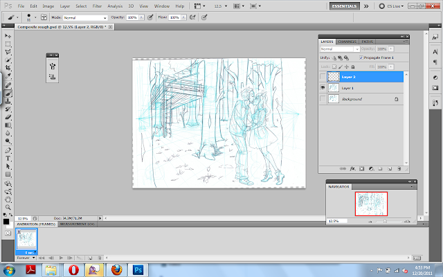
 After we agreed on the details, I set to work. I knew what I wanted the final piece to look like, but to get the detail necessary, I needed to do two roughs- one for the couple, and one for the background. I blew up the pose sketch, printed it in bluelines, and pencilled over that.


And Photoshopped them together.
 I save the file, and begin inking on a seperate layer.
Inking:
 When inking something like this, I make sure to add in a layer of white between the inks and my bluelines, so I can check my inks often.
 And in case you're curious, my brush settings:
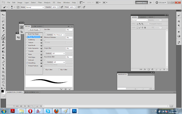 I use an Intuos 4, the smallest size sold.

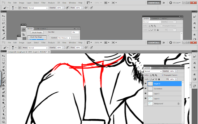
I still make corrections to the sketch at this stage, on a seperate layer, usually in red.

 When inking the background, I use a smaller brush than I used when inking the foreground. Atmospheric perspective is your friend! Sometimes I'll ink the background on a seperate layer and gray it out slightly, further developing my friendship with Atmospheric Perspective. This time, I was not so awesome.
 When I'm doing color work, I keep my spotblacks very light (or in this case, basically non-existant) although I'm careful to make sure to ink heavier where there's shadow.
Laying out Color
 I begin by choosing my predominant background color. Since this is a forest, I decided on a grayish blue green. Next, I start laying out the colors I know I HAVE to use (her hair is pink, she requested that he wear a shirt that matches her hair, ect), so I can tweak the rest of the color scheme around these necessary colors. I work pretty quickly- these inks are closed for the most part, so I simply select the area on the ink layer, go to Select-Modfiy-Expand-Expand by 2 pixels, and then move back to my color layer and fill. I put each color on a seperate layer so that I can easily tweak things.


 I've kept my background dark so that the couple pop, and colored their treehouse in similiar colors to imply an association between the two, and to make it noticable in the dark trees. Here's another opportunity to utilize atmospheric perspective- the receeding trees get lighter and less saturated as they go back.
 I felt like everything was too bright and saturated for a dark forest, so I added a blue green layer to the top, and set it to multiply, and reduced the opacity. I added a blue gradiated layer (Layer 22) and set it to multiply to make the sky seem misty, and a greenish gradiated layer to the ground to to grey it out as it receeds. (layer 21, on top of the olive colored ground which is layer 'Ground')
 I feel like digital pieces often come across as sterile, so I decided to add some paper stock to make it more organic. (Stock is via Akinna-Stock). I couldn't use the paper as it was, I needed to make a few changes:

 I needed it to match the actual commission, so I tweaked the hue and saturation.
 I place it in my commission below the ink layer but above all the color layers.
 And I use the clone tool to expand the paper stock to the size of my image.

 And I set that layer to multiply and tweak the opacity.
My coloring process has varied over the years, but the one I find to be the LEAST odious is a modification of my marker technique. I use the selected color (say, blue for the dress), create another layer, set it to multiply, and begin putting in shade. I adjust the opacity as necessary, and will create additional similiar layers if needed. I usually use two of these layers per object. When that's done, I will create a master layer with a shade of blue, and add blue shading all over. Once I finished doing that, started putting in the streaks of sunlight. They get a seperate layer, I did each ray with a seperate gradiation (probably stupidly, but I was fiddling around, it's the first time I've used some of these techniques), and then set that to lighten and adjusted the opacity.


 And then I erased the rays where they cross the trees closest to the viewer.


 I just realized that these screenshots function as timestamps to show how long I work. Secrets out: I am not charging enough for my time.
This particular commission moved a lot slower than I'd intended. I either need to streamline my process or start charging more, I guess.
 |
| Here's the finished commission. |
As this is an image heavy post, the rest will be behind the cut.
Planning and Construction:
I began with a concept. Lindsey wanted herself and her significant other, a whimsical treehouse, and particular outfits, so I knew what I absolutely needed to have. I did some sketches:


And Photoshopped them together.

Inking:


 |
| Sorry, the next few screenshots were mis-taken. |


 |
| Because I'm constantly correcting my line, these commissions take much longer than traditional commissions. |


Laying out Color


My coloring process has varied over the years, but the one I find to be the LEAST odious is a modification of my marker technique. I use the selected color (say, blue for the dress), create another layer, set it to multiply, and begin putting in shade. I adjust the opacity as necessary, and will create additional similiar layers if needed. I usually use two of these layers per object. When that's done, I will create a master layer with a shade of blue, and add blue shading all over. Once I finished doing that, started putting in the streaks of sunlight. They get a seperate layer, I did each ray with a seperate gradiation (probably stupidly, but I was fiddling around, it's the first time I've used some of these techniques), and then set that to lighten and adjusted the opacity.


I want those boots of hers >.<
ReplyDeleteCute commission! Hm...I think the colors are a bit funny in that the characters have such bright vivid clothing in a dark nature natural setting. That may just be me, I'm not trained in color theory or anything. XD
ReplyDeleteI personally love digital but it's only because I can make as many mistakes as I want. I don't trust myself with traditional material much. Although I'm starting to dabble more with watercolors and colored pencils. XD
@Gwynne Platz :P I do too. A little bit Red Riding Hood, a little punk.
ReplyDelete@Aisazia I think you're right, they bugged me the entire time too. I was torn between making it a sunny atmosphere (which would be odd, since they wanted a treehouse and I needed trees) and darkening their outfits (which would be worse, as she specified the colors). I tried to resolve it as much as possible, but I should have cast sunlight through the trees to brighten it up more.
ReplyDeleteYeah I can see the problem... Ohh this is probably too late but bushes with bright colored flowers may have helped blend it together. :D Sorry I couldn't think of anything good when you asked for a critique. OTL
ReplyDelete