Guest Post: Laurissa Hughes: Page Process for Tess and Jack
Hello!
My name is Laurissa Hughes and I make a webcomic called Tess and Jack. It’s about a cowgirl named Tess and
her robot partner Jack who live in a futuristic Old West. They take odd (very
odd) jobs to keep themselves afloat. It’s a serial comic, so each issue can be
read independently of the others and each covers a different job.
This
whole thing started as an experiment in 2014: I wanted to try and repaint a
digital painting I’d done in 2011 and decided to do it in a comic because I
enjoy narrative art, I wanted to see how well I could hold to an update
schedule, I wanted to experiment with different techniques for making comics so
I’d be ready to make a longer story that I’ve wanted to tell for a long time. Due
to the experimental nature of the whole thing, the process I go through to
create each page has changed in every issue.
Painting
from 2011, and the frame from the comic in 2014.
Issue 1: Work for Hire
I
had literally no idea what I was doing when I
started this, but I went for it anyway. I feel like there’s no “right” way to
make comics and everyone should find their own techniques that make them
comfortable. My process has changed several times throughout the issues because
I’m still experimenting with the ways I most enjoy making comics and that get
me the best end product!
I start out my whole process with
a rough outline (mostly in my head), and I draw the thumbnails. I do most of my
detailed writing and solid dialogue while I thumbnail, seeing the flow of the
page helps me think of how actions will play out in more detail. The thumbnails
are also pretty scribbly because I’m trying to get ideas out quickly. I want to
spend the majority of my time on the finished pages. My process for this part
has stayed pretty much the same over the years, except now I thumbnail with
page layouts in mind.
There’s some organization
on the page, but I would just draw where I had space, sometimes on random
sheets of extra paper lying about.
Still pretty scribbly and
kind of messy, but things are laid out as if they were spreads in books. I also
started to draw in a spiral notebook with lined paper because it’s cheaper!
I then take the thumbnails and
draw the final page at size. I draw at 7” x 10.5”, which is a pretty standard
size for American comics. It’s usually a good idea to draw at 1.5 times or 2
times the size of the final page, because when they’re shrunk down for print,
all of the lines look really sharp and nice. I’ve been drawing at size for all
the issues, so I keep doing it for consistency throughout. If I’m drawing for a
publication I usually draw and ink at 2 times the size.
Whether or not I draw a really
detailed vs. rough sketch depends on my mood or how much time I have to
complete a page. Sometimes I’ll deviate pretty far from my sketch when I ink.
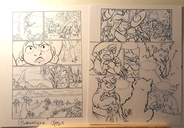
In “Work for Hire”, I drew each
page with a regular lead pencil and then erased it after inking and before
scanning everything into Photoshop because I hate trying to remove pencil lines
or blue pencil in Photoshop.
No pencil lines!
To color Tess and Jack, I start
with flat colors. I used to use Photoshop for the pages, but switched to Clip
Studio in Issue Two. The flatting process has stayed pretty much the same in
every issue, but became more streamlined after I got Clip Studio. More on that
later.
Flatting is a process where only
the solid base color is laid down on the page. After this, all the fancy
painting and effects are added on. I usually start out with flats when I do a
full digital painting as well!
For “Work for Hire”, after the
flat stage, I would add two shading layers set to the “Multiply” blend mode. I
would then take these two layers and “blend” them together where they met using
the Pen Tool in Photoshop with the Opacity set to pen pressure. I never really
liked the way this looked, and it always felt like a needlessly time-consuming
process, but I kept it throughout the first issue for the sake of consistency.
Issue 2: “Lost and Found”
In the second issue of Tess and
Jack, I really wanted to focus on making the colors really nice and lush, and
experiment with that.
Once again, I started with my
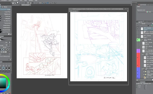
scribbly thumbnails, and then moved on to the sketching stage. I got Clip
Studio pretty early on in making the second issue, and I really like the
program for making comics and other illustrations. It’s nice, because it has a
lot of tools specific to making comics, so it makes parts of the process more
streamlined. Also, drawing digitally in Clip Studio feels much closer to
drawing traditionally for me than a lot of other programs I’ve found. So that’s
exactly what I did for Issue 2; I drew everything digitally, and then printed
it out to ink it traditionally.
After I finished inking, I scanned
everything in and removed the colored lines digitally. This was much easier
that erasing all of the pencil after inking every page, plus there wasn’t as
much risk of smearing the ink. I also like the look of the sketch under the
ink, it’s fun to look back at and see where I’ve come from in terms of drawing
improvement.
Here is the page with the
blue lines still there.
In Clip Studio, I go to
Edit → Tonal Correction → Binarization
This opens the
Binarization menu. I go with the default settings that open up in the window
as, you can see here, it does a good job of getting rid of the blue lines.
Then, in the Layer
Properties window, I toggle the Expression Color to Monochrome. This makes the
page channels black and white, which helps with the next step.
In the Layer Properties
window, I toggle the Monochrome to just Black. It gets rid of the white
background and makes it transparent.
I then create a new layer
and combine them.
Here is the final
combined layer.
The reason I combine the layers to
make the default layer is because it changes the Expression Color back to
Color. If it were to remain Monochrome, then any color it interprets as white
presents as transparent, and any color it interprets as black is black instead
of the color selected.
The Fill Tool is filling
in transparent instead of a color!
Now that the layers are
combined and the Expression Mode is back to Color, it’s filling in with green
instead of transparent.
This also helps me do flat colors,
because I can make the Ink layer a Reference Layer using a handy little toggle
in the upper part of the Layer menu. This makes all of the black lines solid
barriers, so when I fill in solid colors it won’t bleed past the black ink
lines!
The handle little toggle
in question.
Now I’m ready to flat everything,
just like in the first issue. I started out just shading with Multiply layers
on top of the flats and not blending them together, but then I started out
experimenting with gradients. I don’t usually like to use a lot of gradients
because I think they can look really jarring, but I liked how they looked using
them on the Multiply layer and then breaking them up with the Pen Tool.
I started to heavily use this
effect on the base color layers underneath the Multiply layer instead. I
thought it worked especially well with the bushes and trees in the alternate
world in the second issue. I would lay down gradients and then take the Pen
Tool and draw pen strokes on top to break it up and create foliage, bark, or
other effects.
A few more examples of
the broken up gradients from another page.
I kept using the solid Multiply
layers on top, but I tried switching the colors to fit the mood of the scenes,
and I liked using different shades of the colors to create more depth in the
drawings.
Issue 3: Tess of All Trades (Currently
Updating)
With this issue I decided to do
the pages entirely digitally because it’s less time-consuming, and I wanted to
get better at inking digitally. I was worried about inking digitally because I
prefer inking traditionally so much, and I think my digital inks can turn out
looking stiff. There were definitely a few bumps, but I have a tablet monitor,
which I think helps a lot because it feels a lot more natural. Just like any
tool, it takes practice to get used to using it.
For the coloring, I didn’t really
have any goals in mind for experiments, so I started out just using the same
gradient technique from the previous issue. I decided after a few pages to try
and use the Brush Tool instead of the Pen Tool to break up the gradients and
make the backgrounds look a little more painterly. I also occasionally end up
painting a little bit on the multiply layer to add a little more depth. The
characters are just a flat color underneath the Multiply layers.
A detail with the
“Multiply” blend mode toggled off and on to show the painterly look more
clearly.
My goal with this issue right now
is to figure out how to cut production time down a little bit, especially on
the coloring. It’s all an ever evolving process.
One of my favorite things about
webcomics is how they tend to evolve as they go. I like to see people’s art as
it advances and gets better and better! It’s also one of my favorite things
about making a webcomic, I enjoy the process and it makes me feel a little more
free to experiment and grow as an artist and storyteller!
Thank you for reading! Feel free to check out my:
Twitter:
https://twitter.com/whimsyink
Tumblr:
http://whimsyink.tumblr.com/
Instagram:
https://www.instagram.com/whimsyink/
This post was sponsored by my Patrons on Patreon. Guest posts are paid $30 per post and Laurissa REALLY knocked it out of the park with this one. Thank you so much for sharing your knowledge, Laurissa!


Comments
Post a Comment