Pink Lolita Watercolor
Hey guys, I've just returned from a two week visit to my homeland of swamps and gator people, Louisiana. I wasn't able to get as much done as I would have liked, so I'm ready and rarin' to get back to work, and that includes blog changes and improvements.

Recently I posted a watercolor piece that featured an inked line art. The intention behind that line art (inked with non-waterproof ink) was that it would blend into the watercolor painting as washes were applied. I felt like that piece was not a good example of the technique, and I feel like I have yet to master that technique. I decided to try again, changing several factors.
Because I'm working on the same paper that gave me so many problems last time (Canson's 90lb paper), I decided to keep this piece fairly simple. Instead of pencilling the piece first, I went straight to inking after stretching the paper. I used a very pure ink, Winsor Newton's Scarlet, so there would be no color separation. I did allow the piece to dry overnight, but that was more necessity than choice, as I'd been working the entire day and didn't feel up to starting a new piece.
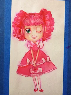
Although I myself do not dress in Lolita fashion and am not part of the community, I do enjoy the fashion (particularly Sweet, Hime, Classic, and Elegant Lolita), and find myself doodling Lolitas on occasion, and have completed a few pieces highly influenced by Lolita fashion. I let the subject matter inspire me, and decided to work with bright, saturated, bubbly colors. For this, I went to my concentrated liquid watercolors, or rather, the palette of liquid watercolors that I had allowed to dry for easy transport. For the most part, the colors reconstitute with little problem, and it's easier to work with them after they've dried than it is for me to work with them wet. As it was, I found the over-saturated hues to be a little intimidating, and didn't play around with the colors as much as I would have liked.
Liquid concentrated watercolors reactivate differently than pan or tube watercolors, they tend to reactivate much more quickly, which can make reworking and applying subsequent washes and color difficult. Rather than glazing, it will mix, so you lose some of the depth of color.

So here we have the piece right after it's been inked. I found some of the finer details difficult to pull using the Tachikawa G nib, they tended to get fat and blobby. I didn't have as much variation in line weight as I would have liked either. Because the source image is rather cartoony, I didn't beat myself up about my inability to pull fine lines, and since I was going to be putting a wash of water over it, I didn't bother to thicken up any of the too-thin lineweights.
 The Scarlet ink had a lot more pigment dispersal than the Nut Brown ink I used in the last piece that utilized this technique and there wasn't any separation of color.


For the hair, I went with a very saturated pink made with reconstituted liquid watercolors. I find the highly saturated colors a little intimidating and I know I should work with them more. With highly saturated colors, I have a tendency to underwork a piece so that it doesn't become overwhelmingly detailed.


The color for the eyes were also mixed from reconstituted liquid watercolors, but I was a bit more adventurous with this- they're a mixture of juniper green and turquoise blue.
After allowing the washes to thoroughly dry, I applied a wash of clean water to the background, and dropped in some turquoise blue, allowing it to disperse naturally on the page.

 As you can see, the pink of the ink and the dress reactivated and mixed with the turquoise, creating a darker hue around the figure.
I feel like this technique works a little better with simpler images and abstract backgrounds, and it still feels like I'm working around the technique rather than utilizing it to best highlight the image. Of course, it should be taken into account that I'm still struggling to use liquid watercolors effectively, which may make it difficult to judge the effectiveness of this technique.
Revisiting Jeeyon Kim's technique

Recently I posted a watercolor piece that featured an inked line art. The intention behind that line art (inked with non-waterproof ink) was that it would blend into the watercolor painting as washes were applied. I felt like that piece was not a good example of the technique, and I feel like I have yet to master that technique. I decided to try again, changing several factors.
Because I'm working on the same paper that gave me so many problems last time (Canson's 90lb paper), I decided to keep this piece fairly simple. Instead of pencilling the piece first, I went straight to inking after stretching the paper. I used a very pure ink, Winsor Newton's Scarlet, so there would be no color separation. I did allow the piece to dry overnight, but that was more necessity than choice, as I'd been working the entire day and didn't feel up to starting a new piece.
 |
| Source |
Although I myself do not dress in Lolita fashion and am not part of the community, I do enjoy the fashion (particularly Sweet, Hime, Classic, and Elegant Lolita), and find myself doodling Lolitas on occasion, and have completed a few pieces highly influenced by Lolita fashion. I let the subject matter inspire me, and decided to work with bright, saturated, bubbly colors. For this, I went to my concentrated liquid watercolors, or rather, the palette of liquid watercolors that I had allowed to dry for easy transport. For the most part, the colors reconstitute with little problem, and it's easier to work with them after they've dried than it is for me to work with them wet. As it was, I found the over-saturated hues to be a little intimidating, and didn't play around with the colors as much as I would have liked.
Liquid concentrated watercolors reactivate differently than pan or tube watercolors, they tend to reactivate much more quickly, which can make reworking and applying subsequent washes and color difficult. Rather than glazing, it will mix, so you lose some of the depth of color.
The Ink Process

So here we have the piece right after it's been inked. I found some of the finer details difficult to pull using the Tachikawa G nib, they tended to get fat and blobby. I didn't have as much variation in line weight as I would have liked either. Because the source image is rather cartoony, I didn't beat myself up about my inability to pull fine lines, and since I was going to be putting a wash of water over it, I didn't bother to thicken up any of the too-thin lineweights.


The Watercolor Process
Usually I'll mix yellow ochre, burnt umber, and scarlet together to make a peachy skintone, but for this piece, I used Holbein's Irodori in Antique Yellow Ochre. Antique Yellow Ochre is a peachy watercolor with a bit of white mixed in, making it less transparent than other watercolors. This effect is well suited for an application such as this, because it covers much of the splotchyness that resulted from the non-waterproof ink. It can be used straight from the tube with just a little water like a gouache, or it can be watered down and mixed with other colors like traditional watercolors. It layers fairly well, and doesn't pull up easily.
For the hair, I went with a very saturated pink made with reconstituted liquid watercolors. I find the highly saturated colors a little intimidating and I know I should work with them more. With highly saturated colors, I have a tendency to underwork a piece so that it doesn't become overwhelmingly detailed.


The color for the eyes were also mixed from reconstituted liquid watercolors, but I was a bit more adventurous with this- they're a mixture of juniper green and turquoise blue.

After allowing the washes to thoroughly dry, I applied a wash of clean water to the background, and dropped in some turquoise blue, allowing it to disperse naturally on the page.


I feel like this technique works a little better with simpler images and abstract backgrounds, and it still feels like I'm working around the technique rather than utilizing it to best highlight the image. Of course, it should be taken into account that I'm still struggling to use liquid watercolors effectively, which may make it difficult to judge the effectiveness of this technique.


Comments
Post a Comment