A Fairytale Watercolor
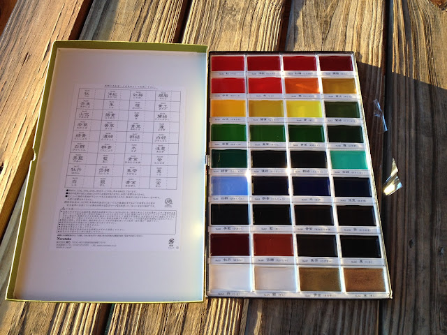
For a month with no conventions, March has been a busy month for me. Between finishing Kamicon commissions, working my way through Magical Girl March (post to come), painting Gizmo Granny pages, and working on my 1001 Knights comic, I haven't really had much free time. I've broken up the monotony of long days spent painting by reviewing a few pens, but for the most part, March has been a month of watercolors.
One of those watercolors was completed as a submission for an artist's table at ALA in San Francisco this summer. For a children's illustrator like myself, The American Librarian Association's biannual convention could be an important step towards getting copies of 7" Kara Volume 1 (and hopefully subsequent volumes) in libraries across the country. Of course, the first step towards exhibiting at any convention is submitting an application, and ALA required those submitting for their artist area to submit a piece of original art for their auction. Their requirements were that the piece be either 8"x10" or 11"x17" and have a literacy or reading theme. I didn't have anything that fit both the size and theme requirement (I work in a totally different ratio usually, as watercolor paper doesn't come in 11"x17" pads), so I needed to whip something up quickly for submission.
I opted to do an 8"x10" piece, which is unusual for me, and I chose to work in landscape as I have few pieces that work in landscape. Below is the finished watercolor:

And beneath the cut is my process!
I approached this piece in a brand new way. I drafted a bunch of thumbnails, and then selected one that not only fit the theme best (in my opinion), but also fit the size restriction and would read well at a smaller size. Then I took a photo of my thumbnails with my Surface Pro (rather than scanning them), and opened the photo in Photoshop to tighten the sketchy thumbnail into something more usable.


The digital thumbnail is still pretty rough, but it's a lot tighter than the tiny sketchbook thumbnail. I blew this up and printed bluelines of it to use as a rough.

I have no idea why this rough is upside down- it opens correctly on my computer and views correctly as a thumbnail in my window. AH WELL. These are the graylines from the rough I sketched, the original is nonphoto blue Color Eno lead and graphite on printer paper. I adjusted the contrast in Photoshop, converted it to duotone in non photo blue, and printed it on Canson Arches watercolor paper.
This little piece gave me a lot of anxiety while painting it- there's always a period of time when you're just SURE your watercolor will be a complete mess, and this piece was no different. What's often important is to keep pushing, working, and thinking, because eventually you'll pull through.
I'm pretty happy with this little watercolor, and I'm excited that ALA has accepted me. I'm really excited to spend time in San Francisco this June, and hopefully I'll get to see some friends while I'm on the lovely West Coast.
One of those watercolors was completed as a submission for an artist's table at ALA in San Francisco this summer. For a children's illustrator like myself, The American Librarian Association's biannual convention could be an important step towards getting copies of 7" Kara Volume 1 (and hopefully subsequent volumes) in libraries across the country. Of course, the first step towards exhibiting at any convention is submitting an application, and ALA required those submitting for their artist area to submit a piece of original art for their auction. Their requirements were that the piece be either 8"x10" or 11"x17" and have a literacy or reading theme. I didn't have anything that fit both the size and theme requirement (I work in a totally different ratio usually, as watercolor paper doesn't come in 11"x17" pads), so I needed to whip something up quickly for submission.
I opted to do an 8"x10" piece, which is unusual for me, and I chose to work in landscape as I have few pieces that work in landscape. Below is the finished watercolor:

And beneath the cut is my process!
I approached this piece in a brand new way. I drafted a bunch of thumbnails, and then selected one that not only fit the theme best (in my opinion), but also fit the size restriction and would read well at a smaller size. Then I took a photo of my thumbnails with my Surface Pro (rather than scanning them), and opened the photo in Photoshop to tighten the sketchy thumbnail into something more usable.


The digital thumbnail is still pretty rough, but it's a lot tighter than the tiny sketchbook thumbnail. I blew this up and printed bluelines of it to use as a rough.

I have no idea why this rough is upside down- it opens correctly on my computer and views correctly as a thumbnail in my window. AH WELL. These are the graylines from the rough I sketched, the original is nonphoto blue Color Eno lead and graphite on printer paper. I adjusted the contrast in Photoshop, converted it to duotone in non photo blue, and printed it on Canson Arches watercolor paper.
I'm pretty happy with this little watercolor, and I'm excited that ALA has accepted me. I'm really excited to spend time in San Francisco this June, and hopefully I'll get to see some friends while I'm on the lovely West Coast.

Comments
Post a Comment