Review: Cotman Watercolors: Watercolor Basics
Over the years, I've given Cotman watercolors a lot of shade. I've snarked about them, snubbed them, used Cotman as the butt of jokes. Sure, I've used Cotman watercolors, but I vastly preferred Winsor and Newton's professional line of watercolors, and nixed the Cotman as soon as funds were available. But are Cotman watercolors really all that bad?
Since I last used Cotman watercolors, I've reviewed a lot of...student grade...watercolors for this blog and on the Nattosoup Studio Youtube channel.
And Cotman came up, and kept coming up, during the five day long watercolor intensive chats I hosted on Twitter. You can check out my Storify if you missed those. While many watercolorists who chimed in had long since replaced their Cotmans with something more professional, a few held steadfast to their pans, and wondered what was so awful about Cotman?
Chagrined, I recorded a special swatchoff video for my Patrons comparing Cotman, Winsor and Newton professional watercolors, and Daniel Smith watercolors, and offered to do a field test, should my Patrons desire it. Of course, they did.
Wanna check out that Swatchoff video? Join the Artnerd community on Patreon today, and gain access not only to that swatchoff, but loads of Early Access videos, backer exclusive content, and even comics and art resources.
For just $1 a month, you can join the community, help support this blog, and get the inside scoop early!
Cotman has several sets available, many of which utilize the same palette box as many Winsor and Newton professional sets, which can cause some confusion when selecting a set. There are nine iterations of Cotman half pan watercolor sets:
The set used in this review the Pocket Plus Set, is still available, but its not the most common iteration of Cotman field sets. I see the Sketchers Pocket Box Set far more often, as well as the Field Plus Travel Set.
There are also tube Cotman sets, which I have not tried, although I have used individual Cotman tubes in the past.
The Skinny on Cotman
The Stats:
Cotman is designed and marketed as an affordable range of watercolor and watercolor accessories. This includes papers, tube and half pan watercolors, and synthetic watercolor brushes. The most commonly used binder is gum arabic, followed by dextrine (in my field test video, I wrongly attributed this to glycerin). All of the colors in the Cotman range are Series 1, the least expensive series offered by Winsor and Newton. Most have a permanency rating of A, but a few have a rating of AA. AA is extremely permanent, A is permanent, and B is moderately durable Many Cotman colors are single pigment, but quite a few have two, and even up to three pigments in the mix.
For comparison, Winsor and Newton Professional Water Colours do not have their binders listed and range from Series 1 (inexpensive) to 4 (most expensive), and include several convienance mixes in their range. The Professional colors also range from B-AA in permanence. The professional line also has a lower ratio of multi pigment to single pigment colors than the Cotman line.
For all Winsor and Newton paints, the label will tell you the permanence, opacity, and pigments used for that color.
Of the 50 available colors, 12 colors in the Cotman range are hues. Hues are not necessarily bad- they are often replacements for more toxic pigments (like cadmiums), but the color will not be the same as the one it's replacing. Hues are also used to replace expensive pigments, bringing the overall cost of the paints down. This substitution is very common in student grade watercolors.
Swatches:
The colors included in the Pocket Plus Travel Set:
Alizarin Crimson Hue
Burnt Sienna
Burnt Umber
Cadmium Red Pale Hue
Cadmium Yellow Hue
Cadmium Yellow Pale Hue
Chinese White
Cobalt Blue Hue
Sap Green
Ultramarine
Viridian Hue
Yellow Ochre
The Field Test:
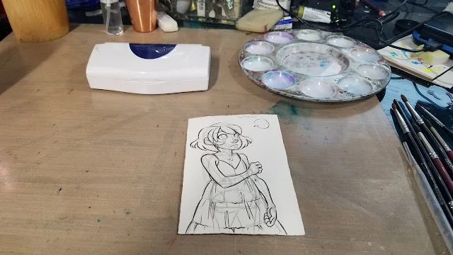
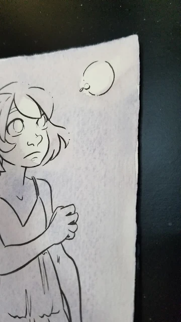
This field test was completed on Fabriano cotton rag watercolor paper. It was inked with a Sailor Mitsuo Aida brushpen.
The paper was simply attached to a support via folded over blue painters tape attached at the top and bottom of the paper.
I wanted a dark blue or black for the background, but the Cotman set has neither available, and nothing that immediately presents itself as an option. I ended up mixing both blues, the cooler red, the darker brown, and probably a yellow (to neutralize) to get my initial background wash.
As you can see here, some of the colors in the mix are already sedimenting out.
When that dried, it was obviously not dark enough, so I continued to mix, match, and layer.
It really takes A LOT of paint (and mixing) to get darker colors with this particular Cotman set.
As I mixed, I wondered who this selection of colors was intended for? A portrait artist? A landscape artist? It's labeled as a Field and Travel set, but the green and brown options are too weak for that, and it lacks a cool blue like a pthalo blue or an indigo.
At this stage, I began introducing a glow effect using the cooler yellow.
Mixing Kara's skintone should have been straightforward- yellow ochre+scarlet red is my go to combination for Caucasian skintones. Unfortunately, both colors are fairly weak, even after activation, so it took A LOT of paint to get her base skintone down.
After mixing up Kara's skintone, I moved on to her hair. I usually use a convienance color- Venetian Red, as my base, but opted for burnt sienna in this instance. Cotman's burnt sienna is incredibly weak- it really takes a lot of paint to achieve a passable color saturation.
Even working directly from the pan, as shown above, with very little additional water, the color is still quite weak.
I also mixed up a shadow color for Kara's skin. My default is permanent mauve+napthol red, but I'll settle for red violet in a pinch. If you need to mix your own, cool red+cool blue will work in instances such as this.
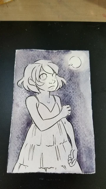
At this point, I knew I needed to build up contrast with the background, as everything was too similar in saturation and tone, so I decided to do another layer of wash in the background. I mixed the wash fairly saturated, and it still goes down weak, chalky, and muddy.
I stepped away from the evening, and allowed the water in my wells to evaporate a little bit.
The next morning, I tightened up a few things- another layer of skincolor with the evaporated mix, another layer of skin shadow with the evaporated mix, tighter details on the firefly, and even some Chinese white in lieu of gouache.
The Verdict:
Not the worst available, but pretty mediocre for the price. There are better options in that pricerange that will give you better results.
In Jana Bouc's review of Cotman watercolors, she mentions emptying her pans by soaking, and being left with colored water and a lot of white sediment. She does this to salvage the palette itself, which is a fairly nice palette, and well worth reusing. My first thought was 'gross', but I can't help but wonder if we would see a similar result with the Professional pans as well. I'm not rich enough to try it, but if anyone is willing to sacrifice a half pan of each for SCIENCE! let me know!
But Becca, Cotman is Student Grade!
I realize that in some ways, it's unfair to compare Cotman watercolors to Winsor and Newton Professional Watercolors, despite retailers claiming Cotman is held to the same exacting standards. After all, Cotman is...student grade, and Winsor and Newton Professional is...professional grade. That's why, for the majority of this review, I opted NOT to compare Cotman to Winsor and Newton Professional in a side by side comparison- hence the field test.
There are plenty of student grade watercolors on the market, and honestly, most perform similarly to Cotman. This can cause a lot of frustration- many beginner watercolorists have turned away from watercolor because they're trying to replicate professional results with student watercolors. They've been told from the start that it's a poor artist who blames their materials, so they naturally assume the reason they have difficulty mixing colors, or colors separate out, or paints handle more like soap than paint is due to user error. They lack the experience and the guidance to know that Student Grade is code for 'cheap, affordable'
Love watercolor? Why not take my free watercolor course?
Check out my Watercolor Basics series for free watercolor tutorials designed to help get you painting ASAP! Begin your watercolor journey today!
Sadly, compared to the other Student Grade options listed on the Blick Site, Cotman is the pick of the litter, as Student Grade is so often synonymous with 'frustrating garbage'. That doesn't mean there aren't better options out there, though.
Looking for Bold, Saturated Color at a Similar Pricepoint?
Sakura Koi Field Set- 30 color set
Prima Marketing Watercolor Confections- Tropical
Kuretake Gansai Tambi
SoHo watercolors
Looking for A Great Starter Set of Quality Watercolor?
Daniel Smith 6 Color Mixing Set
Winsor and Newton Compact Set (uses the same case as a popular Cotman set, with higher quality watercolors)
Winsor and Newton Field Box Set (uses the same case as the Cotman Field Box set, with higher quality watercolors)
Holbein 12 color 5ml tubes (this is a fantastic deal, Holbein makes amazing watercolors)
Mission Gold 9 Color Starter Set (tubes)
American Journey 6 color beginner set
Looking for a great, compact 12 color set of Quality Watercolor?
American Journey 12 color beginner set
Outside Resources and Second Opinions:
Composition and Permanence Tables for Winsor and Newton
Composition and Permanence Tables for Cotman
Composition and Permanence Tables for Winsor and Newton Professional Water Colour
How to Read the Label on a Winsor and Newton Colour
Wet Canvas- What does Permanence Mean
Loads 'o Lillies and Winsor Newton Cotman Watercolor Review
Wet Canvas: Cotman Colors?
Hue vs True Color
To Hue or Not to Hue
Hue vs True
To Hue or not to Hue
Cotman Reviews on Blick
Art is Fun- Watercolor Paint
Parka Blogs: Review: Winsor and Newton Coton Watercolors Sketchers Box
Since I last used Cotman watercolors, I've reviewed a lot of...student grade...watercolors for this blog and on the Nattosoup Studio Youtube channel.
And Cotman came up, and kept coming up, during the five day long watercolor intensive chats I hosted on Twitter. You can check out my Storify if you missed those. While many watercolorists who chimed in had long since replaced their Cotmans with something more professional, a few held steadfast to their pans, and wondered what was so awful about Cotman?
Chagrined, I recorded a special swatchoff video for my Patrons comparing Cotman, Winsor and Newton professional watercolors, and Daniel Smith watercolors, and offered to do a field test, should my Patrons desire it. Of course, they did.
Wanna check out that Swatchoff video? Join the Artnerd community on Patreon today, and gain access not only to that swatchoff, but loads of Early Access videos, backer exclusive content, and even comics and art resources.
For just $1 a month, you can join the community, help support this blog, and get the inside scoop early!
Cotman has several sets available, many of which utilize the same palette box as many Winsor and Newton professional sets, which can cause some confusion when selecting a set. There are nine iterations of Cotman half pan watercolor sets:
 |
| Cotman Brush Set |
 |
| Compact Set |
 |
| Field Box Set |
 |
| Field Plus Travel Set |
 |
| Mini Watercolor Set |
 |
| Painting Plus Set of 24 |
 |
| Pocket Plus Travel Set |
 |
| Sketchers Pocket Box Set |
 |
| Travel Bag Set |
All images were grabbed from DickBlick, for the purposes of education and review. For detailed information about each set, please visit DickBlick's Cotman listing.
The set used in this review the Pocket Plus Set, is still available, but its not the most common iteration of Cotman field sets. I see the Sketchers Pocket Box Set far more often, as well as the Field Plus Travel Set.
There are also tube Cotman sets, which I have not tried, although I have used individual Cotman tubes in the past.
The Skinny on Cotman
The Stats:
- The Site
- 40 available colors
- $26.35 for the Field Plus Travel set on Dick Blick
- $2.77 for 8ml tube on DickBlick
Cotman is designed and marketed as an affordable range of watercolor and watercolor accessories. This includes papers, tube and half pan watercolors, and synthetic watercolor brushes. The most commonly used binder is gum arabic, followed by dextrine (in my field test video, I wrongly attributed this to glycerin). All of the colors in the Cotman range are Series 1, the least expensive series offered by Winsor and Newton. Most have a permanency rating of A, but a few have a rating of AA. AA is extremely permanent, A is permanent, and B is moderately durable Many Cotman colors are single pigment, but quite a few have two, and even up to three pigments in the mix.
For comparison, Winsor and Newton Professional Water Colours do not have their binders listed and range from Series 1 (inexpensive) to 4 (most expensive), and include several convienance mixes in their range. The Professional colors also range from B-AA in permanence. The professional line also has a lower ratio of multi pigment to single pigment colors than the Cotman line.
For all Winsor and Newton paints, the label will tell you the permanence, opacity, and pigments used for that color.
Of the 50 available colors, 12 colors in the Cotman range are hues. Hues are not necessarily bad- they are often replacements for more toxic pigments (like cadmiums), but the color will not be the same as the one it's replacing. Hues are also used to replace expensive pigments, bringing the overall cost of the paints down. This substitution is very common in student grade watercolors.
Hue often refers to a paint of lesser concentration of pigment, hence, a student or economy grade. Student grade paints in general, have less pigment compared to professional grade paints. They have fillers such as dextrin that are used to bulk out the paint without noticeably affecting the color. This makes the paint more economical and it also provides beginners with an alternative to the more expensive professional paints. You may want to upgrade to professional paints when you become more familiar with watercolor painting and can afford to. This is more economical in the end as these paints will last longer and you use less paint for the same saturation of color.
Hue also refers to a paint that is made up of a combination of other pigments but is close in color to the original. For example, Cadmium Red and Cadmium Red Hue. The paint quality is the same, they are both professional grade. However, Cadmium Red is made with cadmium which is very toxic. Cadmium Red Hue is formulated to look like Cadmium Red but does not contain cadmium and is not as toxic. Some artists choose to use the hue of certain colors to avoid health risks posed by using cadmiums, magnesiums, cobalts, ceruleans, and other harmful pigments.
Swatches:
Right: Winsor and Newton, Left: Cotman
Swatched on Fabriano cotton rag watercolor paper
Swatched on Fabriano cotton rag watercolor paper
The colors included in the Pocket Plus Travel Set:
Alizarin Crimson Hue
Burnt Sienna
Burnt Umber
Cadmium Red Pale Hue
Cadmium Yellow Hue
Cadmium Yellow Pale Hue
Chinese White
Cobalt Blue Hue
Sap Green
Ultramarine
Viridian Hue
Yellow Ochre
The Field Test:
This field test was completed on Fabriano cotton rag watercolor paper. It was inked with a Sailor Mitsuo Aida brushpen.
I wanted a dark blue or black for the background, but the Cotman set has neither available, and nothing that immediately presents itself as an option. I ended up mixing both blues, the cooler red, the darker brown, and probably a yellow (to neutralize) to get my initial background wash.
As you can see here, some of the colors in the mix are already sedimenting out.
When that dried, it was obviously not dark enough, so I continued to mix, match, and layer.
It really takes A LOT of paint (and mixing) to get darker colors with this particular Cotman set.
As I mixed, I wondered who this selection of colors was intended for? A portrait artist? A landscape artist? It's labeled as a Field and Travel set, but the green and brown options are too weak for that, and it lacks a cool blue like a pthalo blue or an indigo.
At this stage, I began introducing a glow effect using the cooler yellow.
Mixing Kara's skintone should have been straightforward- yellow ochre+scarlet red is my go to combination for Caucasian skintones. Unfortunately, both colors are fairly weak, even after activation, so it took A LOT of paint to get her base skintone down.
After mixing up Kara's skintone, I moved on to her hair. I usually use a convienance color- Venetian Red, as my base, but opted for burnt sienna in this instance. Cotman's burnt sienna is incredibly weak- it really takes a lot of paint to achieve a passable color saturation.
Even working directly from the pan, as shown above, with very little additional water, the color is still quite weak.
I also mixed up a shadow color for Kara's skin. My default is permanent mauve+napthol red, but I'll settle for red violet in a pinch. If you need to mix your own, cool red+cool blue will work in instances such as this.
At this point, I knew I needed to build up contrast with the background, as everything was too similar in saturation and tone, so I decided to do another layer of wash in the background. I mixed the wash fairly saturated, and it still goes down weak, chalky, and muddy.
The next morning, I tightened up a few things- another layer of skincolor with the evaporated mix, another layer of skin shadow with the evaporated mix, tighter details on the firefly, and even some Chinese white in lieu of gouache.
If you like my art, why not check out my beautiful watercolor comic, 7" Kara?
You can read it free online at 7inchkara.com, or get the first four chapters, a bonus comic, and a beautiful concept section from the Nattoshop.
7" Kara is a charming all ages comic that follows the adventures of Lilliputian Kara as she explores the outside world and makes new friends.
Swatches on Dark Paper
The Verdict:
- Chalky
- Color separation from blends
- Difficult to mix darker colors
- Colors are muted
- Paints feel soapy
Not the worst available, but pretty mediocre for the price. There are better options in that pricerange that will give you better results.
In Jana Bouc's review of Cotman watercolors, she mentions emptying her pans by soaking, and being left with colored water and a lot of white sediment. She does this to salvage the palette itself, which is a fairly nice palette, and well worth reusing. My first thought was 'gross', but I can't help but wonder if we would see a similar result with the Professional pans as well. I'm not rich enough to try it, but if anyone is willing to sacrifice a half pan of each for SCIENCE! let me know!
But Becca, Cotman is Student Grade!
I realize that in some ways, it's unfair to compare Cotman watercolors to Winsor and Newton Professional Watercolors, despite retailers claiming Cotman is held to the same exacting standards. After all, Cotman is...student grade, and Winsor and Newton Professional is...professional grade. That's why, for the majority of this review, I opted NOT to compare Cotman to Winsor and Newton Professional in a side by side comparison- hence the field test.
There are plenty of student grade watercolors on the market, and honestly, most perform similarly to Cotman. This can cause a lot of frustration- many beginner watercolorists have turned away from watercolor because they're trying to replicate professional results with student watercolors. They've been told from the start that it's a poor artist who blames their materials, so they naturally assume the reason they have difficulty mixing colors, or colors separate out, or paints handle more like soap than paint is due to user error. They lack the experience and the guidance to know that Student Grade is code for 'cheap, affordable'
Love watercolor? Why not take my free watercolor course?
Check out my Watercolor Basics series for free watercolor tutorials designed to help get you painting ASAP! Begin your watercolor journey today!
Sadly, compared to the other Student Grade options listed on the Blick Site, Cotman is the pick of the litter, as Student Grade is so often synonymous with 'frustrating garbage'. That doesn't mean there aren't better options out there, though.
Better Alternatives to Winsor and Newton Cotman Watercolors:
Looking for Bold, Saturated Color at a Similar Pricepoint?
Sakura Koi Field Set- 30 color set
Prima Marketing Watercolor Confections- Tropical
Kuretake Gansai Tambi
SoHo watercolors
Looking for A Great Starter Set of Quality Watercolor?
Daniel Smith 6 Color Mixing Set
Winsor and Newton Compact Set (uses the same case as a popular Cotman set, with higher quality watercolors)
Winsor and Newton Field Box Set (uses the same case as the Cotman Field Box set, with higher quality watercolors)
Holbein 12 color 5ml tubes (this is a fantastic deal, Holbein makes amazing watercolors)
Mission Gold 9 Color Starter Set (tubes)
American Journey 6 color beginner set
Looking for a great, compact 12 color set of Quality Watercolor?
American Journey 12 color beginner set
Outside Resources and Second Opinions:
Composition and Permanence Tables for Winsor and Newton
Composition and Permanence Tables for Cotman
Composition and Permanence Tables for Winsor and Newton Professional Water Colour
How to Read the Label on a Winsor and Newton Colour
Wet Canvas- What does Permanence Mean
Loads 'o Lillies and Winsor Newton Cotman Watercolor Review
Wet Canvas: Cotman Colors?
Hue vs True Color
To Hue or Not to Hue
Hue vs True
To Hue or not to Hue
Cotman Reviews on Blick
Art is Fun- Watercolor Paint
Parka Blogs: Review: Winsor and Newton Coton Watercolors Sketchers Box


Comments
Post a Comment