A Different Approach to Watercolor

Trying Out A New Watercolor Technique
Most watercolor artists have a favorite watercolor technique that they come back to, time and again. There's a reason for this- it usually works, and when you're on a deadline, it's important to focus on what gets the result you're looking for.
When I'm not doing work for pay, however, I enjoy getting out of my comfort zone and trying new techniques. Sometimes the end result isn't as polished as I'd like, but I don't abandon a technique until I've tried it several times. I'm a firm believer that you can't hate (or dismiss) something unless you're proficient at it. Otherwise, it's simply a lack of skill that prevents you from achieving the sort of quality you'd like in your work.
Usually when I work with watercolors, I don't go to the trouble of creating an inked line art before I begin painting. Generally I'll tighten up the printed blue lines by pencilling in the entire piece, partially because I like the soft look of the graphite, but also because I often lose the blue lines when I put down a wash. I find that traditional techniques for creating line art tend to look very harsh against the softness of watercolor pigments.
I'm always on the lookout for interesting and new watercolor techniques, and I enjoy picking the brains of other watercolor artists, particularly if their methods greatly differ from my own. Recently I was introduced to a new technique by Jeeyon Kim (a fellow SCAD Sequential Art graduate student and watercolor artist) that involves inking the piece beforehand with non-waterproof ink. The goal is that this line art will dissolve into the watercolor piece, creating a softer lineart that tones the watercolors, unifying them. I inked this particular piece with Winsor Newton's non-waterproof ink in Nut Brown using a Tachikawa G nib. I must admit, I wasn't as careful as I could be, as I assumed that the ink would disperse with the first wash.
The artist must ink the piece with non waterproof inks before painting, with the knowledge that these inks will bleed into the watercolors. It wasn't made very clear to me whether or not the artist applies a glaze of water before actually painting to disperse the pigments in the lineart, or if they work the pigments of the lineart into the individual washes, so I went with my gut and applied a wash first before proceeding to add localized color.
I let my inks sit overnight to give the ink time to dry out and set, as I didn't want the lineart to be as washed out as some of the example pieces. I think in the future, I'll probably lay down the first wash after only an hour of drying time, as I find the lineart distracting from the watercolors.
 |
| Source Winsor Newton non-waterproof inks are available at most art supply stores, though I ordered mine online at Amazon, taking advantage of Prime's free 2day shipping. |
 |
| Source Tachikawa G nibs are a little hard to find, they're not commonly available at most art supply stores. I order mine online from Jetpens, and I think they're worth the price and the wait. G nibs tend to give a fairly fat line, and if you're looking to create delicate lineart, you may want to reconsider this choice. I chose the G-nib because it deposits ink on the surface on the paper rather than cutting into the paper like many finer nibs do. |
 |
| Source I've recommended this nib holder in the past, and I still think it's an excellent choice. I've started noticing them in art supply stores, although mine came from JetPens. The nib holder is unique in that it can accept both fine quills and regular nibs, and I use this holder with both my Tachikawa Manga Tank nibs (very fine, with a reservoir) and my Tachikawa G nibs. |
 |
| Resist the cheap price tag, and avoid this. |

It's been awhile since I've used a nib, and even when I did, I was more of a fan of Tachikawa manga tank nibs (which are a bit like crow quills with a reservoir on the back), using G nibs to apply white ink. I went for the G nib for this piece because crow quill and tank nibs tend to cut into the paper, and I didn't want spider webbing (when the ink bleeds into all the little crevices of the paper). The G nib tends to deposit ink on top of the paper rather than than cut into it. Theoretically, I could have applied the ink with a brush, but I worried that the application would be too light and easily washed out by subsequent layers of watercolor.


After the ink dried, I applied an overall wash of light peach watercolor to tone the page and make color harmonizing easier in the long run. I was excited to observe the reaction of my inked lineart to this wash, and was a bit disappointed that it wasn't entirely swept away. I used a fluffy mop brush to apply the watercolor, which probably didn't disturb the deposited pigments too much. As you can see, there's some color migration, but it's relatively minor, compared to what I've seen. Perhaps if I had used a brush to ink the initial lineart , the lighter application of ink would've dispersed more. That's something to keep in mind and can possibly be used for my artistic benefit in the future, especially if I want a very light lineart.

 |
As you can see, as long as the paper is wet, the ink will continue to spread. If you want to halt the spread of ink, you could consider setting up a fan so the water dries faster, or try blotting the paper. Blotting the paper may pick up or redistribute some of the pigment, so keep this in mind.

I like to have a lot of control of my work, which doesn't result in many 'happy accidents', but when I try new techniques, I try to relinquish some of that control. I think of it a bit as a science experiment, and eagerly note the changes. With this piece, I really didn't mind the uncontrolled spread of ink, nor the blotchiness that resulted.
Something to keep in mind about this technique- areas that tend to have more pigment have a chance of becoming very splotchy. This includes the face, particularly if you draw in a lot of detail in the eyes while completing the lineart. You don't have to ink everything, you can put in a lot of detail when applying color, so if you find your pieces are getting blotchy in the face, pull back on the level of lineart detail. This technique may work better for simpler or messier styles.


The separation is particularly noticeable on the legs, but I figured a wash of yellow orchre, red, and umber (my skintone mix) would solve this problem.

After my wash dried, I began applying my base colors in thin layers. Since the ink I used for the line art was brown, I wanted to stick with a more neutral color palette. This is the part of the process that usually takes me the longest, as I have to let each wash dry before applying another. If I work too fast, I may end up with bad color bleeds. These are simple to fix, you simply dab them up with a bit of sponge or paper towel. You can speed up your drying time by utilizing a fan or a hair dryer, but the air currents may push the pigments to areas you don't necessarily want them.


There are times where I will work wet into wet to build up saturation without creating harsh lines. I enjoy the soft grade from darker straw yellow to lighter straw yellow.


I will admit, I often cheat. I SHOULD apply a base tone for everything in the picture, which would better allow me to gauge how the colors work together, and get a better feel for the piece overall, but if I get excited about a certain area, I'll begin working it before the rest. This hat is a prime example- I was excited about the woven texture and the effect I was getting working wet into wet and wet into dry. If you work this way, you may end up with areas that are overworked, and you might be tempted to overcompensate by overworking other areas. Don't do as I do.


Canson's 90'b paper has a problem with buckling even if it has been properly stretched. The real problem with buckling is that it creates an uneven working surface, allowing pigment to pool where you might not want it to pool. You can work the pigment into other areas using a slightly moistened brush, but it will often migrate back to the area of depression.

The background is where I really began to falter for this piece. Because it was an overglorified sketch, I hadn't figured out a background before I began applying color. I had a vague idea that I wanted it to have a soft focus, the background fading out, but I didn't pursue that idea with enough conviction.


I probably could have stopped here, with some detail to the clovers at her feet, but no, I had to get 'clever'.
Things Start to Go South


 |
| I decided to test out my granulation medium on this piece. As you can see, it does indeed cause the pigment to granulate, although I'm not sure I'm happy with the result. |

Already the piece is looking muddy and amateur, although I wasn't sure why, or what to do about it. I stubbornly decided to persist and see it to completion.


This texture was supposed to look like clovers, but it really looks more like poorly painted in grass.


When my paper started buckling like this, I should have taken the time to let it fully dry and smooth out before continuing, but I wanted to work my sky wet into wet, which just compounded my problems.

 |
| I also mixed granulation medium in some of the blue used for the sky, trying to emulate clouds. Instead, I ended up with a very messy piece. |


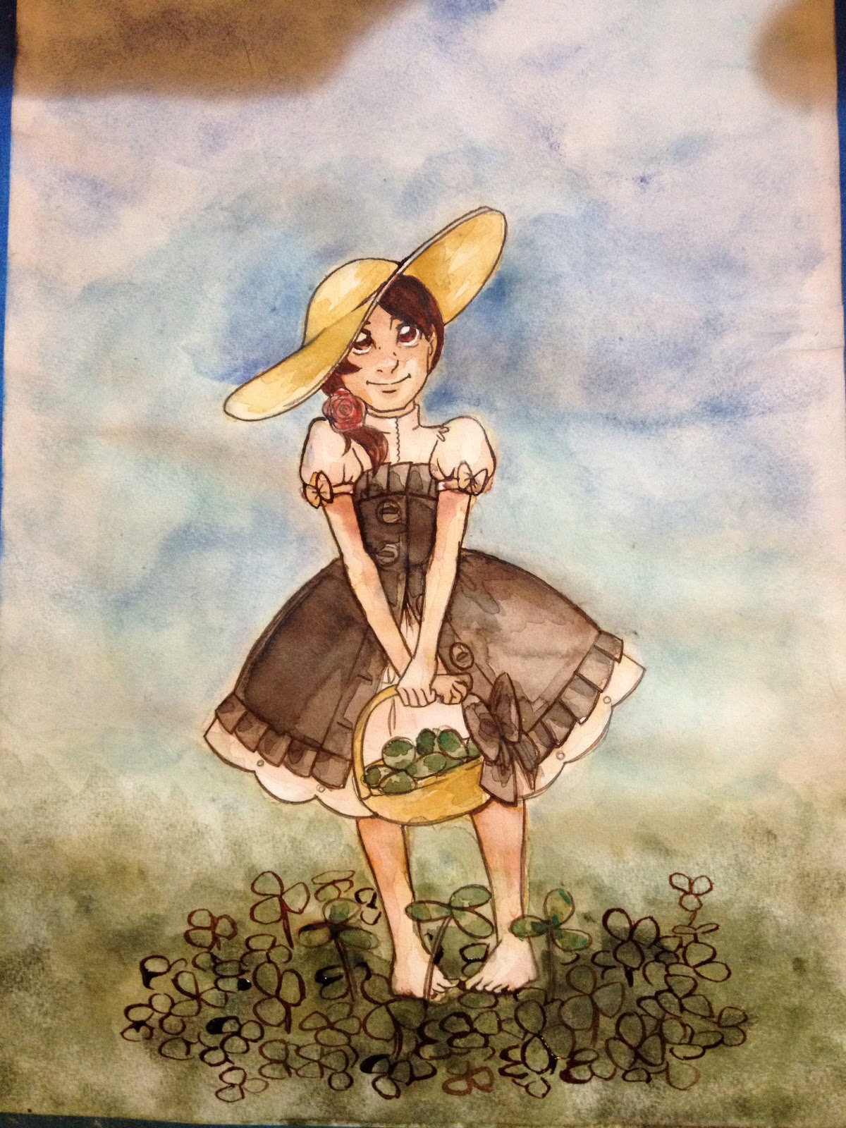
I attempted to scrub out some of the background, working a coarse bristle brush into the paper and sponging off the pigment, but it didn't pull up as much as I had hoped. I solicited my artist friends for help, and they suggested inking in more clovers in the foreground.


 |
| I tried to force a central focus by darkening the blue sky around her. |


I had to wait awhile for the washes to dry before I could start adding detail to the foreground clover.


Thanks for walking us through the entire journey of the piece in stead of just the good parts. It's interesting to see how things went wrong.
ReplyDelete