Walmart Art Supply Review: Pacon Art1st Marker Pad
It's a little ironic to me that the Luling Walmart doesn't sell alcohol based markers, at least not in the traditional sense, but they do sell marker paper. Walmart in general, at least online, DO sell Chameleon markers, which I've already reviewed on this blog, as well as Spectrum Noir (again, reviewed here), even fine point Le Pens, which according to Walmart are alcohol based (although I've never tested them as alcohol based markers). Walmart.com probably offers these markers to serve their crafter/scrapbooking customer base, but your in-person mileage may vary. Walmart.com even offers Spectrum Noir refills and replacement nibs, which I had trouble finding for sale in the US years ago during my initial review. And of course, they sell Bic Mark Its, which I'm reviewing as a supplement to the Walmart Art Supply Review series.
Pacon makes a number of sub-brands that include Array, Art Street, Decopuffs, Decoro, Classroom Keepers, Ella Bella, Fadeless, and Art1st, the last of which is the sub-brand we'll be looking at today. Pacon's focus as a company is making paper products for elemenatry education, which means the Art1st Marker Pad isn't marketed at artists, and may not be artist quality. Pacon is a US company located in Wisconsin, although their manufacturing and warehousing facilities are found worldwide. Pacon owns Strathmore, a paper brand readers of this blog are very familiar with, as I use this brand for plate Bristol Board, sketchbooks, and occasionally watercolor paper. Both Pacon and Strathmore paper products are very easy to find, and are carried in stores from high end art boutique supply stores and nationwide chains like DickBlick to Michaels, Walmart, and Dollar Tree.
Pacon seems to offer a fair selection of paper products in the Art1st line, including multi media paper, drawing paper, and sketch diaries. I'm having difficultly in finding a list of concrete differences between Art1st papers and Strathmore, but I'm going to go out on a limb and from my experience, it seems that Art1st offers budget artist papers, whereas Strathmore offers ranges (Good, Better, Best, Professional) to suit different budgets, and between the two brands, I'd say some choices are just a matter of personal preference rather than performance and availability.
Regarding marker paper, I must admit, I have a preference for saturating thick papers with lots of ink, because I like subtle graduations and lots of layering (just like my watercolors!). I rarely use marker paper, and when I do, it's for a very specific purpose (Copic's translucent marker paper for noodling around over a color pencil sketch), otherwise I use sketchbook paper, cardstock, and Strathmore's Plate Bristol. If you ARE interested in using marker paper, I highly suggest you read this post on Marianne Walker's blog, I Like Markers. I think this blog is a great reference if you're interested in alcohol based markers, although the focus is very Copic heavy, as Marianne is a Copic rep.
Pacon Art1st Marker Pad
Pacon Art1st marker paper is tape bound (and pages will start to fall out as you use the pad, so keep a binder clip handy!) at the top with a thin cardstock cover and thin chipboard back.
The Paper
The paper inside is bright white, very thin, and very smooth, but doesn't feel like it has any special coating. The paper weave feels tight, which is usually good for ink applications, as it helps to insure that colors are bright.
There isn't anything particularly special about this marker paper that sets it apart from other papers or makes it seem more suitable for markers, but I'm willing to let the markers guide me to a decision. This paper is NOT made for watercolor markers, or watercolor applications, so I will not be testing watercolor markers on this paper, just waterbased (Crayola) and alcohol based (Copic and Shin Han Twin Touch).
Inking on Pacon Marker Paper
Inking with the Sailor Mitsuo Aida, as it's a waterproof brushpen, and I prefer to ink with brushpens. The paper takes the ink well, and the smooth surface makes it easy to pull nice lines. Since the paper is so smooth, I have to take care to allow the ink to dry before dragging my hand across the surface.
For the following test, Mitsuo Aida ink was allowed to dry a full 24 hours (if not more) before any color was applied, to prevent ink smearing.
Waterbased Markers- Initial Tests on Marker Paper
Colors lay down vibrantly- more so than sketchbook paper. Markers don't bleed through the paper, despite the paper feeling thin. Color doesn't immediately soak in- gives me hope that some blending can happen.
Nope, can't blend, and paper starts to pill if I try.
Field Test- Crayola Supertips
Paper is very thin, very prone to tearing/wrinkling when you erase, so be careful. Although this is marker paper, you can't really layer the Crayola makers, because the paper gets damaged with repeated applications. Techniques that work for alcohol based markers-such as scribbling small, overlapping circles quickly to avoid streaking, or presaturating the paper with a very light shade or colorless blender so color is more readily dispersed, do not work with waterbased markers.
You can check out the rendering process I used for this image in my Walmart Art Supply Review Waterbased Markers post.
Crayola Supertips with Crayola Multicultural Waterbased Markers (Another Markering Style)
This isn't really a ding on the marker paper, but the Crayola Washable Ultra-Clean markers are so dry that marker doesn't apply evenly, even on paper designed for use with markers.
Even this deliberately lighter marker application, which involves no blending and minimal layering, caused some paper pilling with waterbased markers. I was hoping that marker paper, with it's smoother surface, would be less abraded by the marker's stiff tips, but unfortunately this isn't the case, and the wetter the paper is, the more likely it is to pill.
You can check out the process for this illustration by reading my Waterbased Marker Review on Crayola's Multicultural Color markers, which will be up on the blog soon!
Alcohol Based Markers (Copics)
I'm going to use all the techniques and layering that I would use with Plate Bristol, cardstock, or Copic marker paper.
Applying a "wash" of color with Copic Wides
And since I don't trust this paper, I'll be working with a thick sheet of cardstock underneath.
My Copic wides seem to smear the long dried Mitsuo Aida ink, which doesn't usually happen on the papers I prefer to use (cardstock, mixed media paper, watercolor paper), but could be due to the markers being a bit dry.
I have trouble blending out the wide as well, as this paper is very thin, the alcohol dries quickly, so it's hard to get nice blends. Because this paper is so thin, it's very prone to bleeding through, so I'm working on top of a sheet of cardstock.
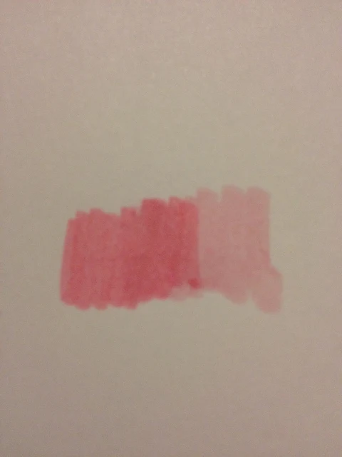
Copic Wides Use (Note: Some are Custom-made)
R0000
R20
R02
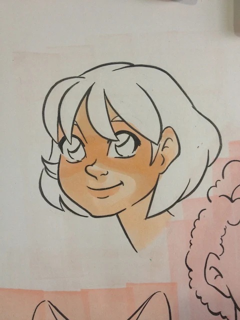
Kara
I seem to apply color differently from other manga-influenced artists in that I rarely utilize the white of the page when applying skin, I like to apply a light shade of skin all over, and build up shadows. For my list of colors, and how they were used, keep reading, I break them down by character.
Colors used for: Kara
Skin
E00- Base
YR01- Start of Blush
E93- progressing blush
R20- Darken blush (NOTE Usually I prefer R02, but that marker is dry and I'm ordering refills)
E51- Darker skintone, applied after base shadow
E21- Even darker skintone, used to apply shadow after E51
E34- Darkest shadows of skintone, base freckles applied after BV0000, and after all alcohol has evaporated
E13- Additional freckles
E23- Freckes
Shadow
BV31- Base shadow on skin, applied after blush, also applied as shadow to eyes and blended out with Colorless Blender
BV0000- contrasting skin shadows, applied after E34
Hair
E97- Hair base
E08- Shadows
E09- Shadows
E79- Shadows
E49- Final Shadows
Like My Colors? Get Your Own!
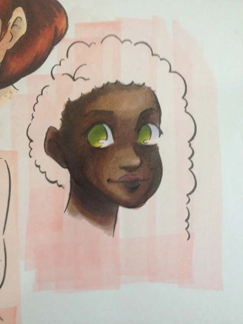
Naomi
I'm still trying to develope methods and techniques to better render darker skintones using alcohol based markers. Part of the issue is that it seems like the colors are never really right for what I want to do, and part of it is with darker skintones, you really can't fudge things the way you can with lighter ones. I also had trouble getting my darkest colors to appear as dark and vibrant as they actually are, so there isn't as much contrast between Naomi's skin and hair as I normally like.
Colors Used for: Naomi
Blush
E04, Applied to cheeks, eyelids, bottom of nose, lips, chin, reapplied after E23 application
R85- Trying to get a darker blush that shows up well without displacing original color of skin
Skin
E71- All over base
E27- Majority of face, blocking in shadow
E23- Blend between E71 and E 27
E37 Blending out E27, but sits on top of paper and doesn't blend well
E34- Used to blend out the E37 that just sat on paper surface, lighten up some areas a little bit
Eyes
Shinhan Twin Touch GY48- Base color
SH TT GY235
Copic G28
E23, very end, as Naomi has hazel eyes
Hair
E71- Used as Base
E47- Used all over
E79- Starting to apply shadows
E49- Final Shadows
Shadow:
BV31- Eyes, blended out with Colorless Blender
BV13 Shadows on skin
Like My Colors? Get Your Own!
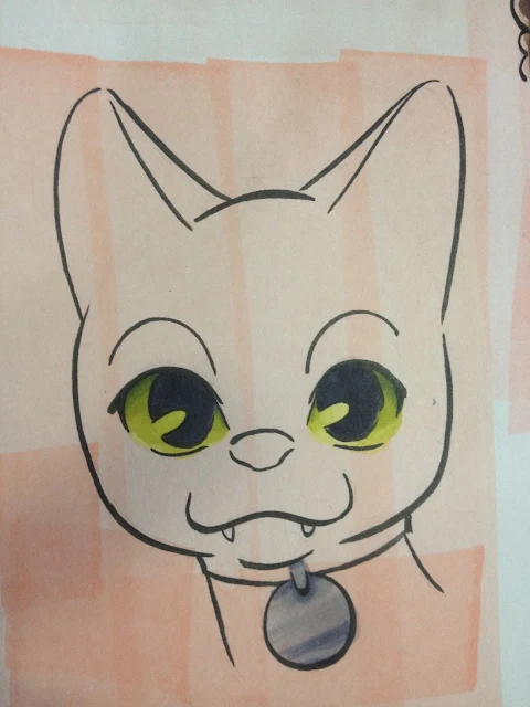
Pancake
Colors Used For: Pancake- Cat
Eyes
YG00- Applied as all over base
Shin Han Twin Touch GY48
SH TT GY235
BV25- Iris of eye
BV29
Fur
C6- Fur base, also used to blend out C10
C10
BV29
Ears
R20- Base pink color
R85
E04 Innermost shadow
Collar
Metal
SH TT BG3
Copic BV25
Fabric
R17- Base
R27
R39
Shadow
BV31, blended out with Colorless Blender, used on eyes
Like My Colors? Get Your Own!
This paper is shiny enough, especially when alcohol based ink like Copic has built up on the surface, that it's difficult to take photos.
The back of the test sheet has almost as much color as the front. I thought this paper wasn't supposed to bleed through!
Good thing I had a piece of heavy cardstock underneath, just in case.l There's a significant amount of bleed on the cardstock as well.
Verdict
Well, it's marker paper, I guess? It stands up to alcohol based markers pretty well, but so does my sketchbook paper or cardstock. In general, I don't really use marker paper for illustrations, unless it's Copic's semi transparent marker paper, which is a bit like vellum. The Pacon marker paper feels fairly thin, does nothing to prevent bleed through, and buckles when it becomes oversaturated with alcohol. For skintones that require building up in order to look believable and not become splotchy (like Naomi's), colors start to just sit on paper surface, rather than soaking in, and it makes it very difficult to blend correctly.
Overall Verdict
I recommend you skip the Pacon marker paper and pick up a ream of cardstock- you'll get more paper, paper that's better able to withstand various marker types, and while you're paying a bit more, it will definitely last you longer. Pacon's marker paper isn't bad, but it doesn't have any special properties that make it worth purchasing over an additional sketchbook or cardstock. If you're on a limited budget, you can rest assured knowing you aren't really missing out by not purchasing special marker paper.
Pacon's marker isn't particularly bad, it won't ruin your drawings, so if you've already purchased some, you might as well use it. For alcohol based markers, the UCreate sketchbook I'm reviewing for the Walmart Art Supply Series performs just about as well as the Pacon marker paper, and costs $5.37 for 75 spiral bound sheets- a little pricier, but much more practical and versatile.
Pacon makes a number of sub-brands that include Array, Art Street, Decopuffs, Decoro, Classroom Keepers, Ella Bella, Fadeless, and Art1st, the last of which is the sub-brand we'll be looking at today. Pacon's focus as a company is making paper products for elemenatry education, which means the Art1st Marker Pad isn't marketed at artists, and may not be artist quality. Pacon is a US company located in Wisconsin, although their manufacturing and warehousing facilities are found worldwide. Pacon owns Strathmore, a paper brand readers of this blog are very familiar with, as I use this brand for plate Bristol Board, sketchbooks, and occasionally watercolor paper. Both Pacon and Strathmore paper products are very easy to find, and are carried in stores from high end art boutique supply stores and nationwide chains like DickBlick to Michaels, Walmart, and Dollar Tree.
Pacon seems to offer a fair selection of paper products in the Art1st line, including multi media paper, drawing paper, and sketch diaries. I'm having difficultly in finding a list of concrete differences between Art1st papers and Strathmore, but I'm going to go out on a limb and from my experience, it seems that Art1st offers budget artist papers, whereas Strathmore offers ranges (Good, Better, Best, Professional) to suit different budgets, and between the two brands, I'd say some choices are just a matter of personal preference rather than performance and availability.
Regarding marker paper, I must admit, I have a preference for saturating thick papers with lots of ink, because I like subtle graduations and lots of layering (just like my watercolors!). I rarely use marker paper, and when I do, it's for a very specific purpose (Copic's translucent marker paper for noodling around over a color pencil sketch), otherwise I use sketchbook paper, cardstock, and Strathmore's Plate Bristol. If you ARE interested in using marker paper, I highly suggest you read this post on Marianne Walker's blog, I Like Markers. I think this blog is a great reference if you're interested in alcohol based markers, although the focus is very Copic heavy, as Marianne is a Copic rep.
Pacon Art1st Marker Pad
- Tapebound top
- Totally opaque
- 40 pages
- $3.94 at Walmart, in store purchase only
- Acid Free
- Ink should not bleed through to next sheet
The "Package"
Pacon Art1st marker paper is tape bound (and pages will start to fall out as you use the pad, so keep a binder clip handy!) at the top with a thin cardstock cover and thin chipboard back.
The paper inside is bright white, very thin, and very smooth, but doesn't feel like it has any special coating. The paper weave feels tight, which is usually good for ink applications, as it helps to insure that colors are bright.
 |
| CraZArt Marker Swatches |
 |
| Swatching markers back in Luling in July. |
Inking on Pacon Marker Paper
Inking with the Sailor Mitsuo Aida, as it's a waterproof brushpen, and I prefer to ink with brushpens. The paper takes the ink well, and the smooth surface makes it easy to pull nice lines. Since the paper is so smooth, I have to take care to allow the ink to dry before dragging my hand across the surface.
For the following test, Mitsuo Aida ink was allowed to dry a full 24 hours (if not more) before any color was applied, to prevent ink smearing.
Waterbased Markers- Initial Tests on Marker Paper
Colors lay down vibrantly- more so than sketchbook paper. Markers don't bleed through the paper, despite the paper feeling thin. Color doesn't immediately soak in- gives me hope that some blending can happen.
Nope, can't blend, and paper starts to pill if I try.
Field Test- Crayola Supertips
Paper is very thin, very prone to tearing/wrinkling when you erase, so be careful. Although this is marker paper, you can't really layer the Crayola makers, because the paper gets damaged with repeated applications. Techniques that work for alcohol based markers-such as scribbling small, overlapping circles quickly to avoid streaking, or presaturating the paper with a very light shade or colorless blender so color is more readily dispersed, do not work with waterbased markers.
You can check out the rendering process I used for this image in my Walmart Art Supply Review Waterbased Markers post.
Crayola Supertips with Crayola Multicultural Waterbased Markers (Another Markering Style)
This isn't really a ding on the marker paper, but the Crayola Washable Ultra-Clean markers are so dry that marker doesn't apply evenly, even on paper designed for use with markers.
Even this deliberately lighter marker application, which involves no blending and minimal layering, caused some paper pilling with waterbased markers. I was hoping that marker paper, with it's smoother surface, would be less abraded by the marker's stiff tips, but unfortunately this isn't the case, and the wetter the paper is, the more likely it is to pill.
You can check out the process for this illustration by reading my Waterbased Marker Review on Crayola's Multicultural Color markers, which will be up on the blog soon!
Alcohol Based Markers (Copics)
I'm going to use all the techniques and layering that I would use with Plate Bristol, cardstock, or Copic marker paper.
Applying a "wash" of color with Copic Wides
And since I don't trust this paper, I'll be working with a thick sheet of cardstock underneath.
My Copic wides seem to smear the long dried Mitsuo Aida ink, which doesn't usually happen on the papers I prefer to use (cardstock, mixed media paper, watercolor paper), but could be due to the markers being a bit dry.
I have trouble blending out the wide as well, as this paper is very thin, the alcohol dries quickly, so it's hard to get nice blends. Because this paper is so thin, it's very prone to bleeding through, so I'm working on top of a sheet of cardstock.
Copic Wides Use (Note: Some are Custom-made)
R0000
R20
R02
Kara
I seem to apply color differently from other manga-influenced artists in that I rarely utilize the white of the page when applying skin, I like to apply a light shade of skin all over, and build up shadows. For my list of colors, and how they were used, keep reading, I break them down by character.
Colors used for: Kara
Skin
E00- Base
YR01- Start of Blush
E93- progressing blush
R20- Darken blush (NOTE Usually I prefer R02, but that marker is dry and I'm ordering refills)
E51- Darker skintone, applied after base shadow
E21- Even darker skintone, used to apply shadow after E51
E34- Darkest shadows of skintone, base freckles applied after BV0000, and after all alcohol has evaporated
E13- Additional freckles
E23- Freckes
Shadow
BV31- Base shadow on skin, applied after blush, also applied as shadow to eyes and blended out with Colorless Blender
BV0000- contrasting skin shadows, applied after E34
Hair
E97- Hair base
E08- Shadows
E09- Shadows
E79- Shadows
E49- Final Shadows
Like My Colors? Get Your Own!
Naomi
I'm still trying to develope methods and techniques to better render darker skintones using alcohol based markers. Part of the issue is that it seems like the colors are never really right for what I want to do, and part of it is with darker skintones, you really can't fudge things the way you can with lighter ones. I also had trouble getting my darkest colors to appear as dark and vibrant as they actually are, so there isn't as much contrast between Naomi's skin and hair as I normally like.
Colors Used for: Naomi
Blush
E04, Applied to cheeks, eyelids, bottom of nose, lips, chin, reapplied after E23 application
R85- Trying to get a darker blush that shows up well without displacing original color of skin
Skin
E71- All over base
E27- Majority of face, blocking in shadow
E23- Blend between E71 and E 27
E37 Blending out E27, but sits on top of paper and doesn't blend well
E34- Used to blend out the E37 that just sat on paper surface, lighten up some areas a little bit
Eyes
Shinhan Twin Touch GY48- Base color
SH TT GY235
Copic G28
E23, very end, as Naomi has hazel eyes
Hair
E71- Used as Base
E47- Used all over
E79- Starting to apply shadows
E49- Final Shadows
Shadow:
BV31- Eyes, blended out with Colorless Blender
BV13 Shadows on skin
Like My Colors? Get Your Own!
Pancake
Colors Used For: Pancake- Cat
Eyes
YG00- Applied as all over base
Shin Han Twin Touch GY48
SH TT GY235
BV25- Iris of eye
BV29
Fur
C6- Fur base, also used to blend out C10
C10
BV29
Ears
R20- Base pink color
R85
E04 Innermost shadow
Collar
Metal
SH TT BG3
Copic BV25
Fabric
R17- Base
R27
R39
Shadow
BV31, blended out with Colorless Blender, used on eyes
Like My Colors? Get Your Own!
This paper is shiny enough, especially when alcohol based ink like Copic has built up on the surface, that it's difficult to take photos.
The back of the test sheet has almost as much color as the front. I thought this paper wasn't supposed to bleed through!
Good thing I had a piece of heavy cardstock underneath, just in case.l There's a significant amount of bleed on the cardstock as well.
Verdict
Well, it's marker paper, I guess? It stands up to alcohol based markers pretty well, but so does my sketchbook paper or cardstock. In general, I don't really use marker paper for illustrations, unless it's Copic's semi transparent marker paper, which is a bit like vellum. The Pacon marker paper feels fairly thin, does nothing to prevent bleed through, and buckles when it becomes oversaturated with alcohol. For skintones that require building up in order to look believable and not become splotchy (like Naomi's), colors start to just sit on paper surface, rather than soaking in, and it makes it very difficult to blend correctly.
Overall Verdict
I recommend you skip the Pacon marker paper and pick up a ream of cardstock- you'll get more paper, paper that's better able to withstand various marker types, and while you're paying a bit more, it will definitely last you longer. Pacon's marker paper isn't bad, but it doesn't have any special properties that make it worth purchasing over an additional sketchbook or cardstock. If you're on a limited budget, you can rest assured knowing you aren't really missing out by not purchasing special marker paper.
Pacon's marker isn't particularly bad, it won't ruin your drawings, so if you've already purchased some, you might as well use it. For alcohol based markers, the UCreate sketchbook I'm reviewing for the Walmart Art Supply Series performs just about as well as the Pacon marker paper, and costs $5.37 for 75 spiral bound sheets- a little pricier, but much more practical and versatile.


Comments
Post a Comment