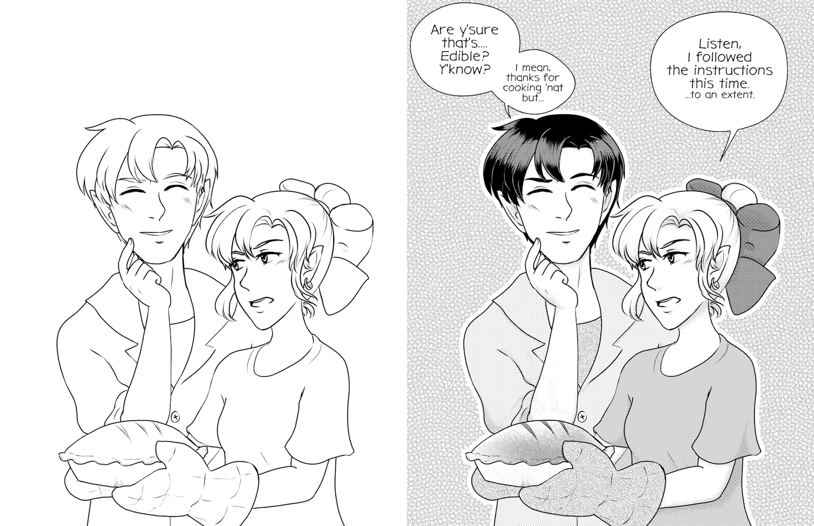
Guest Post: Kabocha's Screentone Walkthrough
Hello, and welcome again, to another walkthrough by kabocha!
So, what is screentone?
My good buddy Loom goes over what screentones are and a bit about their history in this tutorial. If you’re curious, give it a read!
But to be brief, screentones are patterns are basically dot patterns meant to provide textures, values, or other things. They’re not limited to manga or OEL stuff, but that’s where one will find them nowadays.
If you’re interested in the technical aspects of screentones (what DO the numbers mean?), maybe you ought to check out Loom’s tutorials, as she covers high-res and low-res, as well as information on moire and overlays and using them to your advantage.
ANYWAY. How do we go from linework to a toned illustration? Welp.
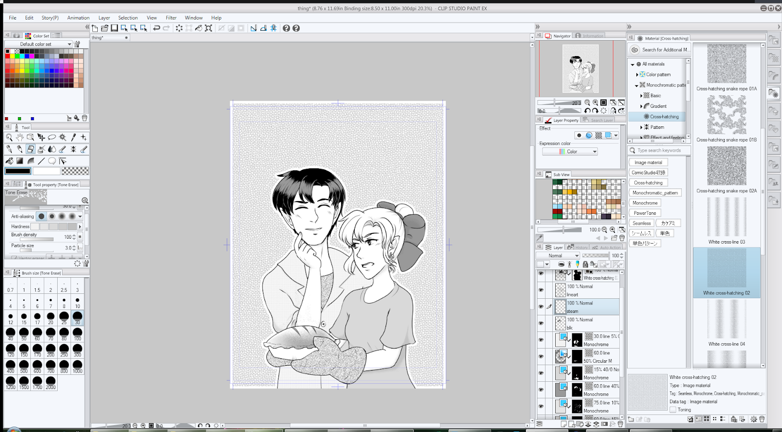
First things first -- YES, I am working in Clip Studio Paint. While I’ll be referring to specific tools in this application, the general process can be applied basically anywhere you have digital tones available. (Traditional toning? Little bit of a different beast, and I cleared out my traditional tones in 2015.)
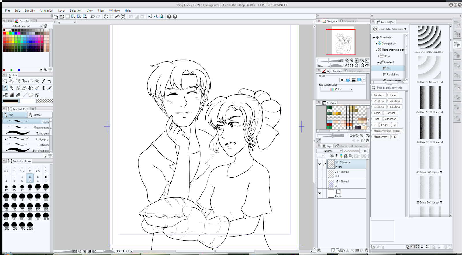
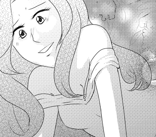
First things first, when you do your lineart, try and make sure your linework is generally closed,as if you’re going to begin flatting. This was about as good as I was going to get for the time being.
Basic Fills
So, you know how in Loom’s tutorials, “value” is mentioned? It comes into play here.
Think of screentoning as being like coloring in greyscale; you know where your darks and your lights should be.
In this case, I know one character’s hair is near-black, so I’m just going to go ahead and imply that with some black fills, with highlight areas erased.
I’ve gone over this technique in the past, with both near-black hair and a character who has brownish hair. You can repeat this process if you want to combine spot blacks for shadowing as well!
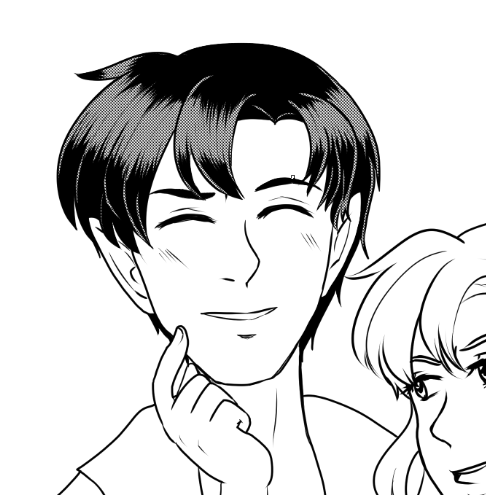
I added tone to make it clear his hair isn’t shiny black.
In this case, I chose 60L/40% as my screentone of choice, which translates to something like 60 lines per inch at 40% value. The 60 line choice is pretty much my own preference, but 40% is fairly dark, fitting my purposes.
Now that we’ve got the darkest area of the image done, let’s move on to something else.

This time, I selected the entire area of the shirt, which would be kind of… a light brown or grey. So a much lighter tone is needed. This time, I went with something with a lower line count (50L) because 60L would produce something that looks slightly more saturated.
Next up, the bow! What color would you expect it to be? Usually I use fairly saturated (but not necessarily bright) red for this character.

I decided to re-use the 60L/40% tone -- though without any spot blacks, it looks much lighter in comparison to the hair I previously used it on.
You can repeat this sort of process through your illustration to see what all you can create.
Dots vs Noise
It’s important to note that even if you have two types of tones with the same saturation, the TYPE of tone will make a difference in its appearance. For example, here we have a “dot” tone and a “noise” tone.
These produce different types of textures, and are worth playing with! They also will resize differently as well.

Gradiation
Workspace aside -- many applications offer gradiated screentones! Usually they come in two types of gradients -- Radial and Linear.
These are especially good for… Well, expressing gradients. Dark to light, burnt to not-burnt, and so on.
In this case, I used a circular gradient as a fill for the pie crust, as it seemed most fitting.
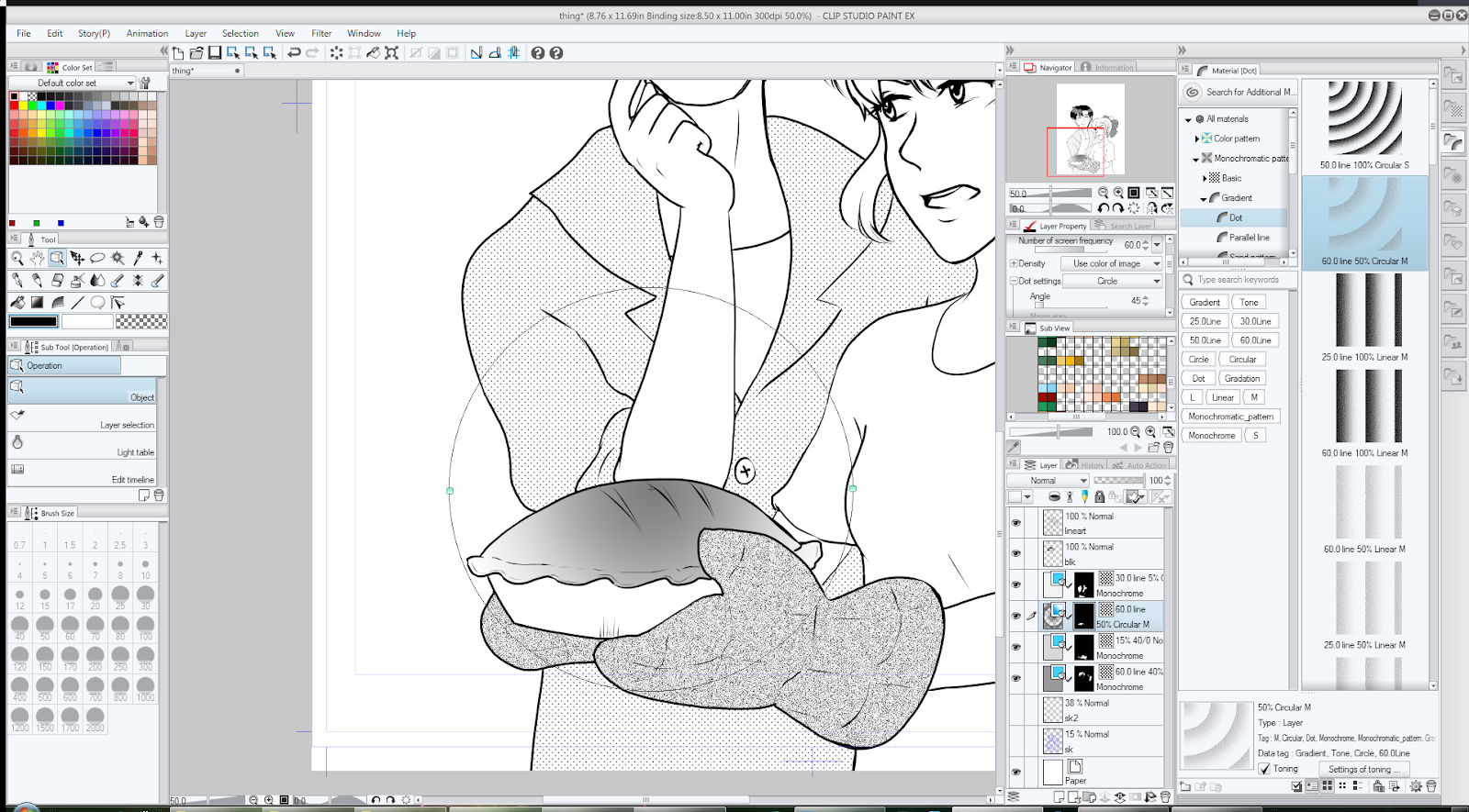
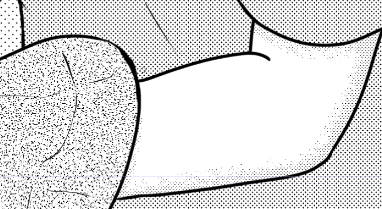
There are also cases where you can use Gradients for shading -- as seen here:
Gradient shading isn’t new, but always worth looking at here and there.
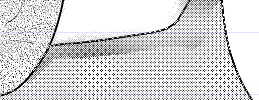
Tone Erasing
Now that we have some areas laid out with screentone, one might realize… Well, I want to erase things, but I want it to be soft-shaded -- how do I accomplish that?
Back in the day, you’d grab a rough eraser, or use an knife to scrape your tones.
Digitally, there’s a myriad of ways to do this, and it will vary based on your program.
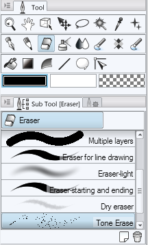
I made a Tone Erase brush in Clip Studio Paint, or you could use use the existing Tone Scraping airbrush (which puts down tone). If you use either of these in conjunction with layer masks, you can accomplish some pretty neat things.
Yes, sometime in-between the gradient and the erasing, I added another flat tone.
|
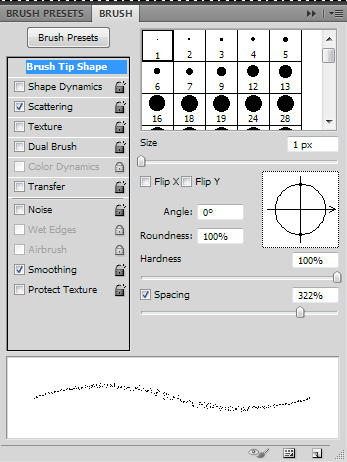
In Photoshop, you can make your own tone eraser by using the Pencil tool and using white over your screentone, or by setting your eraser mode to Pencil. Once you do this, open up your Brush window (F5), and play with the settings pictured below. Your preferences may vary, so you should experiment!

Finishing touches
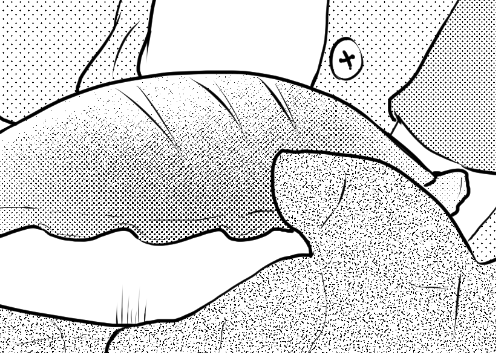
And finally, now that we have the tone laid out, we can start doing things like adding shading and such. When laying down my tone, I’m going to use the tone eraser to accomplish a more soft-shaded look.
For this, I chose 75L/5% instead of another 60L tone.
This allows me to exploit moire when layering it on top of another toned area.
In the process of toning, I also repeated the process on the bow and in various other places to help add depth. This typically isn’t necessary, but can help!
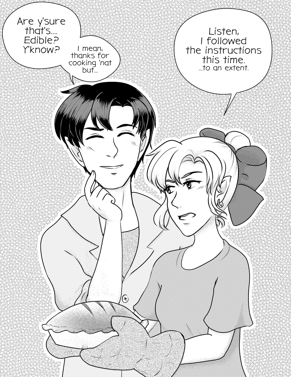
Afterward, I added some tone to the background, as well as text, to produce the finished image!
If you’re like me, and can’t get enough screentone, you can find a myriad of resources on Clip Studio Paint’s assets website. If you search their official account, you can find some awesome goodies!
Wanna see more of my screentone nonsense? Check me out on deviantArt, or read my manga-styled webcomic, Linked!


Comments
Post a Comment