One Layer Watercolor: Watercolor Basics
This series is also made possible thanks to the generosity and interest of my Patrons on Patreon.

My Watercolor Basics series is a longform, in depth tutorial series aimed at empowering others to pursue their artistic interests. Due to the nature of these series, which require process posts, numerous examples, and in depth research, these posts are extremely resource intense. It is only due to the support and loyalty of my Patrons that I can devote the time, resources, and knowledge to posts like this. To my Patrons, I owe my sincere thanks- without you, there would be no Watercolor Basics or Intro to Comic Craft series.
For only $2 a month, you can join the Artnerd community and help support quality content like this. Your pledge enables me to pay guest artists, purchase supplies for review, and offset some of the costs these in depth posts incur. Your support inspires me to dedicate the time necessary to writing and creating art education content.
Now that we've gone over the process for an entire watercolor illustration, you guys should be fairly familiar with my working methods, especially if you're following along with the YouTube demonstrations.
This is a straightforward technique that is deceptively difficult. You're simply applying one layer of color per area- relying on the white of the paper or working wet into wet for detail and definition. If you're used to building up forms and contrast through layers and layers of color, this technique is definitely a challenge!
Materials Used:
Additional Materials:
Preparing Your Image and Workspace

Mixing Skintone

Applying a Light Wash Around Image
 Although the focus of this tutorial is to apply bold fields of color, I find that 'grounding' the image (especially for vignettes or pinups like the above image) with a light wash of cerulean blue only in the background helps significantly.
Working Layer by Layer, One Area at a Time
Skin

Blush

Red Posies

Once I've established my lightest colors, I can start painting directly from my pans. For this, I recommend activating your paints beforehand, so they're ready to use when you're ready to apply color. For these flowers, I used Holbein's Cherry Red.
Green Shamrocks


One of the neater effects of using textured watercolor papers is that the paper surface will affect how the paints dry, as evident in the upper right hand shamrock.
For these shamrocks, I used Holbein's Hooker's Green.
Hair

Dress

Painting larger areas requires a well kept round that can pull a fine point, yet hold a large amount of paint, some patience, and a quick hand, as ideally, you want to finish in one pass. I recommend handing larger areas one area at a time- left sleeve, pockets, body of dress, right sleeve.
For Kara's Dress, I used a blue green by Soho watercolors- note, this is a synthetic blue green, and is not light fast.
Pinafore and Flower Centers


White Gouache for Details

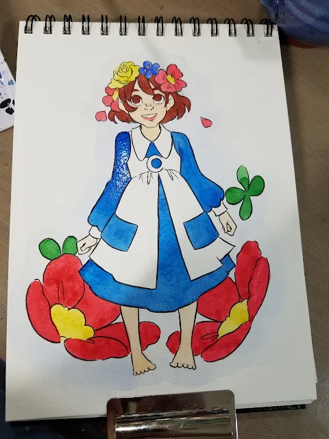
Finished Piece


The end result, in my instance, is a fairly graphic piece that stands well on it's own, and looks quite different from my regular watercolor work.
Pros:
Cons:

My Watercolor Basics series is a longform, in depth tutorial series aimed at empowering others to pursue their artistic interests. Due to the nature of these series, which require process posts, numerous examples, and in depth research, these posts are extremely resource intense. It is only due to the support and loyalty of my Patrons that I can devote the time, resources, and knowledge to posts like this. To my Patrons, I owe my sincere thanks- without you, there would be no Watercolor Basics or Intro to Comic Craft series.
For only $2 a month, you can join the Artnerd community and help support quality content like this. Your pledge enables me to pay guest artists, purchase supplies for review, and offset some of the costs these in depth posts incur. Your support inspires me to dedicate the time necessary to writing and creating art education content.
One Layer Watercolor
Now that we've gone over the process for an entire watercolor illustration, you guys should be fairly familiar with my working methods, especially if you're following along with the YouTube demonstrations.
This is a straightforward technique that is deceptively difficult. You're simply applying one layer of color per area- relying on the white of the paper or working wet into wet for detail and definition. If you're used to building up forms and contrast through layers and layers of color, this technique is definitely a challenge!
Materials Used:
- Watercolors (given the lack of layers, you can use cheaper watercolors if you wish- there's no glazes to make layers muddy)
- Watercolor paper (you can use inexpensive watercolor paper if you wish, as the paper isn't going to be saturated. I use Strathmore's Field Watercolor Notebook)
- Watercolor brushes (I tend to prefer rounds- they are particularly good for this exercise, as they can get into small corners)
Additional Materials:
- Welled palette
- bulldog clips to secure your paper
Preparing Your Image and Workspace


My preferred mixture for most Caucasian skintones is yellow ochre+scarlet lake or hue.

Working Layer by Layer, One Area at a Time
Skin

I find that even in an application such as this, which relies on saturated colors and stark white contrast, painting the skin delicately, rather than thickly, is best.

For blush, I use a mixture of Aliz Crimson mixed very sparingly.

Green Shamrocks


One of the neater effects of using textured watercolor papers is that the paper surface will affect how the paints dry, as evident in the upper right hand shamrock.
For these shamrocks, I used Holbein's Hooker's Green.
Hair

For Kara's hair, I used Indian Red.


Painting larger areas requires a well kept round that can pull a fine point, yet hold a large amount of paint, some patience, and a quick hand, as ideally, you want to finish in one pass. I recommend handing larger areas one area at a time- left sleeve, pockets, body of dress, right sleeve.
For Kara's Dress, I used a blue green by Soho watercolors- note, this is a synthetic blue green, and is not light fast.
Pinafore and Flower Centers


For these items, I used Soho's Indian Yellow. I have not tested any Soho watercolors for lightfastness, so I cannot recommend them for projects that will be displayed.

Once everything has had a chance to dry completely, thickly mixed gouache or Copic Opaque white can be used to add highlights and accents.


The end result, in my instance, is a fairly graphic piece that stands well on it's own, and looks quite different from my regular watercolor work.
Pros:
- Takes less time
- May be easier to reproduce
- Graphic, easy to read style
Cons:
- Need to get it right on the first go round, corrections may leave blemishes that are distracting and hard to hide.
- Need to plan your whites (highlights) ahead of time
Today's Sponsor- 7" Kara
Speaking of watercolor, today's Watercolor Basic post was brought to you by the webcomic launch of 7" Kara, the comic that has inspired this series! If you enjoy my watercolor art, illustration, or tutorials, please check 7" Kara out on Tumblr or on the 7" Kara site.

If you just can't stand a cliffhanger, Volume 1 of 7" Kara is available on Gumroad and through my web-shop. Volume 1 contains the first four chapters of 7" Kara, and a bonus story, as well as loads of additional illustrations and a concept section!


If you just can't stand a cliffhanger, Volume 1 of 7" Kara is available on Gumroad and through my web-shop. Volume 1 contains the first four chapters of 7" Kara, and a bonus story, as well as loads of additional illustrations and a concept section!


Comments
Post a Comment