Alcohol Marker Review: Kurecolor Brush and Fine for Manga
Although I've promised myself I would start moving away from alcohol based marker reviews, I find myself discovering new brands and wanting to share them here. Kuretake is by no means a new brand to me, as I've reviewed many of their fude pens, and I've even reviewed their alcohol markers once before.
I purchased my Kuretake Kurecolor Brush and Fine for Manga markers from Amazon, as they currently have the best price online.
The Brand and Past Reviews
Other Alcohol Markers from Kuretake:
Link from MarkerPop
Kurecolor
Kurecolor Twin S
Past Reviews:
Kuretake Kurecolor Twin S
These markers were originally designed for manga artists and illustrators, and the site promises 'velvety smooth laydown of colour' as well as 'amazing blending properties'. These markers launched in the US in May of 2012, but don't seem to have gained much traction in the alcohol marker arena.
The Stats:
Colors Purchased:
Flesh and Neutral Tones set (12 markers) $39.50 on Amazon
Manga Set 'Girl' (10 markers+ 2 purple fineliners) $39.43 on Amazon
Duplicate Colors are Bolded for your reference.
Colors included in Flesh and Neutral Tone Set:
Pale Beige
Vanilla
Ivory
Champagne
Light Bisque
Rose Beige
Flesh Colour
English Rose
Blush
Pale Blush
Pink Haze
Porcelain
Colors included in Manga Set Girl:
2 Violet fineliners- 01 and 05
Wine Red
Cornflower Blue
Cadmium Orange
Ivory
English Rose
Sand
Dark Oatmeal
Gray Brown
Blue Gray 2
Warm Gray 1
The Packaging
Both sets came in sturdy plastic cases. Inside the case, there's nothing to keep the markers in order, and markers are very prone to shifting. For sets like the skintones and neutrals, this can become very confusing, as the colors are all very similar, especially if you're going by cap alone.
Portrait Set


The skintone and neutral set does not have a secure closure- the lid simply tucks into the rest of the package.
Manga Starter Set- 'Girl'


For this package, the lid securely tucks into the rest of the package via a little flap.

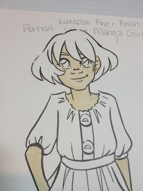
Manga Set 'Girl' includes an informational pamphlet that gives the basics for how to use alcohol markers for illustration, demonstrates which colors are used for the included illustrations, and includes an uncolored copy of the front illustration for you to practice on. The paper this is printed on is extremely thin.

The Markers
As mentioned above, Kurecolor Brush and Fine for Manga are twin tipped markers. The black cap hides the brush tip, and the color cap hides the fine. This is the reverse of most markers I encounter, and it was a bit frustrating as I kept pulling off the wrong cap time and again.


Body screening indicated the Fine tip and the Brush tip

Also unusual is the fact that the fine tip not only has the color cap, but the color collar as well. This is generally used to indicate the brush tip on alcohol markers.

The brush is a bit stubbier than most alcohol marker brushes. The barcode sticker indicates the color name.

The fine tip is a fiber nib, similar to the fine nib used for pigment ink on Distress watercolor markers.
Comparison Shots
Compared to other popular alcohol markers
Kurecolor Brush and Fine for Manga markers are much thinner than other refillable alcohol markers, some of the thinnest I've ever tested, and much thinner than Kuretake's Kurecolor Twin or their original Kurecolor alcohol markers.
The fine nib is closer to the nibs used on watercolor markers than to alcohol marker bullet nibs, but the brush is very similar to those used by Prismacolor, Copic, and Winsor and Newton, except a bit shorter.
The body of the Kurecolor Brush and Fine for Manga reminded me of other markers made by Kuretake, so I pulled out several other waterbased markers to see how the bodies stacked up.
Compared to Other Kuretake Brush Markers (and one Tombow)
The general design of the Kurecolor Brush and Fine for Manga is very similar to the Kuretake Zig Art and Graphic Twin and the Tombow ABT- long narrow body, colored cap at the fine point, single color cap to signify color within. The fine nib is very similar to the fine nib on the Tombow ABT, and the brush is much shorter and thicker than the other markers.
The styling in general is also very similar to these non-refillable waterbased markers- long black body with generic body screening, color name and number is on the barcode sticker rather than the body, nibs are probably not replaceable.
The Swatch Test
The Field Test
The Skin


Colors did not layer upon themselves very well- it was difficult to build up tones this way, requiring me to grab other markers and try to color match.


Colors were so similar it was difficult to build up contrast by layering different colors as well.

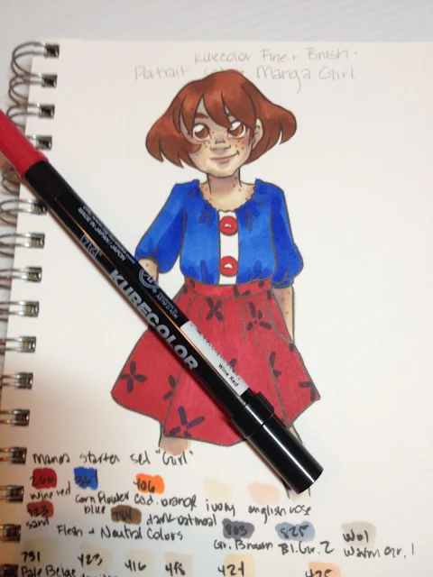
As you can see, there is very little contrast on the face, despite several layers of ink.


Despite having both the Portrait set and the Girl set, I found it difficult to build up contrast with Kara's skin. Most of the colors in the Portrait set were very similar to one another, and the ink had a tendency to bleed on the Strathmore 300 Series Mixed Media paper. I probably should have left the skin alone at this point, as it's all downhill from here.

As neither set included a light lavender (for shading), I had to use the Cool Blue that came with the Manga Girl set, which desaturated the skin quickly, and contributed to the muddiness of the skin in later photos.
Mangaka generally use a totally different method of applying color than I do, so these markers may work well if you prefer to leave large areas of white on your illustration, and utilize color as your shadow. I test markers based on the way I prefer to render, and this may have been my own shortcoming, rather than the Kurecolor Brush and Fine for Manga.


I should have been patient and just allowed the hair and eyes to provide enough visual contnrast, as Kara's red-brown hair is sufficiently different in tone from her freckled skin. These markers can quickly saturate small areas.

Which means it doesn't layer upon itself very well- there isn't much difference between the first layer and the second, which limits how far your markers can go.


Clothes
This is the area where I really suffered from sufficient colors, and where the markers' quick saturation was most detrimental, as I really struggled to build up shadows with limited colors in a color family. This was particularly true for the red. I probably could have gone for a orange-red skirt, as I did have an orange, but sadly I didn't think about it at the time.


The Verdict
Given the fact that I've never seen these markers at a brick and mortar store (if you have, let me know where, and I'll add it to the post!), I find it difficult to recommend these markers over brands that are more easily accessible. I found them a bit difficult to control, as they were very prone to bleeding on the Mixed Media paper I tested them on, but I enjoyed using the brush tip and found that it performed quite well. I had difficulty layering colors, and I had trouble selecting appropriate skintones, especially as my order kept getting mixed up. I'd like to revisit these markers at a later date and see if I can wrangle them into submission.
If you do have easy access to these markers, they generally work quite well, especially if you can pick and choose colors that work for your personal rendering style. I found both sets difficult to render with, even when used together, as the colors in one set were too similar to build sufficient contrast, and colors in the other were to disparate to bridge the gap in tones. I should note that I'd purchased a blender marker (I'd actually bought it first, but I don't remember from where), and FORGOT IT AT HOME. I'd had my two new sets shipped to Luling so I could work during winter break, hence some of the unusual (and mostly unmentioned in this post) difficulties I faced, as well as my willingness to give these markers another pass at a later date.
More Information on this product
Zig Kurecolor-Kuretake UK
I purchased my Kuretake Kurecolor Brush and Fine for Manga markers from Amazon, as they currently have the best price online.
The Brand and Past Reviews
Other Alcohol Markers from Kuretake:
Link from MarkerPop
Kurecolor
Kurecolor Twin S
Past Reviews:
Kuretake Kurecolor Twin S
These markers were originally designed for manga artists and illustrators, and the site promises 'velvety smooth laydown of colour' as well as 'amazing blending properties'. These markers launched in the US in May of 2012, but don't seem to have gained much traction in the alcohol marker arena.
The Stats:
- Refillable- you can find some refill inks through Amazon and through Marker Supply
- Replaceable Nibs
- Brush Nib and bullet nib
- 135 colors+ colorless blender
- Available in a variety of sets and openstock
- Available on Jetpens, Amazon, Kuretake website, Craft Carrot
- Kurecolor Twin markers are available in 135 colors, the same appears to be true for the Kurecolor Brush and Fine for Manga
- I've found a couple sources for open stock- MerriArtist- $2.76 each and Scribblers (UK)
Kurecolor Color Chart
 |
| Image Source |
Flesh and Neutral Tones set (12 markers) $39.50 on Amazon
Manga Set 'Girl' (10 markers+ 2 purple fineliners) $39.43 on Amazon
Duplicate Colors are Bolded for your reference.
Colors included in Flesh and Neutral Tone Set:
Pale Beige
Vanilla
Ivory
Champagne
Light Bisque
Rose Beige
Flesh Colour
English Rose
Blush
Pale Blush
Pink Haze
Porcelain
Colors included in Manga Set Girl:
2 Violet fineliners- 01 and 05
Wine Red
Cornflower Blue
Cadmium Orange
Ivory
English Rose
Sand
Dark Oatmeal
Gray Brown
Blue Gray 2
Warm Gray 1
The Packaging
Both sets came in sturdy plastic cases. Inside the case, there's nothing to keep the markers in order, and markers are very prone to shifting. For sets like the skintones and neutrals, this can become very confusing, as the colors are all very similar, especially if you're going by cap alone.
Portrait Set


The skintone and neutral set does not have a secure closure- the lid simply tucks into the rest of the package.
Manga Starter Set- 'Girl'


For this package, the lid securely tucks into the rest of the package via a little flap.

Manga Set 'Girl' includes an informational pamphlet that gives the basics for how to use alcohol markers for illustration, demonstrates which colors are used for the included illustrations, and includes an uncolored copy of the front illustration for you to practice on. The paper this is printed on is extremely thin.

The Markers
As mentioned above, Kurecolor Brush and Fine for Manga are twin tipped markers. The black cap hides the brush tip, and the color cap hides the fine. This is the reverse of most markers I encounter, and it was a bit frustrating as I kept pulling off the wrong cap time and again.


Body screening indicated the Fine tip and the Brush tip

Also unusual is the fact that the fine tip not only has the color cap, but the color collar as well. This is generally used to indicate the brush tip on alcohol markers.

The brush is a bit stubbier than most alcohol marker brushes. The barcode sticker indicates the color name.

The fine tip is a fiber nib, similar to the fine nib used for pigment ink on Distress watercolor markers.
Compared to other popular alcohol markers
 |
| From Left to Right: Winsor and Newton Brushmarker, Copic Sketch, Prismacolor Brush Marker, Kurecolor Brush and Fine for Manga |
Kurecolor Brush and Fine for Manga markers are much thinner than other refillable alcohol markers, some of the thinnest I've ever tested, and much thinner than Kuretake's Kurecolor Twin or their original Kurecolor alcohol markers.
 |
| From Top to Bottom: Kurecolor Brush and Fine for Manga, Prismacolor Brush marker, Copic Sketch, Winsor and Newton Brushmarker |
 |
| From Top to Bottom: Kurecolor Brush and Fine for Manga, Prismacolor Brush Marker, Copic Sketch, Winsor and Newton Brushmarker |
 |
| From Top to Bottom: Kurecolor Brush and Fine for Manga, Prismacolor Brush marker, Copic Sketch, Winsor and Newton Brushmarker |
The body of the Kurecolor Brush and Fine for Manga reminded me of other markers made by Kuretake, so I pulled out several other waterbased markers to see how the bodies stacked up.
Compared to Other Kuretake Brush Markers (and one Tombow)
 |
| From Top to Bottom: Kurecolor Brush and Fine for Manga, Zig Brushables, Zig Art and Graphic Twin, Tombow ABT |
The styling in general is also very similar to these non-refillable waterbased markers- long black body with generic body screening, color name and number is on the barcode sticker rather than the body, nibs are probably not replaceable.
 |
| From Top to Bottom: Kurecolor Brush and Fine for Manga, Zig Brushables, Zig Art and Graphic Twin, Tombow ABT |
 |
| From Top to Bottom: Kurecolor Brush and Fine for Manga, Zig Brushables, Zig Art and Graphic Twin, Tombow ABT |
The Swatch Test
 |
| Color chart on the Flesh and Neutral Tones Set |
 |
| Color chart on the Manga Starter Set 'Girl' |
 |
Top Two Rows: Swatches from the Manga Starter Set 'Girl'
Bottom Two Rows: Swatches from the Skintones and Neutrals set
|
The Field Test
The Skin


Colors did not layer upon themselves very well- it was difficult to build up tones this way, requiring me to grab other markers and try to color match.


Colors were so similar it was difficult to build up contrast by layering different colors as well.

As you can see, there is very little contrast on the face, despite several layers of ink.


At this point, I tried to knock in some blush and some shadow with Pink Haze.

Despite having both the Portrait set and the Girl set, I found it difficult to build up contrast with Kara's skin. Most of the colors in the Portrait set were very similar to one another, and the ink had a tendency to bleed on the Strathmore 300 Series Mixed Media paper. I probably should have left the skin alone at this point, as it's all downhill from here.

As neither set included a light lavender (for shading), I had to use the Cool Blue that came with the Manga Girl set, which desaturated the skin quickly, and contributed to the muddiness of the skin in later photos.
Mangaka generally use a totally different method of applying color than I do, so these markers may work well if you prefer to leave large areas of white on your illustration, and utilize color as your shadow. I test markers based on the way I prefer to render, and this may have been my own shortcoming, rather than the Kurecolor Brush and Fine for Manga.


At this point, I really overworked the skin by adding too many colors and trying to blend them out. I finally figured it was time to move on to something else.
Hair
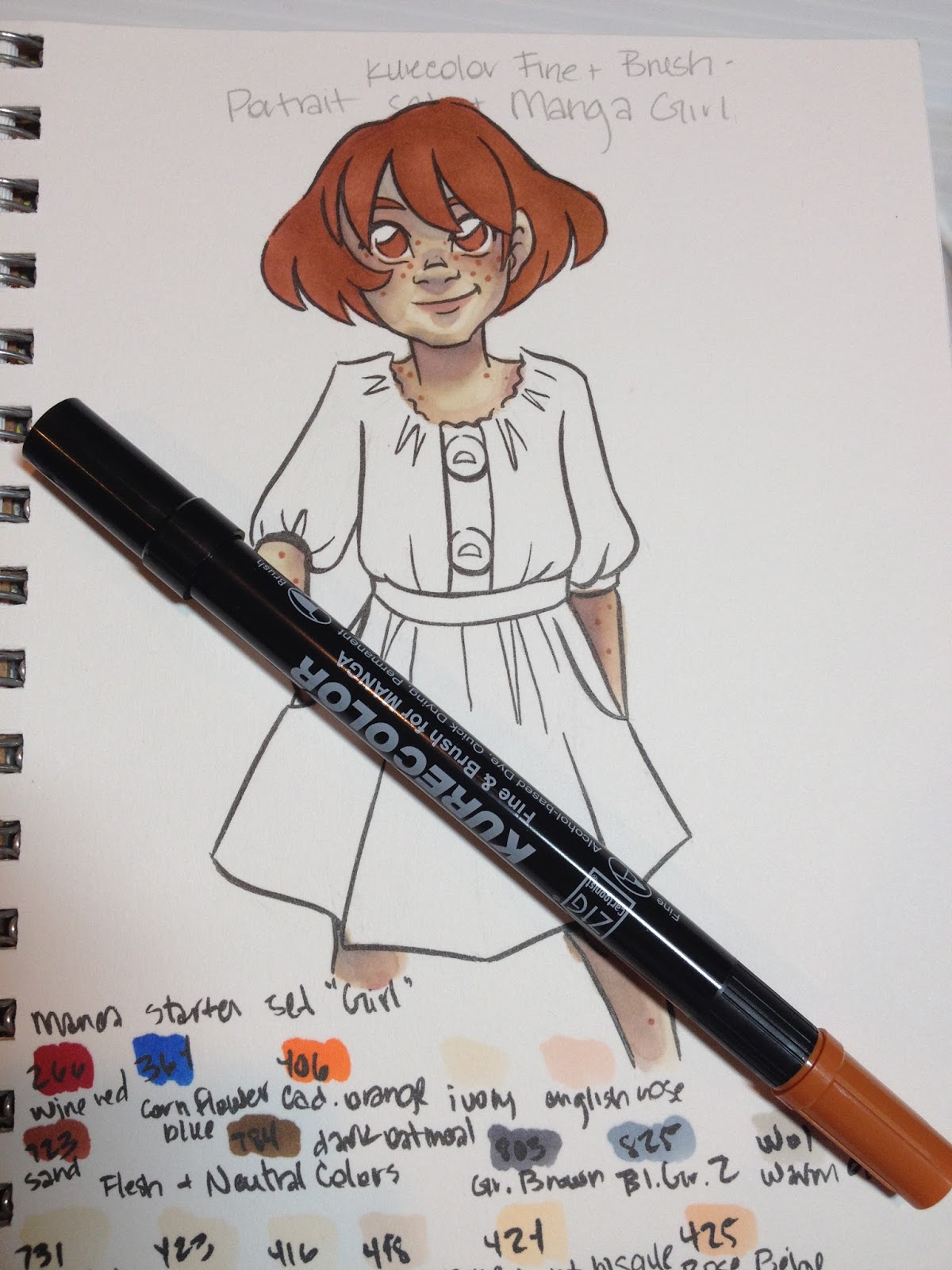
I should have been patient and just allowed the hair and eyes to provide enough visual contnrast, as Kara's red-brown hair is sufficiently different in tone from her freckled skin. These markers can quickly saturate small areas.

Which means it doesn't layer upon itself very well- there isn't much difference between the first layer and the second, which limits how far your markers can go.


I never really built up enough contrast on the hair itself (I suppose I should have left in white highlights, as many artists do) given how limited my color range was. Usually 22 colors should be sufficient for a marker test (more than sufficient, really).
This is the area where I really suffered from sufficient colors, and where the markers' quick saturation was most detrimental, as I really struggled to build up shadows with limited colors in a color family. This was particularly true for the red. I probably could have gone for a orange-red skirt, as I did have an orange, but sadly I didn't think about it at the time.


The Verdict
Given the fact that I've never seen these markers at a brick and mortar store (if you have, let me know where, and I'll add it to the post!), I find it difficult to recommend these markers over brands that are more easily accessible. I found them a bit difficult to control, as they were very prone to bleeding on the Mixed Media paper I tested them on, but I enjoyed using the brush tip and found that it performed quite well. I had difficulty layering colors, and I had trouble selecting appropriate skintones, especially as my order kept getting mixed up. I'd like to revisit these markers at a later date and see if I can wrangle them into submission.
If you do have easy access to these markers, they generally work quite well, especially if you can pick and choose colors that work for your personal rendering style. I found both sets difficult to render with, even when used together, as the colors in one set were too similar to build sufficient contrast, and colors in the other were to disparate to bridge the gap in tones. I should note that I'd purchased a blender marker (I'd actually bought it first, but I don't remember from where), and FORGOT IT AT HOME. I'd had my two new sets shipped to Luling so I could work during winter break, hence some of the unusual (and mostly unmentioned in this post) difficulties I faced, as well as my willingness to give these markers another pass at a later date.
More Information on this product
Zig Kurecolor-Kuretake UK


Comments
Post a Comment