Webcomic Chat 'Education' Illustration Development

Past Webcomic Chat Illustrations:


All three of my WCC illustrations are watercolor, but all three underwent a digital sketching stage, and then digitization for lettering and distribution.
My Art Education topic was inspired by the NATTO Scholarship!

The NATTO Scholarship is a series of small scholarships aimed at helping artists pursue their art education. We're awarding three scholarships- $1000, $500, and $250 to three lucky entrants! You can find out more information about the NATTO scholarship, as well as entry information here.
About Webcomic Chat:

Webcomic Chat is a weekly Twitter chat aimed at discussing webcomic process, promotion, and lifestyle. It's hosted on the WebComic Chat twitter page, and participants are encouraged to use the #webcomicchat hashtag. Volunteers are solicited to submit questions and art, and on occassion, I'm fortunate enough to be picked.
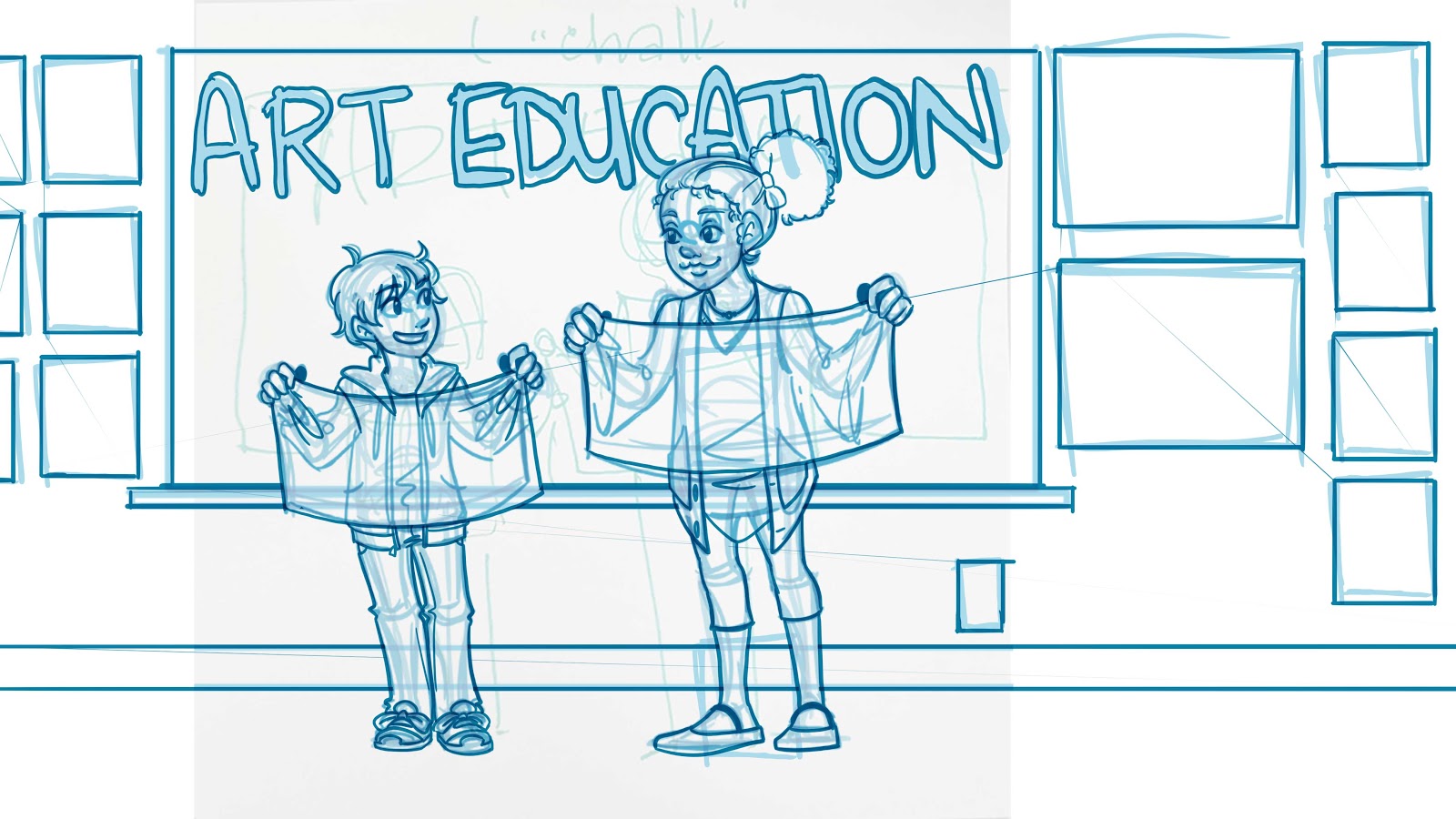
Sketch:

I took a photo of this Post It with my phone, and sent it to my Surface Pro 3. From here, I tightened the sketch digitally in Photoshop.
For some reason, this is often the easiest, and most intuitive way for me to work. I struggle with recreating thumbnails, even the most basic subjects, so being able to import an thumbnail from any surface has really opened up how I work.
These days, I frequently mix traditional and digital steps in my art process. Sketch on a Post It, pencils and tightened roughs digitally in Photoshop, print it out on watercolor paper and paint it traditionally, back to Photoshop for corrections and lettering. It frustrates me that people try to draw harsh demarcations between what is traditionally created art and what is digitally created art, and I feel like this may stifle some artists from producing their best work.

I realized the size requirements had changed from a square to a rectangular format, and this changed the composition a bit. I do prefer the close up to the longshot, but it presented a fun opportunity to decorate the classroom.

Tight Pencils:
Once I completed my digital sketch, I dropped the opacity on my sketch layers, and went over everything with a darker blue to tighten up details.
This step isn't necessary, but it makes it much easier for inking, as I can drop these to blue lines.
Bluelines:

This was printed on Fabriano Studio watercolor paper (I like how it takes ink, and it performs decently for limited layer watercolor applications).
Tight Pencils:


Tight pencils aren't necessary for every artist, but I enjoy using this stage as an opportunity to tighen up facial expressions, tweak hand gestures, and adjust clothing.
When completing tight pencils, I prefer to use a .7 mechanical pencil with HB lead.
Inks:
Materials:
Sakura FB brushpen
Sakura Graphic and Calligraphy pens, using Pigma ink (these will be waterproof)


I left the phrase 'Art Education' uninked, since I want to imitate chalk on a chalkboard, and thought the inked outline would be too harsh. As stretching the watercolor paper will remove the blue guidelines, I penciled Art Education onto the chalk board, so it would remain visible.


Here's the cleaned digital scan. I try to make it a point to remember to stop and scan my lineart inks before painting, so I have the option to use it as a digital piece, or can offer it as a lineart on my Gumroad.
When inking the border, my hand slipped. This is something that can't be corrected with traditional media until after I've watercolored the piece- if it can be corrected at all.
Watercolor:
Stretching the Page

Toning and Beginning the Background (large forms)

This is mainly just to give the piece an overall base color. .In this instance, I went with a light wash of warm yellow.
Applying Masking Liquid

Materials:
Clean Water
Masking Fluid (Winsor and Newton Colorless Masking Fluid)
Synthetic Brush
Brush Soap
My preferred masking liquid is Winsor and Newton Colorless Masking Fluid, but every artist seems to have their preference. If you're struggling to find one that works for you, don't lose hope- there are many on the market, and not all play nicely with every watercolor paper.
Painting the Chalkboard


Once I've achieved the color depth I'm looking for, and the paper has fully dried, I use a masking fluid eraser to pick up the masking fluid. For best success with masking fluid, I find it best to remove it as soon as possible- this fluid sat on the page for only a couple days.
Toning the Letters
I felt like the letters were a little too white, and needed some variation to look like chalk. I planned on adding opaque white/white watercolor pencil later on to add highlights back in, so I went ahead and glazed some blue grey over Art Education.


Rendering the Characters:


Adding Environmental Details:
Once most of the illustration has been completed, I start adding in small environmental details. Since this is an art classroom, I have an opportunity to create mi nature works of art. The goal is to make pieces that could feel like they were made by young students.


Scanning and Color Correction:
I scan using a large format Epson scanner- quite a pricey investment that has served me well over the years. I scan at 600DPI as it better picks up the nuances of watercolor. I've found my scanner isn't quite perfect- it tends to desaturate originals, and sometimes colors will skew, so once the piece is scanned, I open it up in Photoshop for color correction.

Color correction can vary piece to piece, but generally I'll do a little tweaking in Hue and Saturation (generally just changing the hue to be a bit warmer, since my Epson tends to be a bit cool). After Hue and Saturation, I'll duplicate my scan layer, set the duplicate to multiply, and then knock it down until it matches the original.
Please note: Both my work monitors have been color calibrated.
Lettering is also done in Photoshop. I'm a big fan of Blambot's comic fonts- the font used here is Letteromatic. Blambot has a lot of free to use fonts for indie and web creators, so if you're having trouble with your lettering, I highly recommend you check them out!


Comments
Post a Comment