Watercolor Basics: Step by Step: Rendering
Now that we've introduced the basics of Watercolor Basics, it's time to take you step by step through some of the most common processes for completing a watercolor illustration. I'm going to take you from start to finish through my 2016 Christmas card illustration, explaining my techniques as I go. I have a series of video tutorials recorded concurrently that should be available on my Youtube channel soon, if you need some live action explanation.

If you enjoy this series, if you have learned something, or if I have inspired you in some way, please take a moment to share this, or any post, with your friends and familiy on your favorite social networking platform. There are handy sharing buttons below this post. If you enjoy art education content, and would like to be part of the process, please visit my Patreon for information on how to join the artnerd community. Backers get early access to popular series, backer exclusive content, and voting rights on upcoming content.
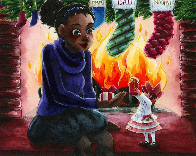
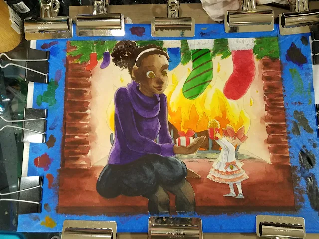
When we've finished these tutorials, this is what the finished illustration will look like! This image was designed and used for my Christmas 2016 cards sent out to friends, family, and Patrons.
This image features Naomi and Kara from my children's watercolor comic, 7" Kara. If you enjoy this blog, and enjoy my art, I highly recommend you order a copy through my shop!
Previously, I showed you guys how to block your illustration in (link)
In this tutorial, I'm going to demonstrate several methods I use to render a watercolor illustration. This is the stage that takes the longest, and requires the most experience. I highly recommend you watch the accompanying video for step by step explanations. This post will gloss over the topic to give you an overview.
Materials Used in this Tutorial:
Watercolors of your choice (I use Winsor and Newton moist half pans, Daniel Smith, SoHo, and Holbein watercolors)
Daisy watercolor wells or palette of choice- For mixing large amounts of color
Deep welled watercolor palette- I used a recycled mochi ice cream carton
Watercolor brushes (I use mainly rounds)
2 watercolor cups- 1 clean, 1 dirty- I like the Faber-Castell collapsible cups
Paper towels
Paper used:
Canson Moulin du Roy
Watercolor Brushes Used in this Tutorial:
Step 1


Step 2: Continue to work on developing colors and layers in the background


Step 3: Work on non-adjacent areas while paint dries.


Step 4: When too many adjacent areas are wet, take a break to let everything dry.

 Painting White

Step 4: As layers dry, continue to add detail, blending out with clean water.

And add another layer of skintone, leaving a rim of unpainted skin closest to the fire, to indicate light.


I want Naomi's stockings to read as sheer fabric, so I painted several layers of skintone (and even blush) before adding a layer of Payne's gray mixed with black, heavily diluted with water.


Step 5: I continue to build up layers until things 'feel' right.

I realize this isn't very descriptive, but it's something you develop over time. In 7" Kara Volume 1, my watercolors in Chapter 1 are far less rendered, and have far fewer layers of watercolor, than Chapter 4, and Chapter 4 is less sophisticated in terms of how the watercolor is handled than pages from Chapter 7. Check out the end of this post for those examples, or order your copy of 7" Kara, Volume 1 today and see for yourself!


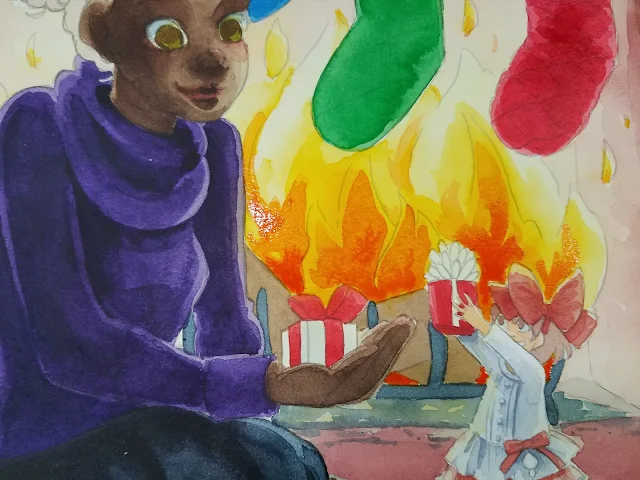


When you're nearing the end of rendering, you can add your darker layers of color- like Naomi's hair, skirt, and sweater. Adding these saturated colors early on may lead to bleeding when adjacent areas are filled.
Step: Allow your watercolors to dry overnight before applying shadows for best results


 For more beautiful watercolor work, why not pick up a copy of 7" Kara, Volume 1? 7" Kara is a lush watercolor comic the entire family can enjoy, following the adventures of tiny Kara as she discovers humans, explores the backyard, and befriends a kitten. Created by Becca Hillburn, if you enjoy this blog and my art, you'll love 7" Kara. Volume 1 is available in the Natto-shop.

If you enjoy this series, if you have learned something, or if I have inspired you in some way, please take a moment to share this, or any post, with your friends and familiy on your favorite social networking platform. There are handy sharing buttons below this post. If you enjoy art education content, and would like to be part of the process, please visit my Patreon for information on how to join the artnerd community. Backers get early access to popular series, backer exclusive content, and voting rights on upcoming content.

When we've finished these tutorials, this is what the finished illustration will look like! This image was designed and used for my Christmas 2016 cards sent out to friends, family, and Patrons.
This image features Naomi and Kara from my children's watercolor comic, 7" Kara. If you enjoy this blog, and enjoy my art, I highly recommend you order a copy through my shop!
Previously, I showed you guys how to block your illustration in (link)
In this tutorial, I'm going to demonstrate several methods I use to render a watercolor illustration. This is the stage that takes the longest, and requires the most experience. I highly recommend you watch the accompanying video for step by step explanations. This post will gloss over the topic to give you an overview.
Materials Used in this Tutorial:
Watercolors of your choice (I use Winsor and Newton moist half pans, Daniel Smith, SoHo, and Holbein watercolors)
Daisy watercolor wells or palette of choice- For mixing large amounts of color
Deep welled watercolor palette- I used a recycled mochi ice cream carton
Watercolor brushes (I use mainly rounds)
2 watercolor cups- 1 clean, 1 dirty- I like the Faber-Castell collapsible cups
Paper towels
Paper used:
Canson Moulin du Roy
Watercolor Brushes Used in this Tutorial:
- For rounds larger than 6, I use synthetic brushes. Your preferences may vary from mine- I have several brands, and still have not found a brand I think perform as well as natural hair brushes. Synthetic brushes are much cheaper than natural hair brushes, especially at larger sizes, and are useful for blocking in color, as we will be doing in this tutorial.
- Creative Mark Rhapsody Kolinsky Sable Brushes- 4, 2, 1, 0
- Creative Mark Squirrel Brushes- 4, 6
- Blick Master Studio Squirrel- 4, 6
Step 1

Working quickly and wet into wet, I apply a layer of mixed brick red. While that is still wet, I dab in brown and carbon black.


Watercolor always dries lighter and less saturated than when it is applied, so you may have to apply multiple layers to get the depth of color you want. As you progress through the painting, you can mix your paints thicker and work with more saturated colors, but it's important to start out light, especially if you're new to watercolor.


At this stage, it's time to add blush to Naomi's skin. I like adding blush to darker skintones at various stages of the process- right after the overall tone has been applied, in between layers of skintone, and at the end of the rendering process. I feel that this helps me develop believable skintones. If this doesn't make sense, fear not- I have a tutorial for watercoloring darker skintones coming up, and I cover this in detail in the video tutorial for this image.

I allowed my piece to dry for several hours, and returned when the piece was not only dry to the touch, but no longer cool to the touch.
For Naomi's skirt, I wanted to create the impression of black fabric. To do that, you don't begin with black- black is the last color you add. You begin with an indigo, a purple, or a Payne's gray.
Painting Black
Step 1: Tone with a lighter color, in this example, Payne's Gray.
Step 2: Gradually build up your layers of color to black, saving black for last.


For large areas, you should avoid leaving the paper its natural white. Instead, you want to go for the illusion of white, and white objects do have areas of shadow where the 'white' is darker. For the shadow on Kara's shirt, I used a very light mixture of Holbein's neutral tint, violet, and a little Payne's gray, and slowly built the color up layer after layer.

Step 4: As layers dry, continue to add detail, blending out with clean water.
At this stage, I also darken the blush on Naomi's cheeks, as well as her lips.

And add another layer of skintone, leaving a rim of unpainted skin closest to the fire, to indicate light.


I want Naomi's stockings to read as sheer fabric, so I painted several layers of skintone (and even blush) before adding a layer of Payne's gray mixed with black, heavily diluted with water.


Step 5: I continue to build up layers until things 'feel' right.


When you're nearing the end of rendering, you can add your darker layers of color- like Naomi's hair, skirt, and sweater. Adding these saturated colors early on may lead to bleeding when adjacent areas are filled.
Step: Allow your watercolors to dry overnight before applying shadows for best results

Examples


Left: Page from Chapter 1. Right Page from Chapter 4


Left: Page from Chapter 4. Right: Page from Chapter 6.
Notes:
Coming up next: Adding Shadows
- If you have any questions, or would like to see something specific demonstrated, please email me using the form in the left hand sidebar.
- Be patient- rendering takes time and taste- so allow your paper time to dry
- Every painting has an ugly stage- and that's ok! Learn to push past the ugly, try not to be discouraged!
- Higher quality papers, and cold press papers, can take more layers of watercolor than cheaper papers
Coming up next: Adding Shadows


Comments
Post a Comment