Watercolor Basics: Adding Details and Finishing Touches
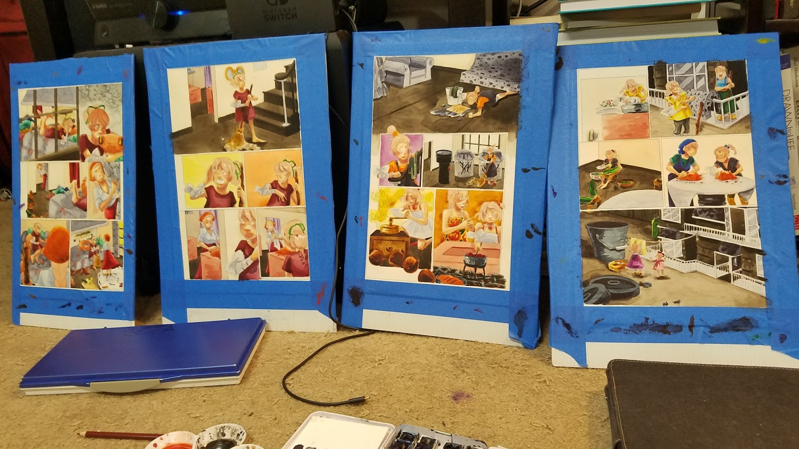
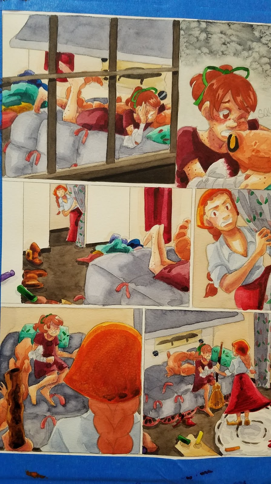
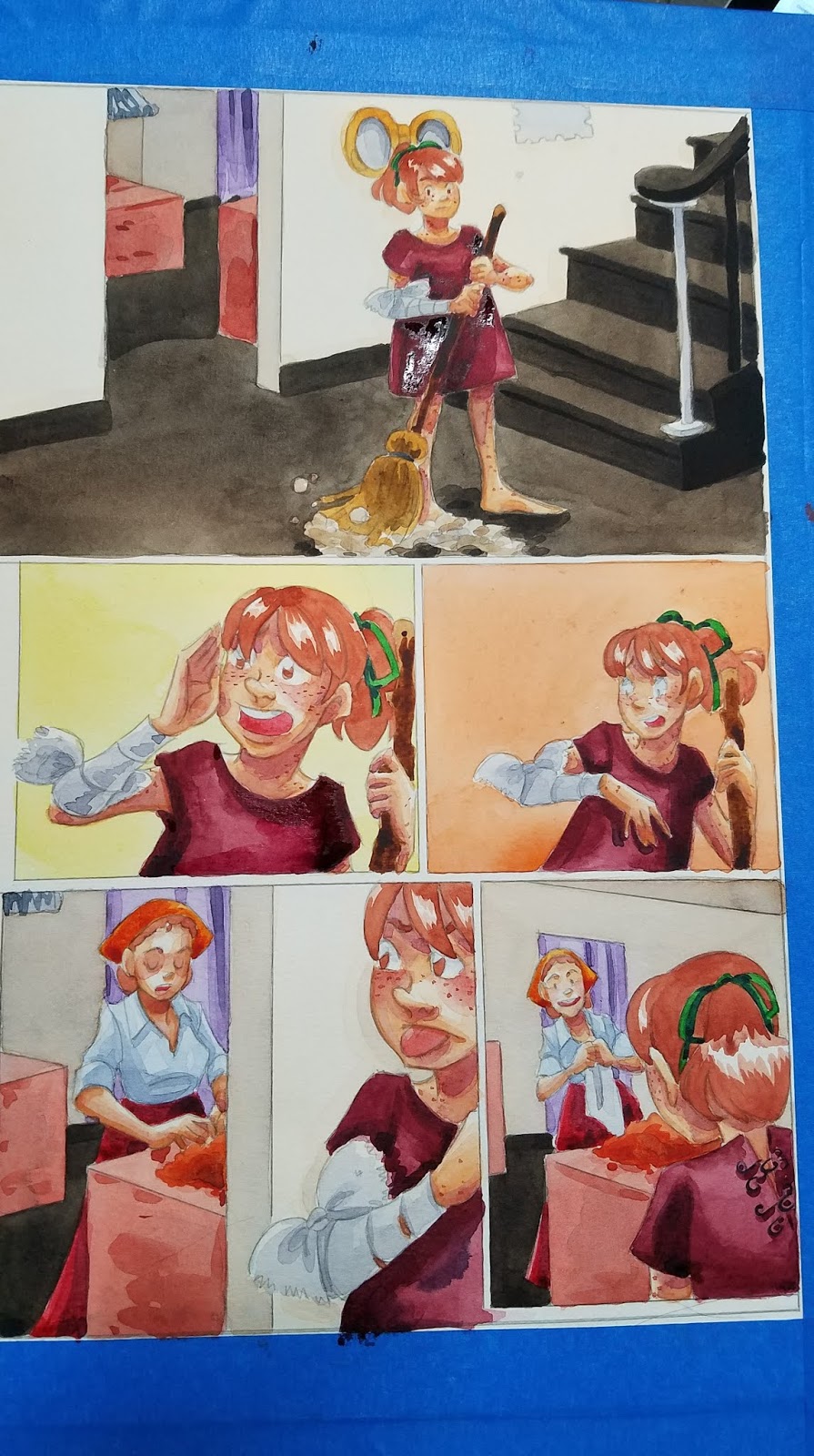
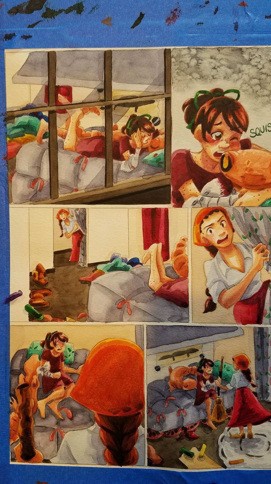
I realize this a little out of the order of operations- we've talked about stitching together spreads, lettering our comics, and dived in to color correction, so it's probably a little strange to return to in progress, stretched pages. I'm currently working on painting Chapter 8 of 7" Kara, and had the opportunity to cover some lost ground.
This is often the stage that really trips people up, mostly because they try to begin it way too early, adding details while they're still applying glazes and shadows. Any heavy application of watercolor paint will be prone to bleeding, reactivation, and running, and while applying a glaze over such an area CAN yield interesting effects, it's often the cause of much frustration for watercolor artists and illustrators.
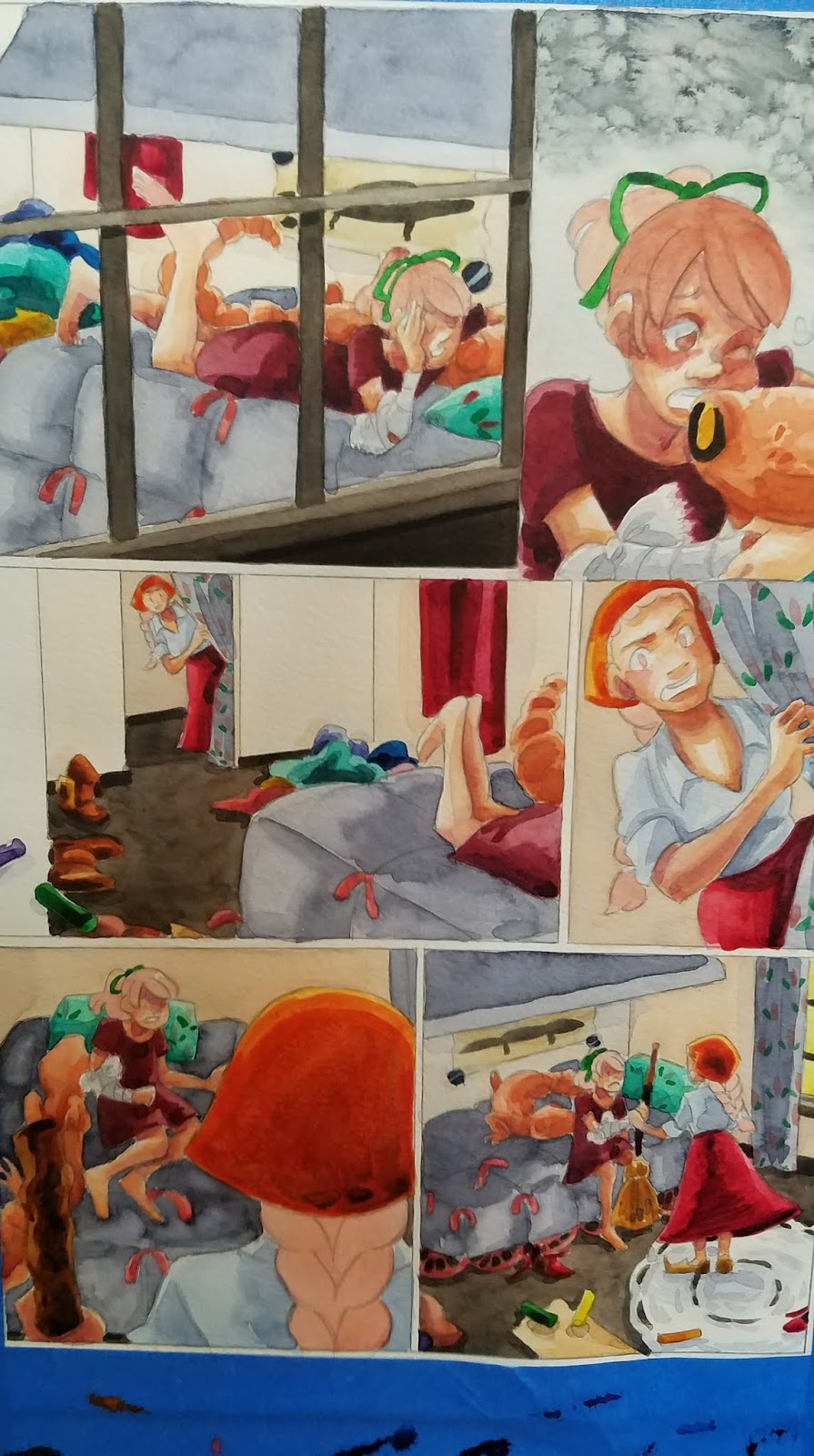
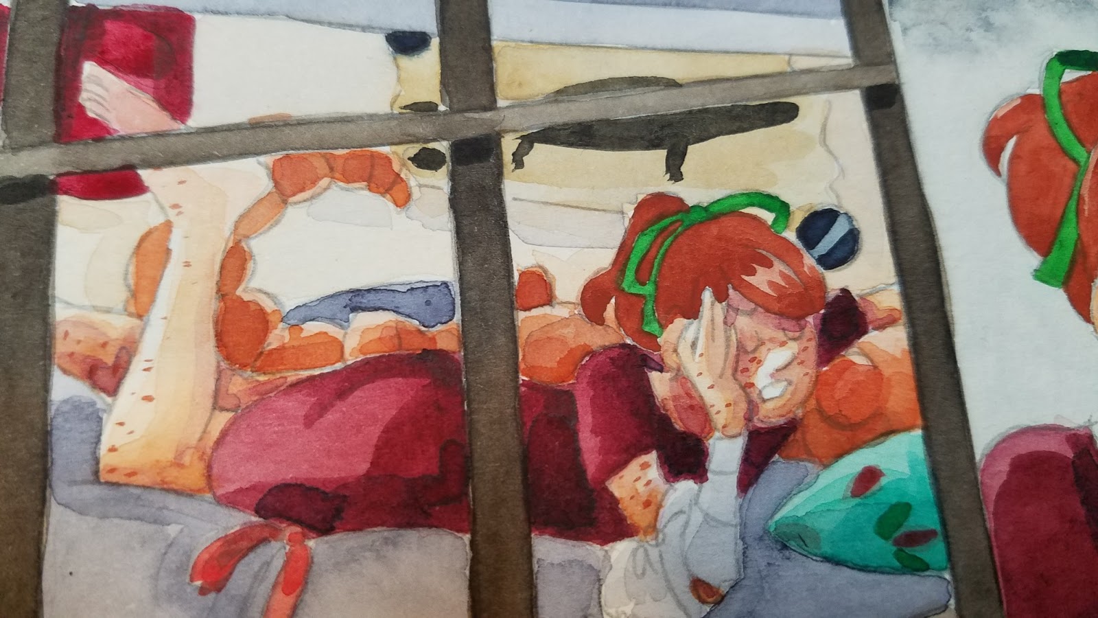
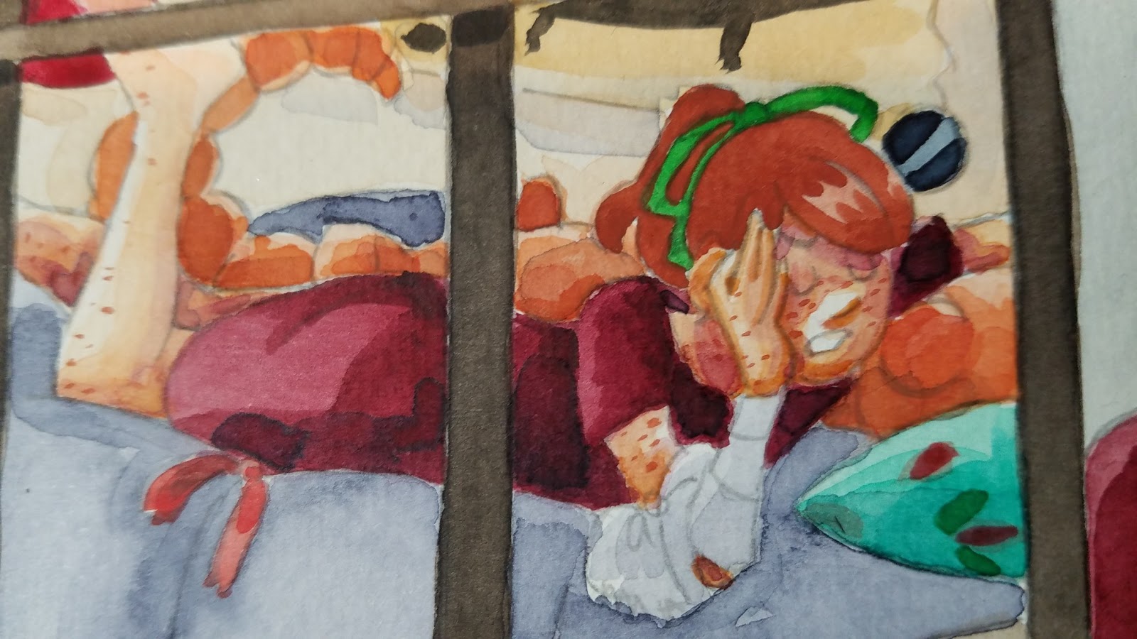
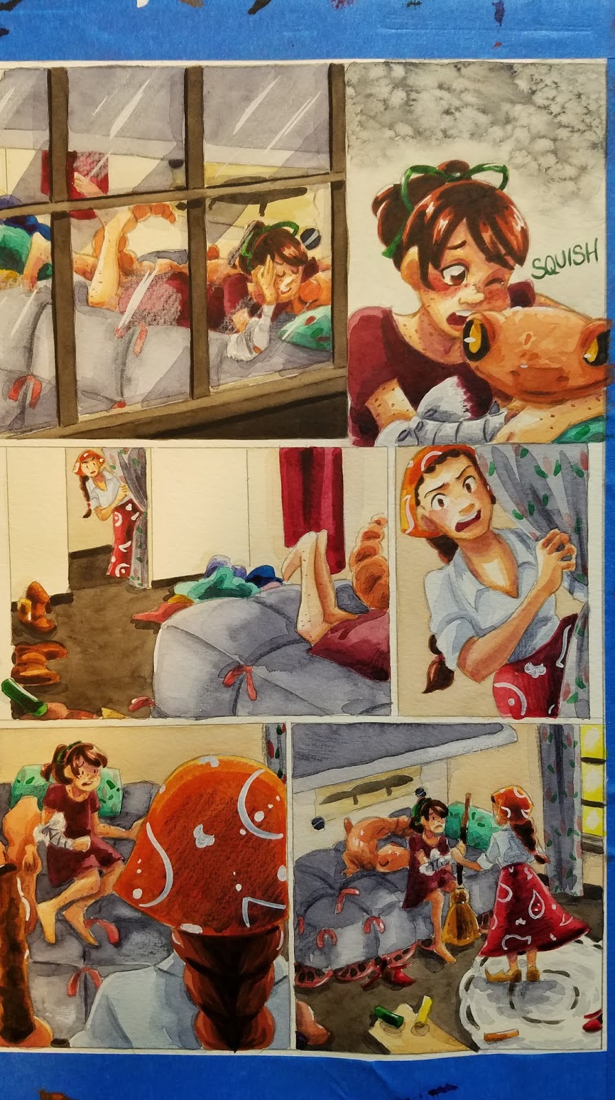
Skin shadows have been added, as well as a general application of my preferred shadow color (Holbein's Neutral Tint, Holbein's Neutral Tint mixed with a dioxine purple).

This is the stage where I start thinking about refining details, working with thick applications of color, using gouache and watercolor pencils. Its the stage where I really have an opportunity to build up contrast, and the stage when the page finally starts to come together.


Much of painting a watercolor comic is simply painting by numbers- mainly fills- but this is an opportunity to use brushwork to add distinctive touches.
Building Up Hair:

I usually do hair in three or so stages- the base color (excluding white highlights), a midtone, and the shadows.
Base Color:


Adding the First Midtone:


Adding the Second Midtone:


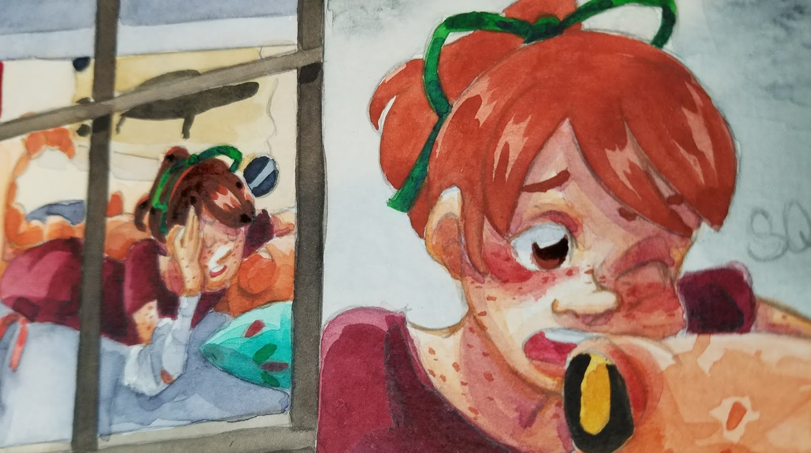
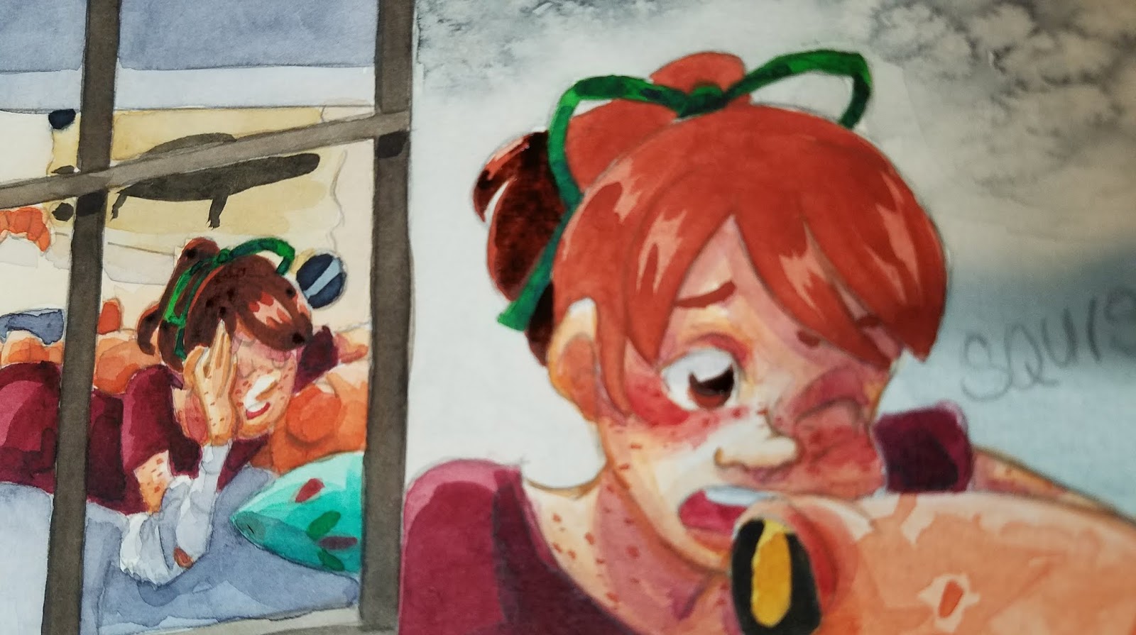


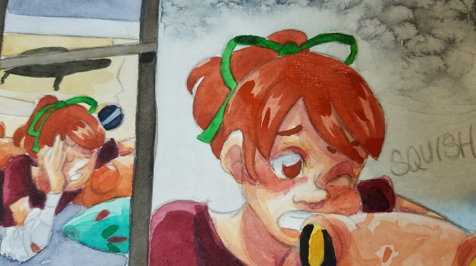
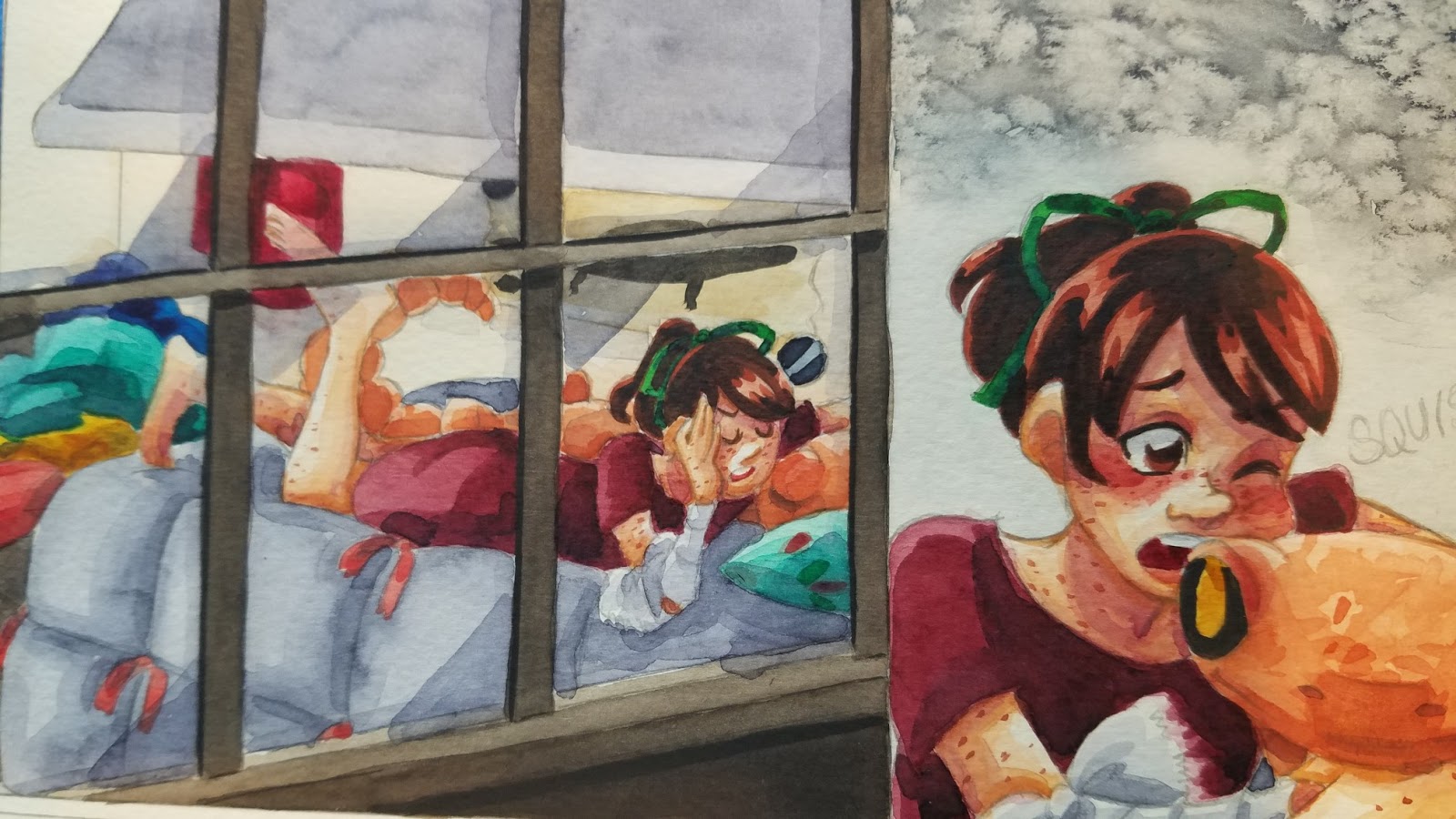
Adding Freckles:
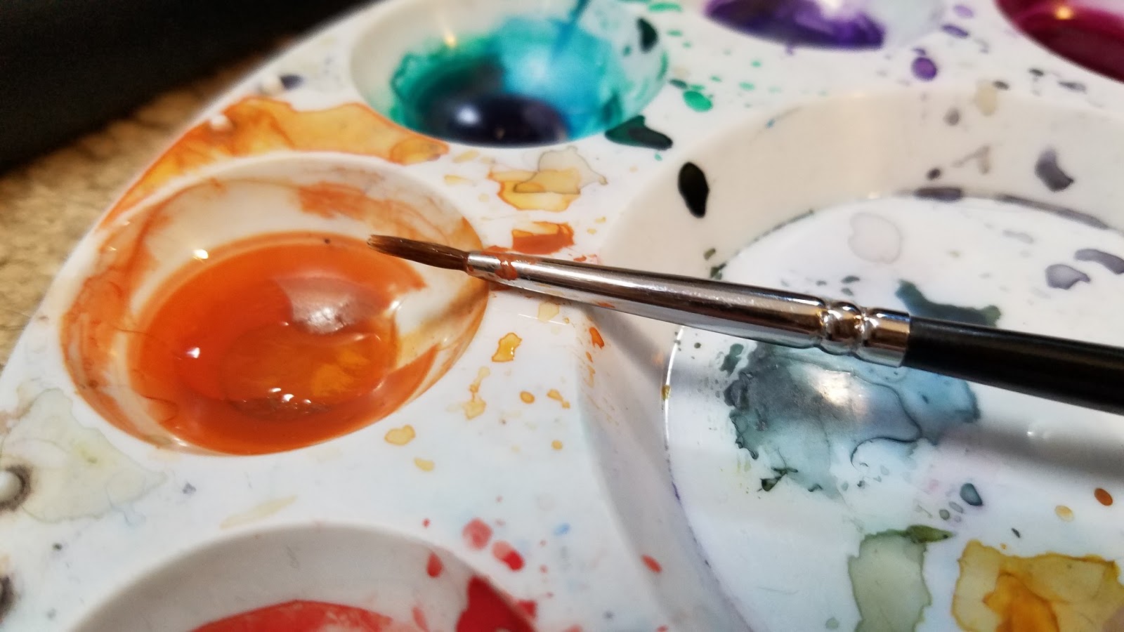
For very fine details, such as eyelashes and freckles, or for delineating forms, I use a size 0 Creative Mark Rhapsody Brush.

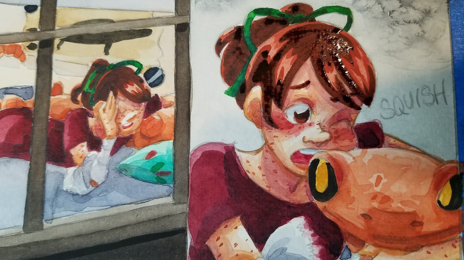
'Inking'- Tightening Up Forms
Using dehydrated or very concentrated watercolor

Particularly useful on skin, especially to cover graphite lines, or help the graphite blend in better.
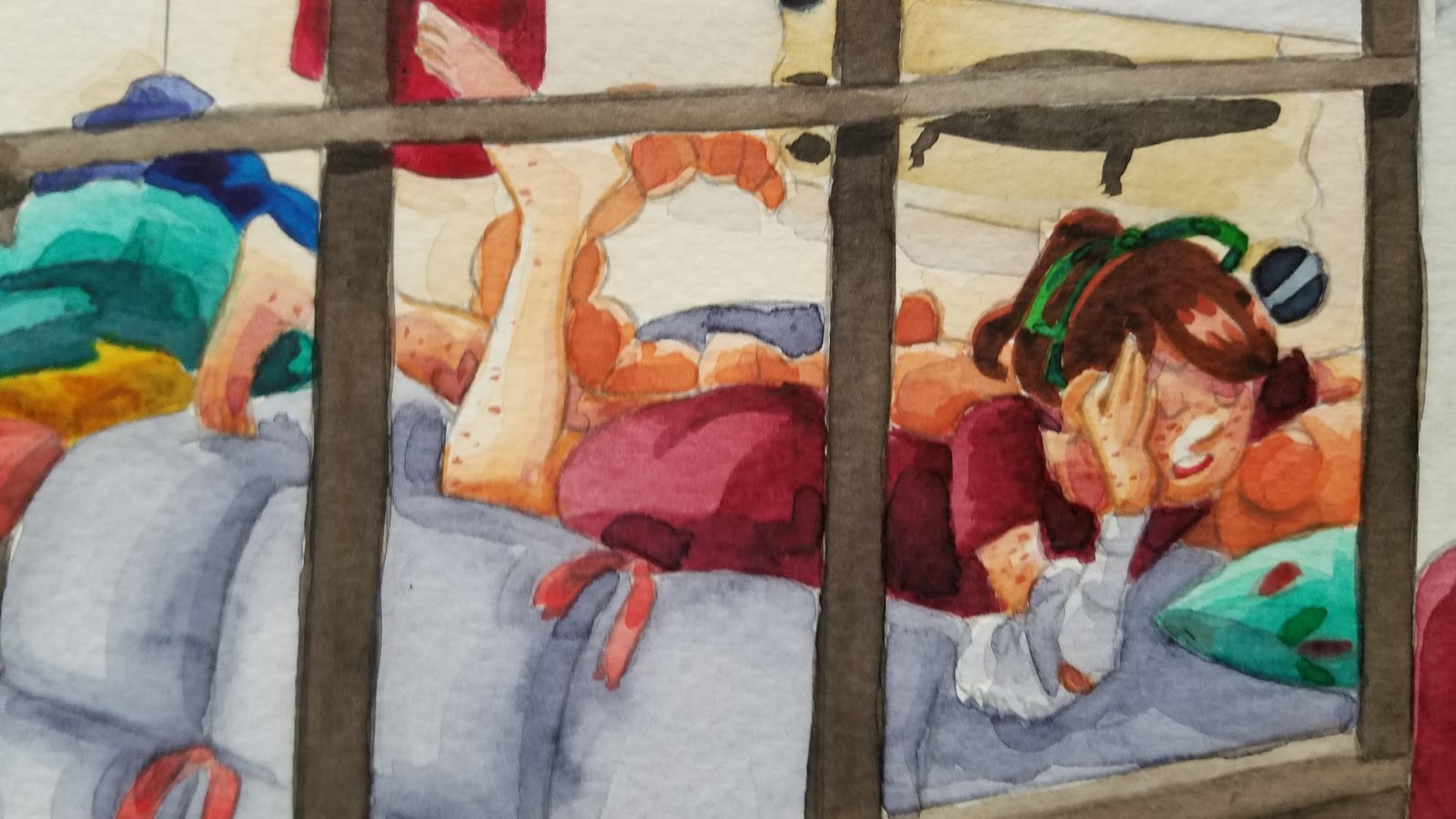
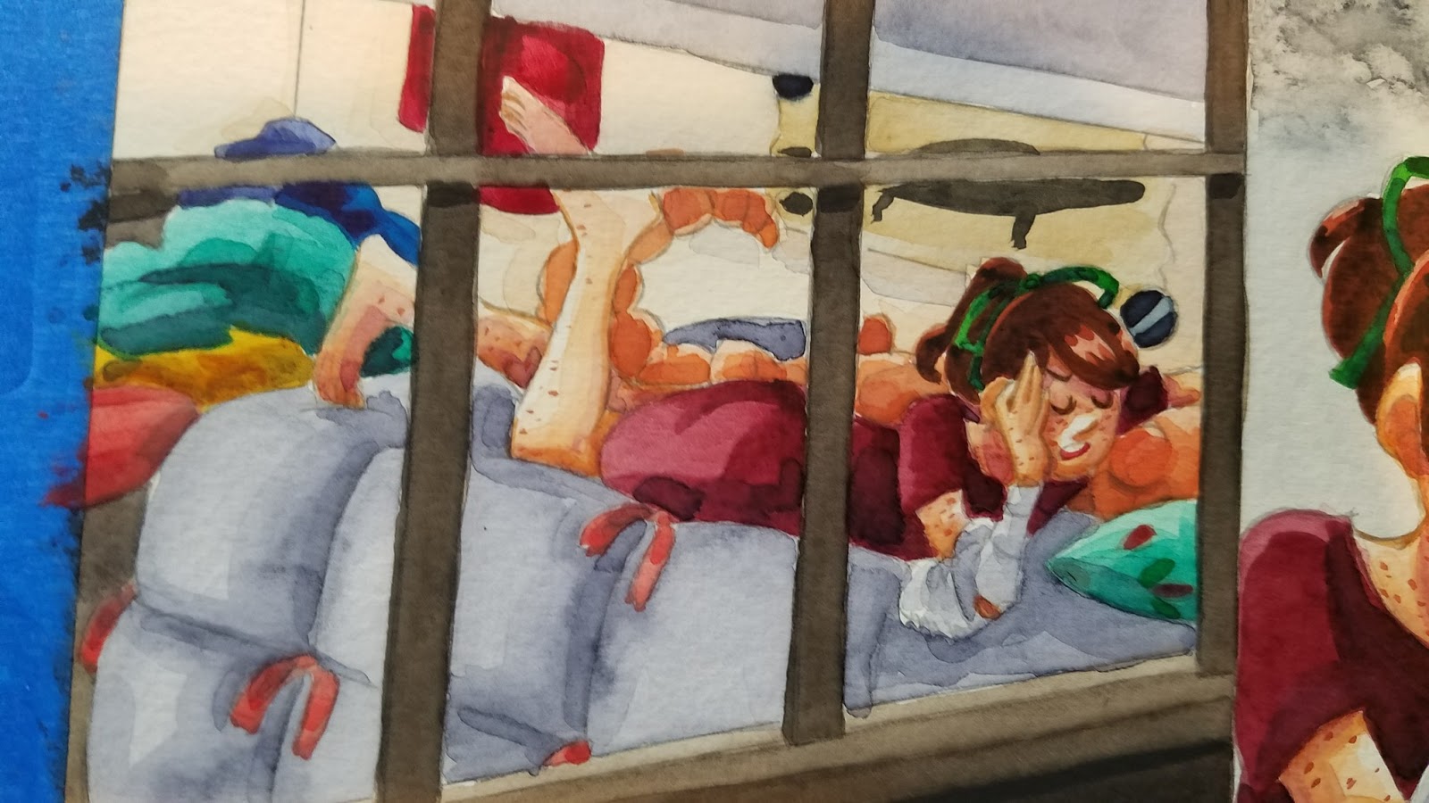
Before 'inking'
After 'inking'


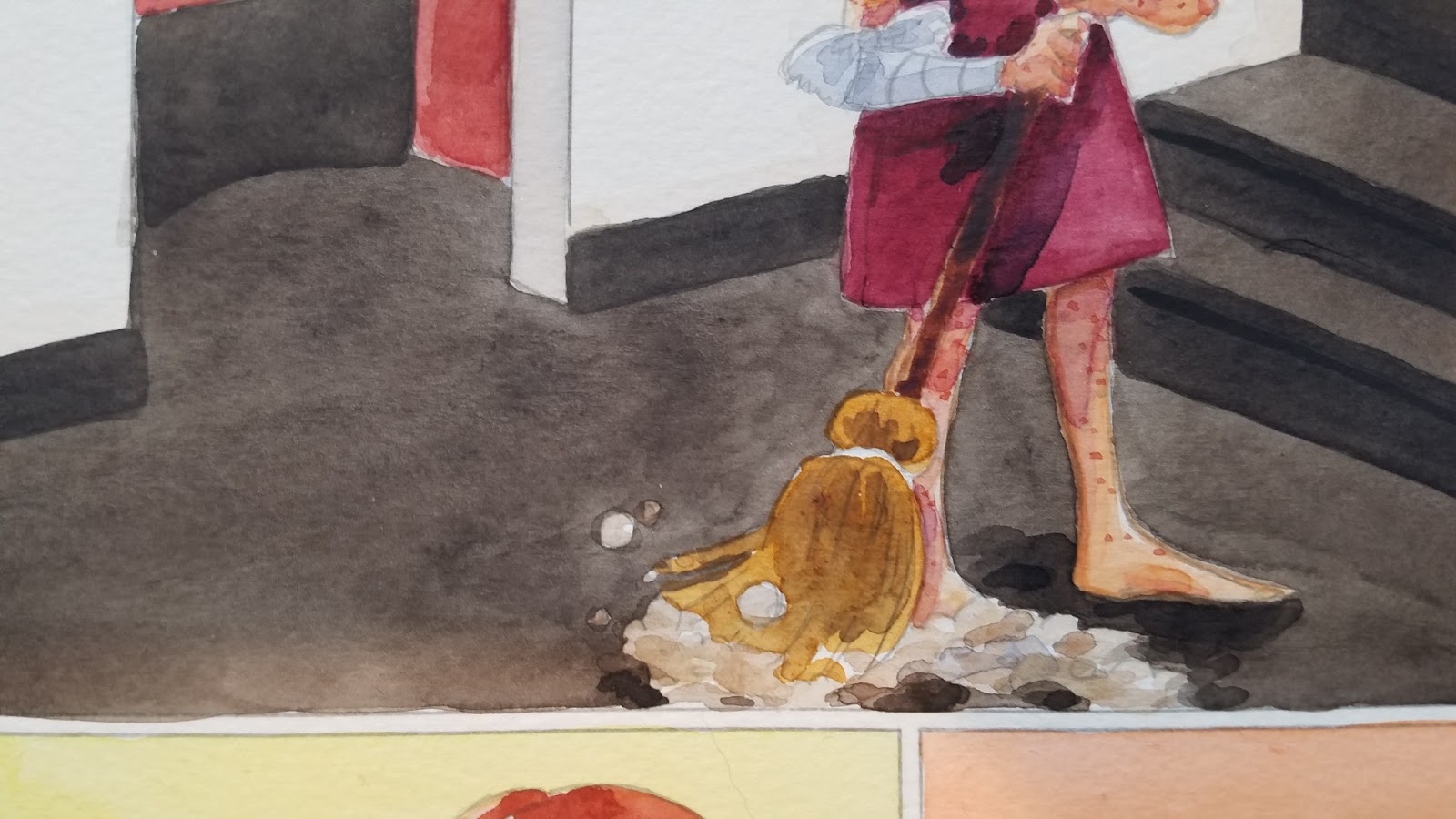
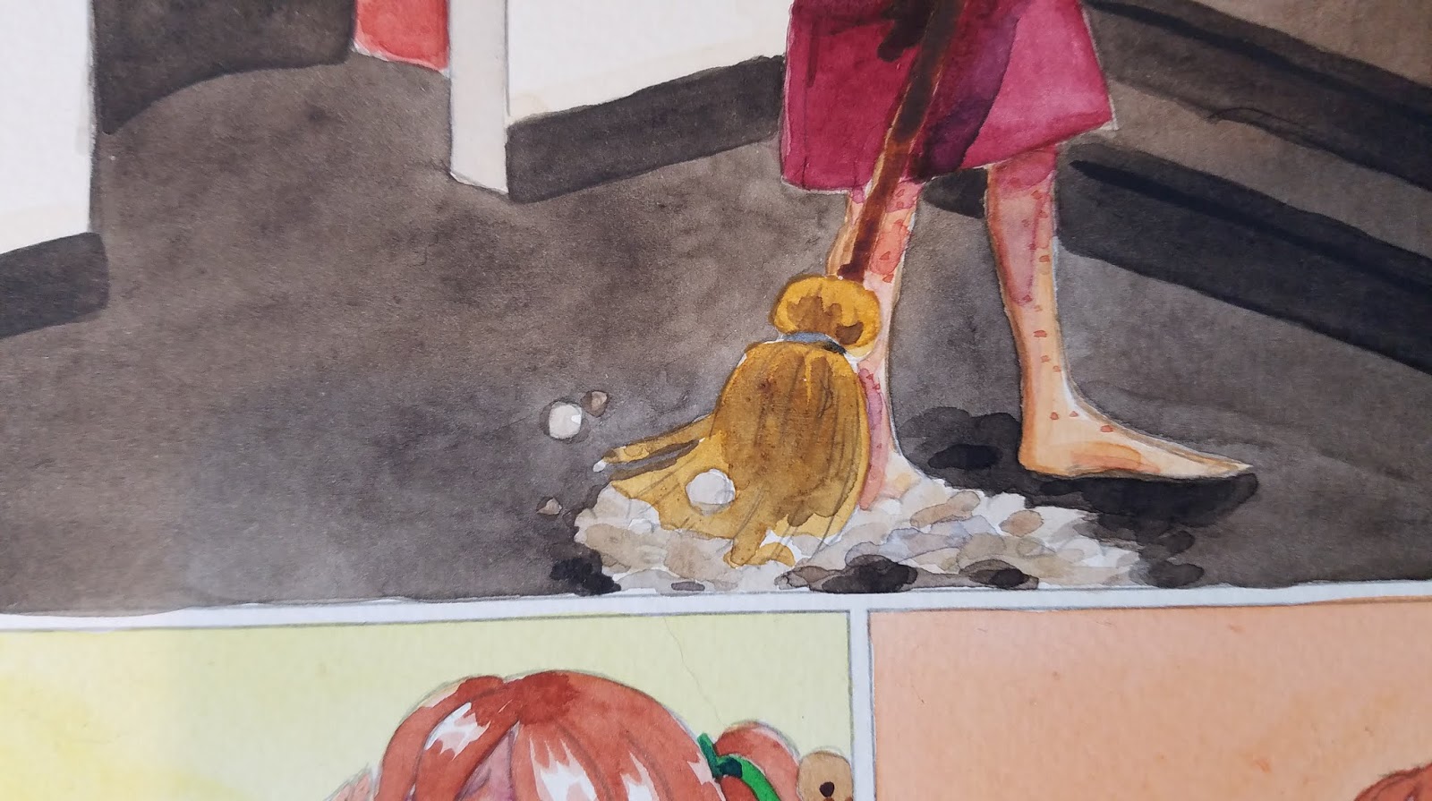
Filling In Tight Areas:
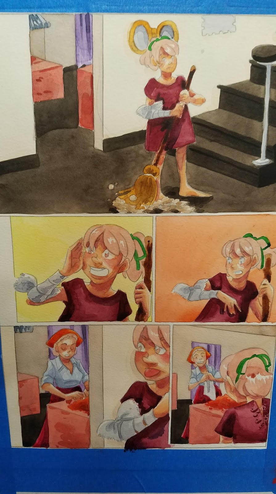
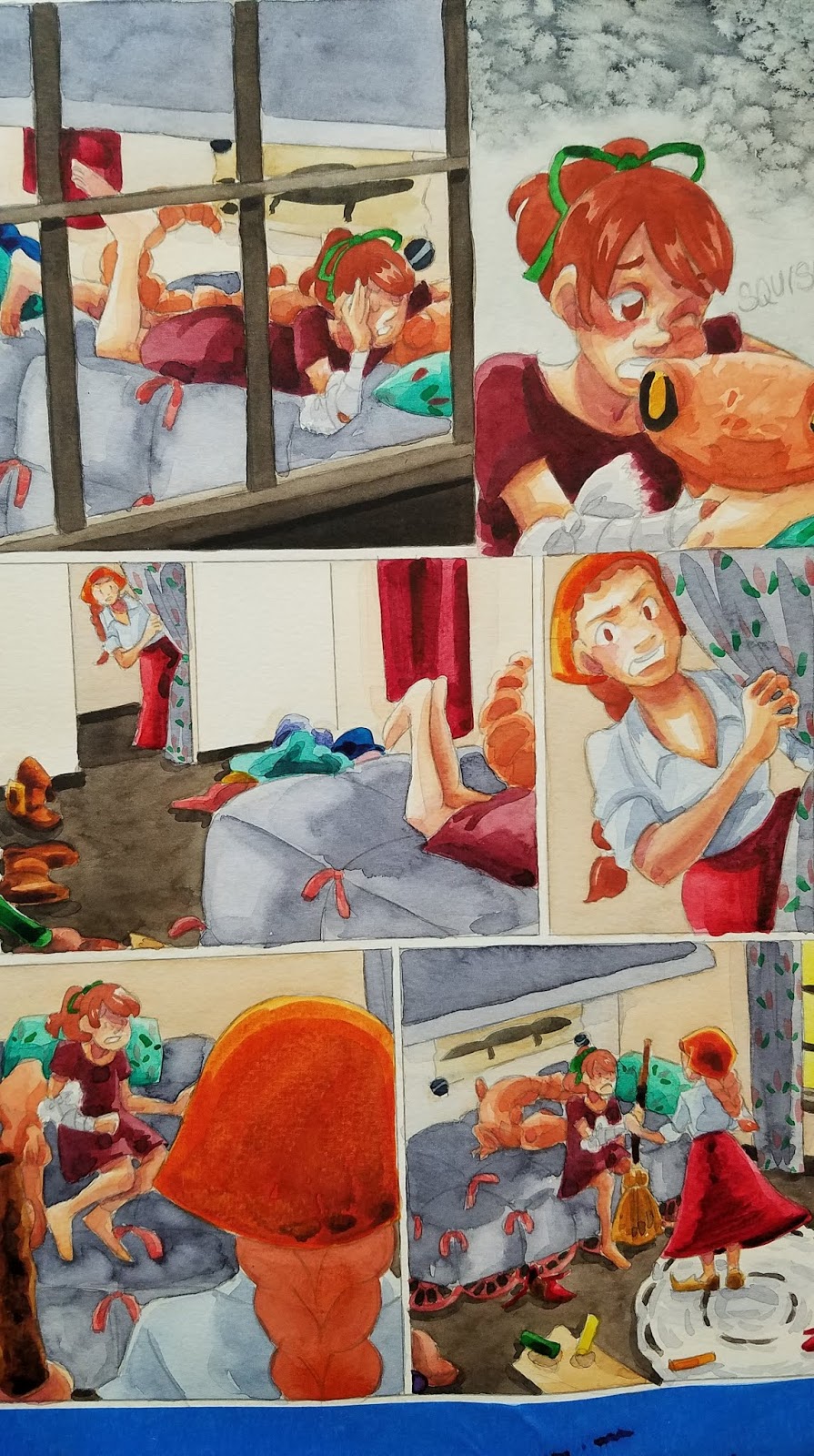
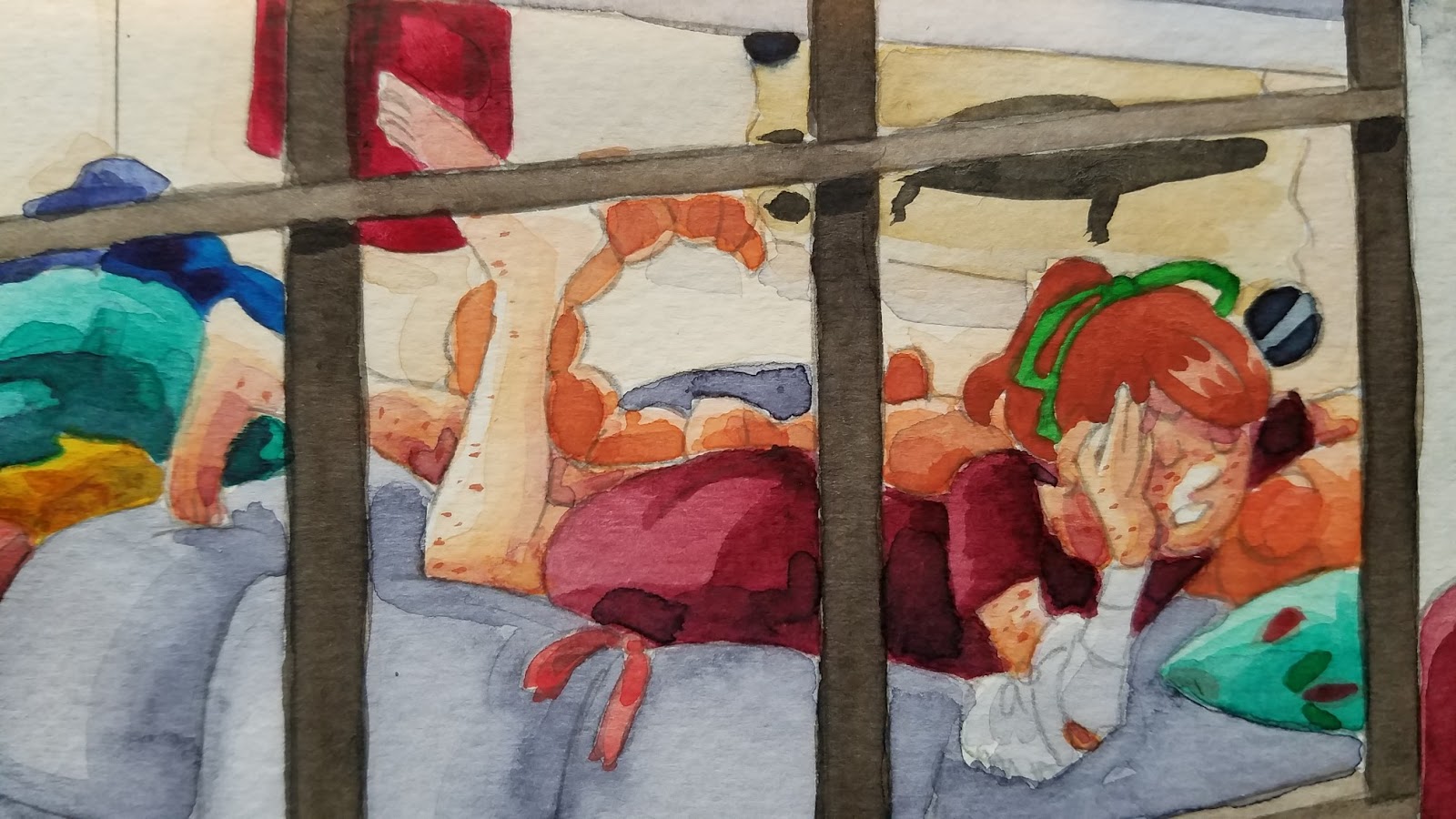
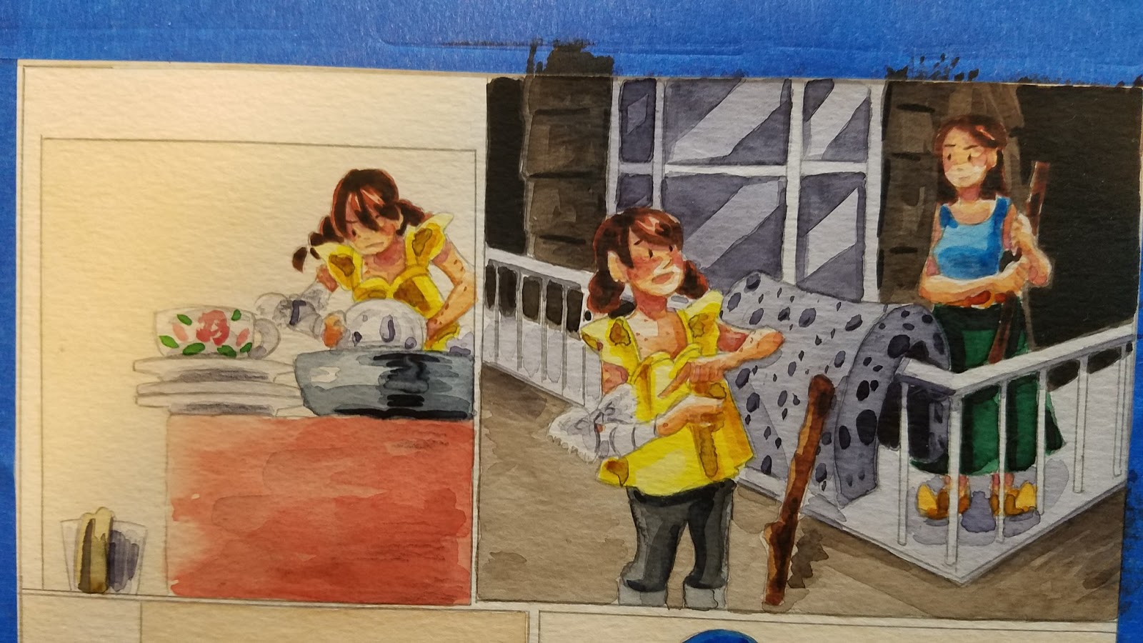
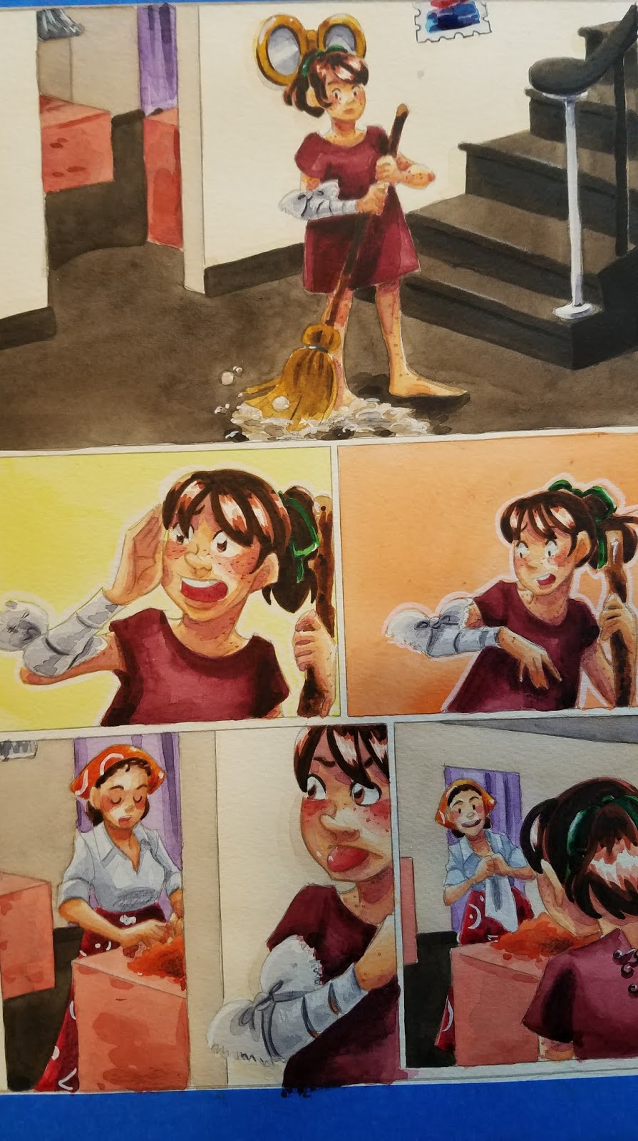
These are usually reserved until the main area has been painted, as often washes will reactivate heavier applications of paint, and the area would have to be repainted anyway. In this example, I left the band on the broom white until the straw had been rendered.

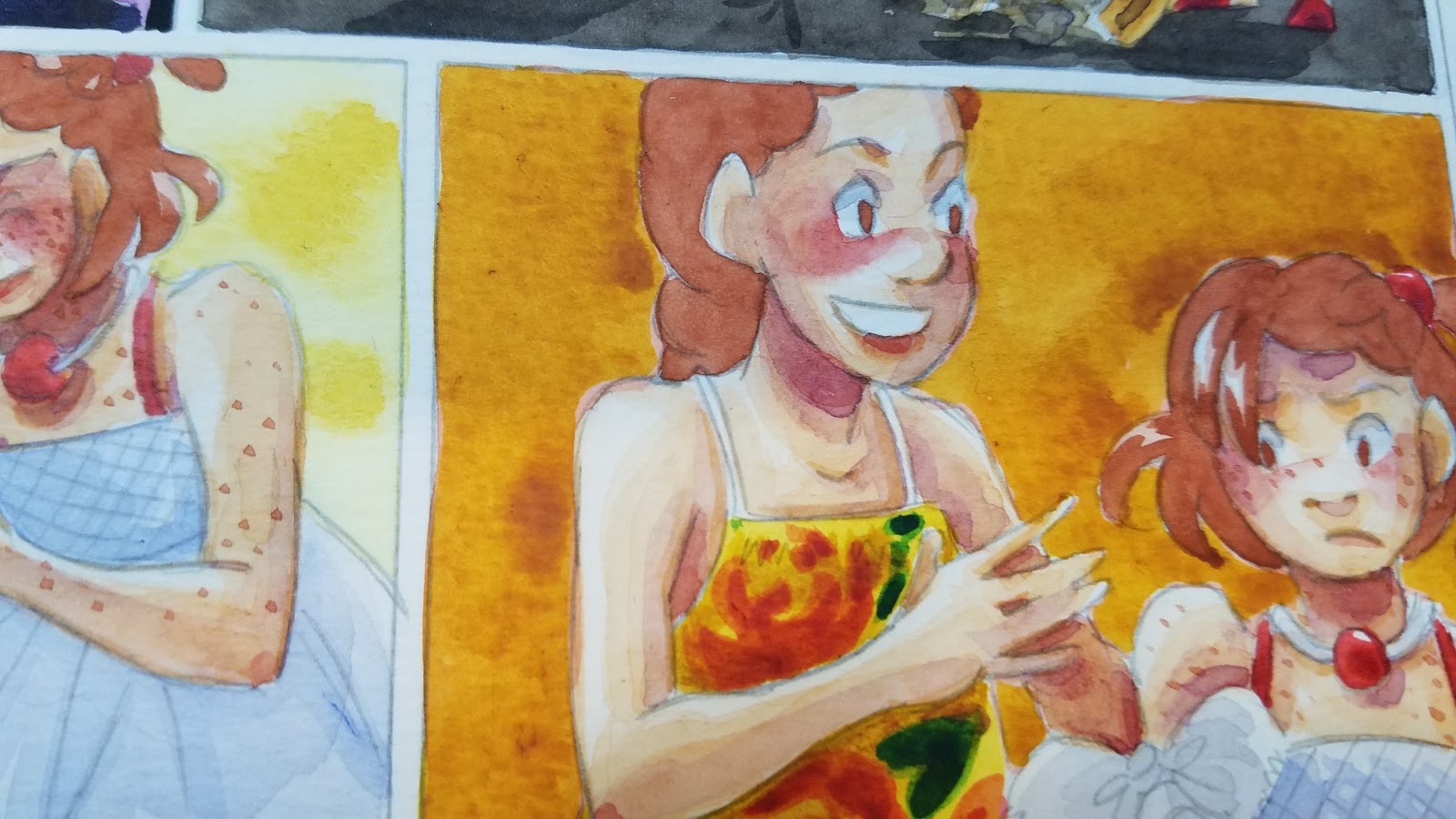
And in this example, I left the straps of her dress white until the skin had been painted.


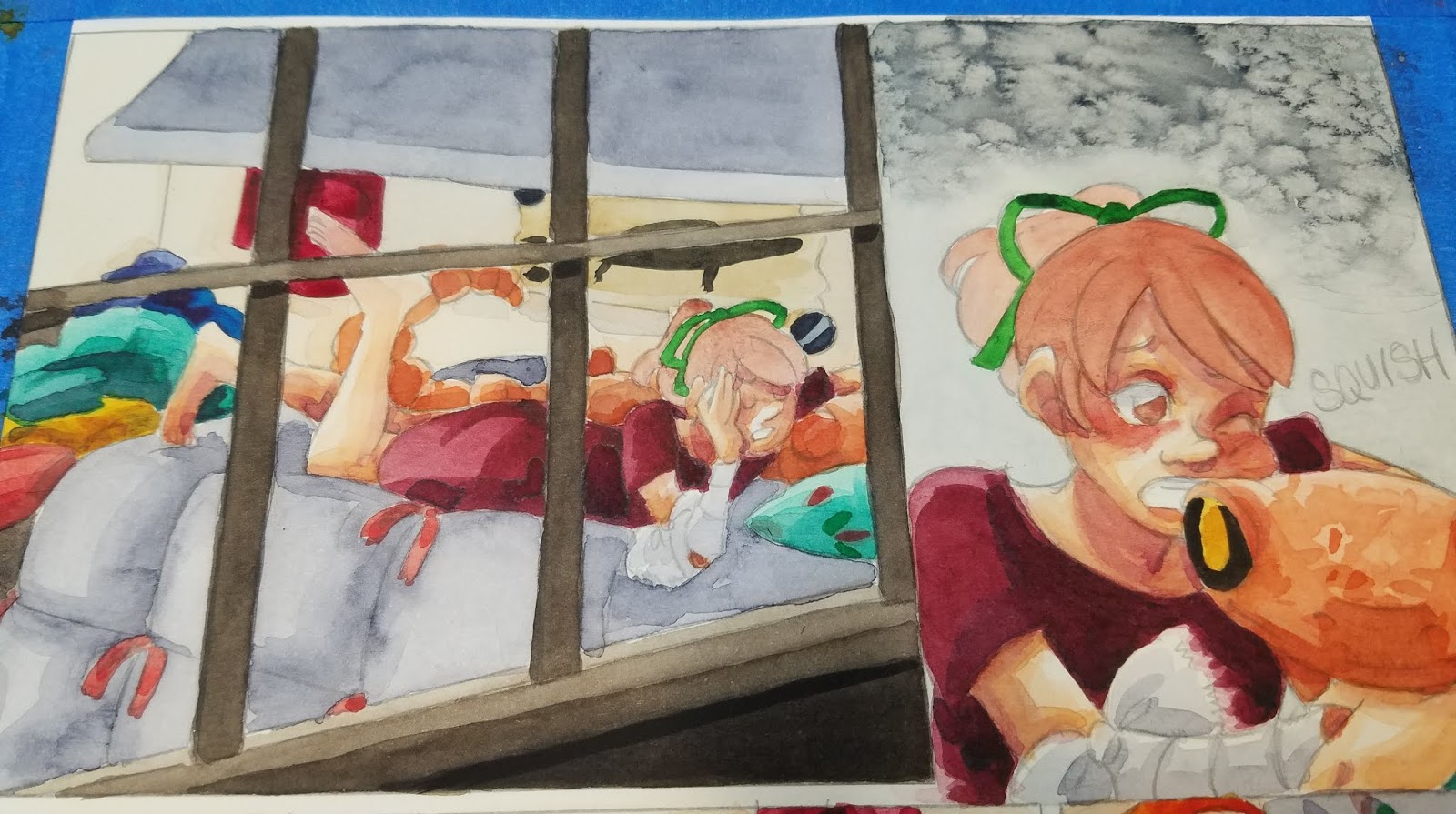
Adding Cast Shadows
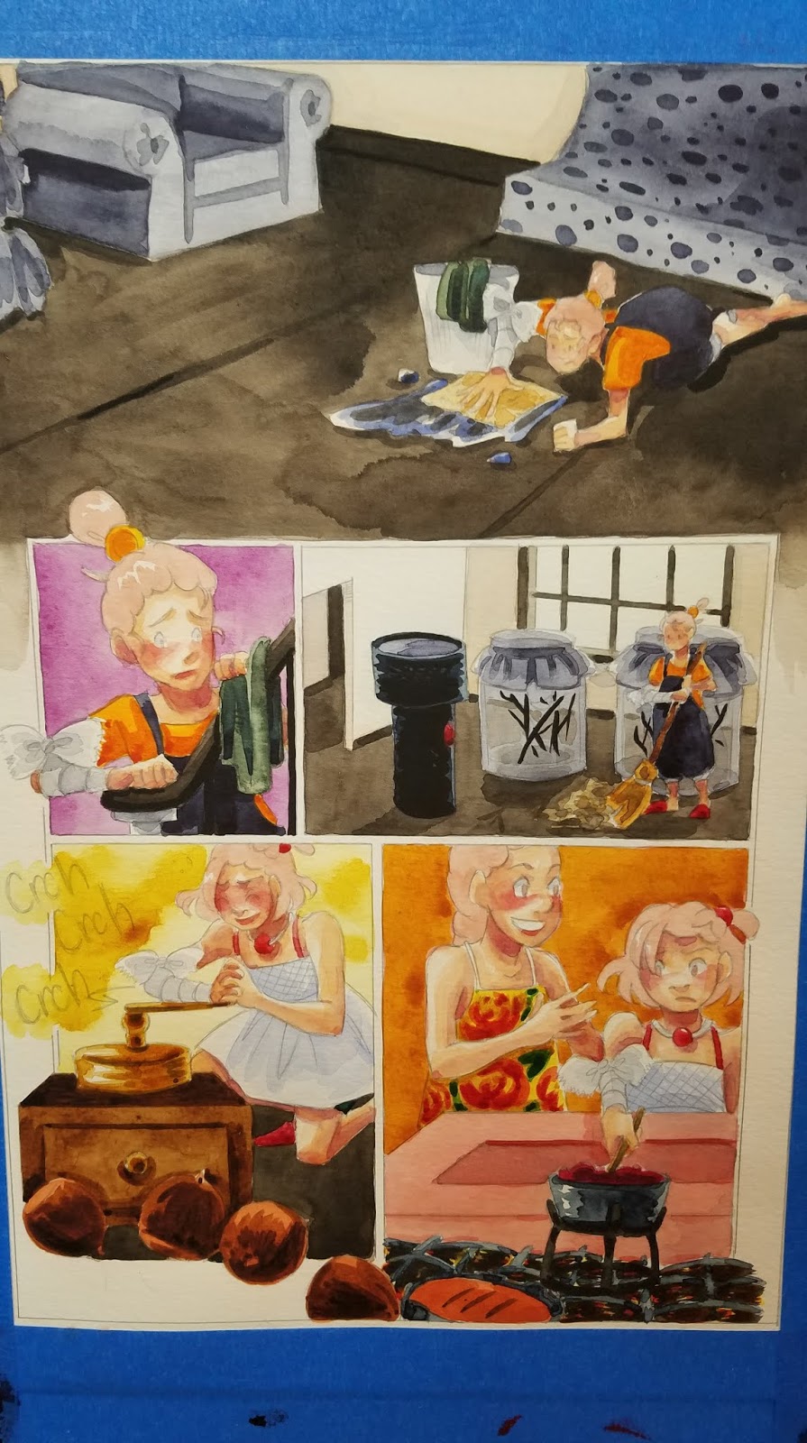
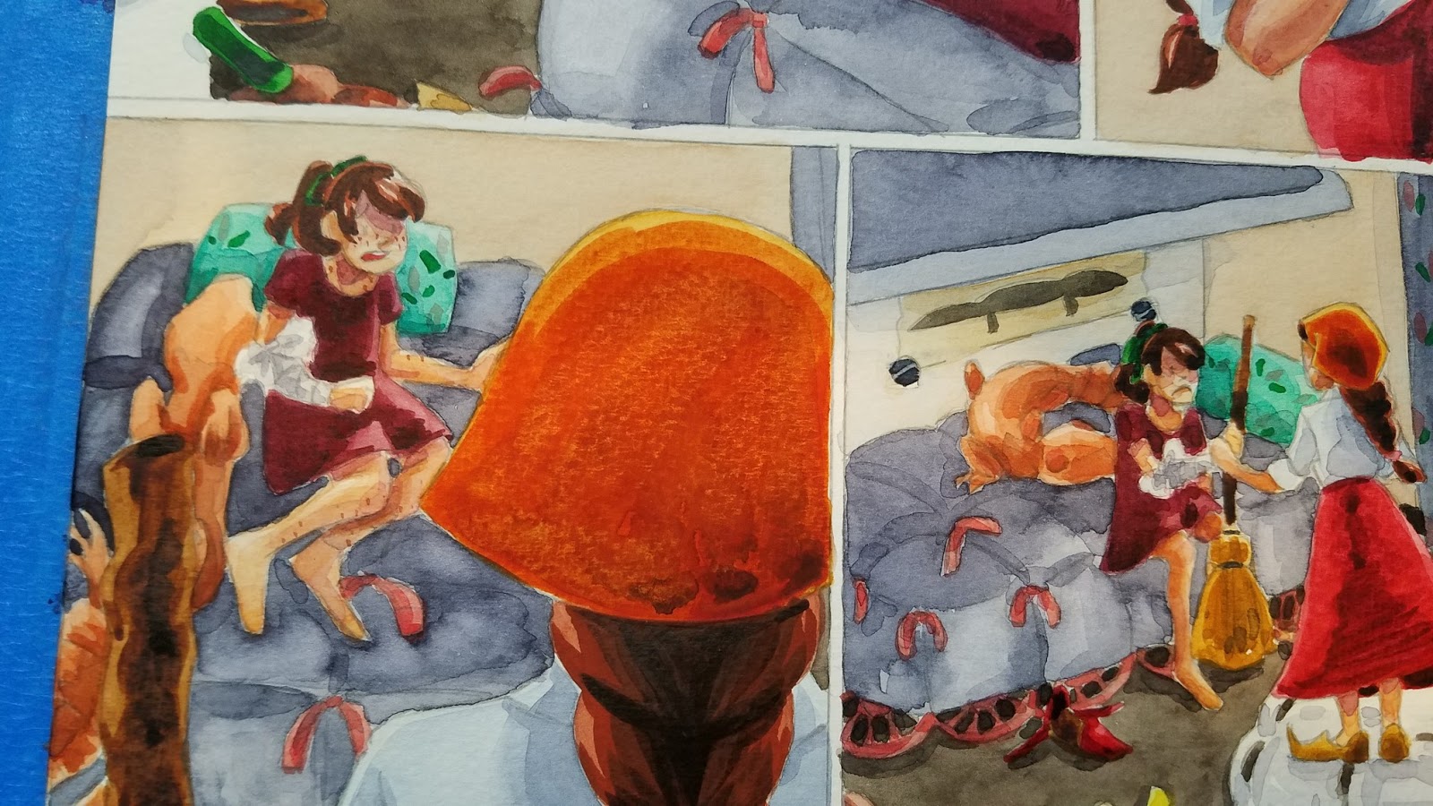
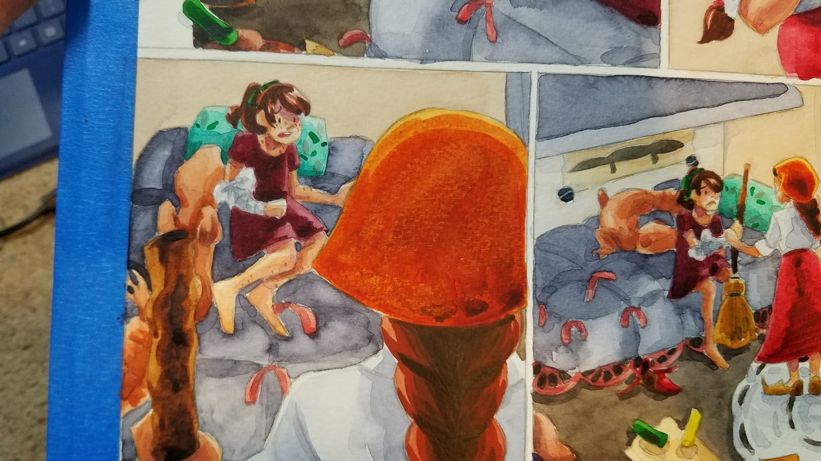
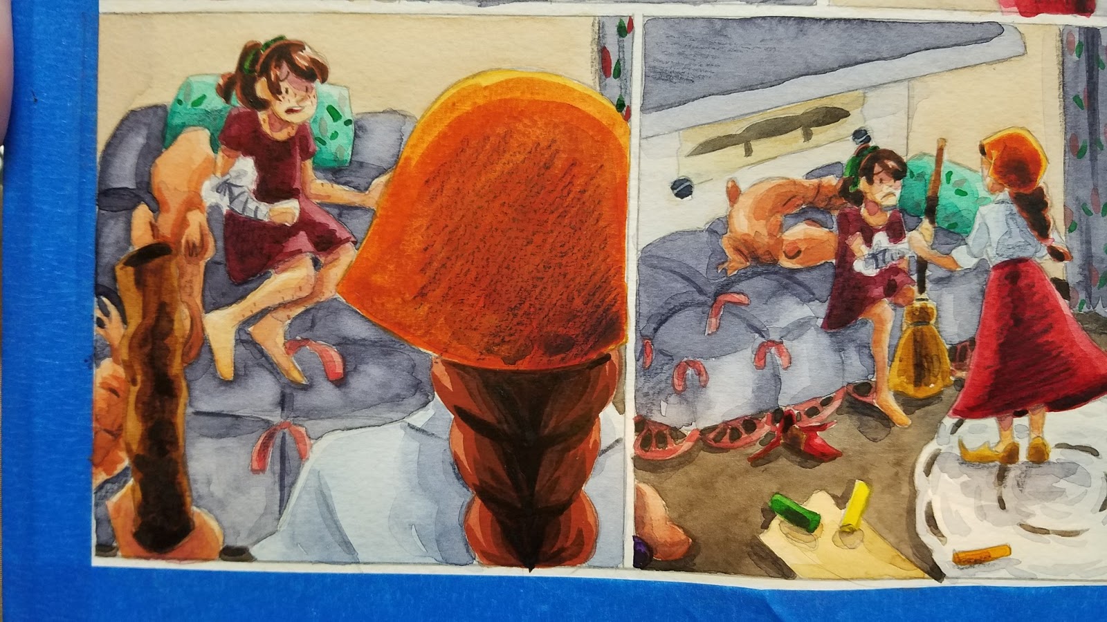
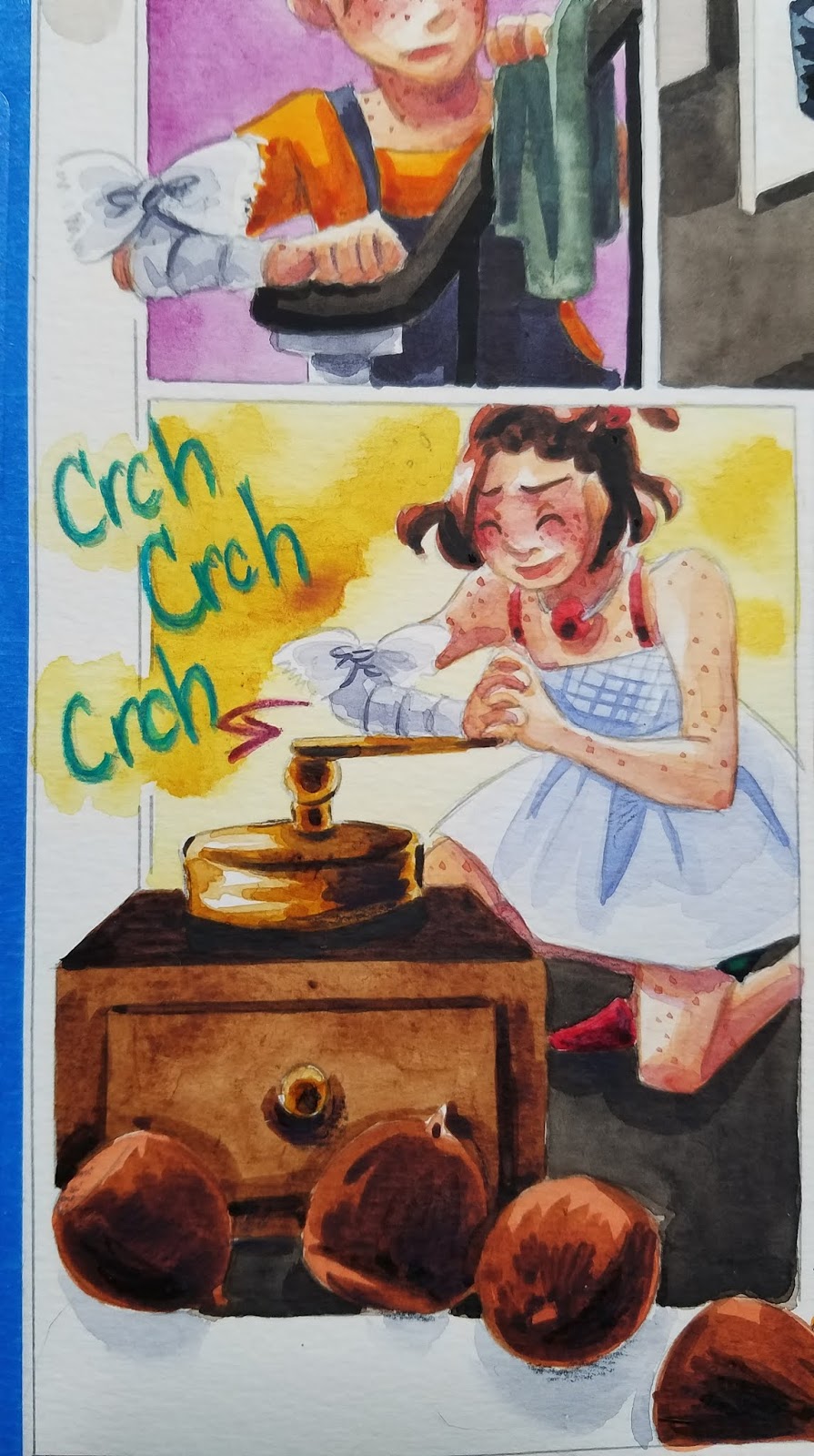
The panel borders were left page white for this panel, but I thought a little cast shadow would make this panel feel less static and more like the acorns are tumbling out of the panel.


Overpainting/Overglazing
This should be used with extreme discretion, as it can reactivate previously painted areas, causing paint to run. However, that can be used to your advantage (to soften lines, for example). Generally, I do overglazing for adding neutral tint shadows, and may repaint the area if too much color is disturbed, or the color is overly disaturated.
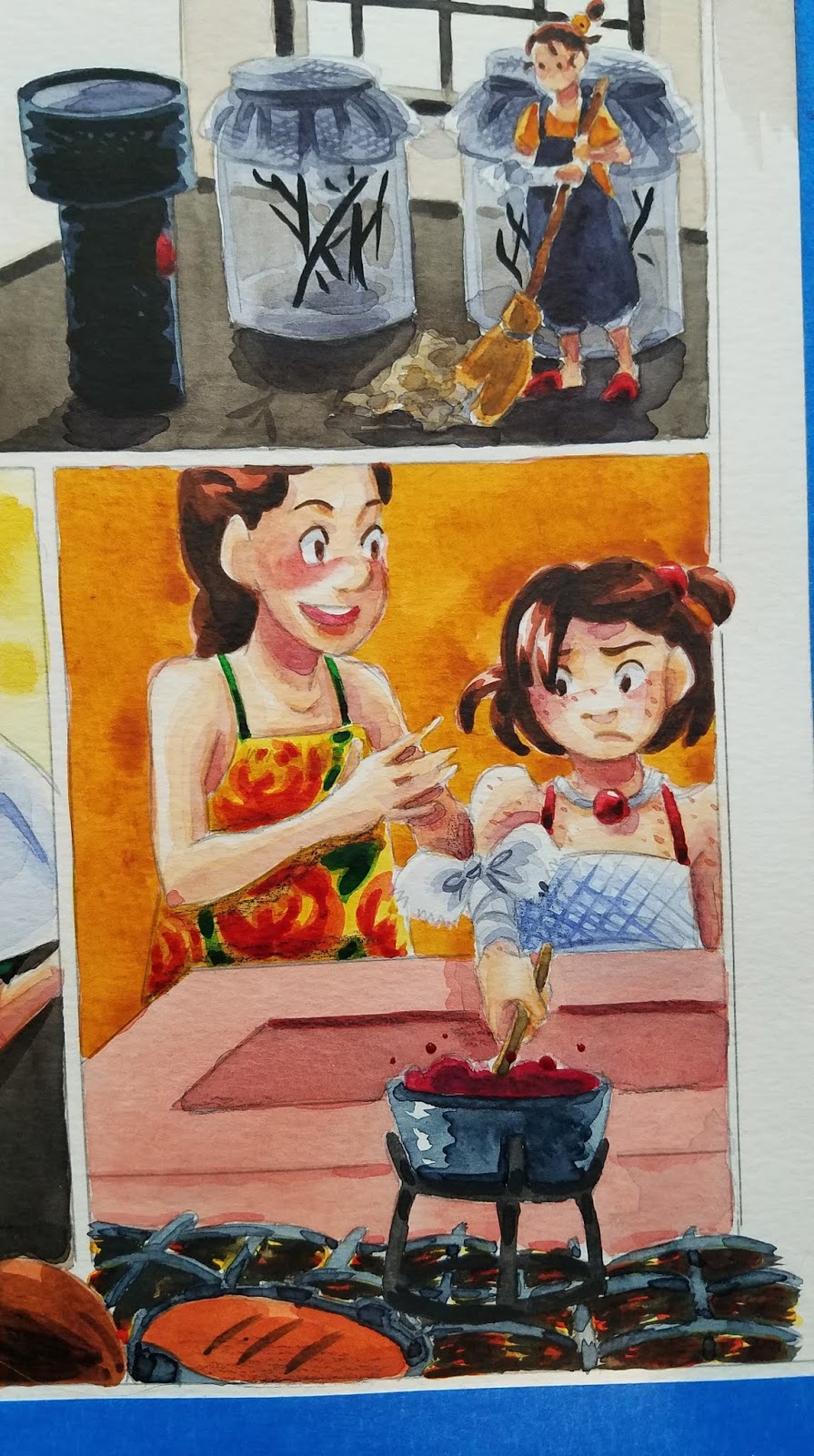
In this example, I use Tyrian purple to add shadows to Kara's dark red dress.


Color Pencils
- To Reinforce Shadows
- To Reinforce Lineart
- To Add Detail
- To add Highlights
- Lettering and Sound Effects
- Reestablish Lost Color
I prefer Derwent's Inktense and Supracolor II watercolor pencils as they deliver A LOT of pigment and don't chew through prior layers of watercolor
Reinforce Shadows


Reestablish Lost Color


- Lettering and Sound Effects


To add Highlights


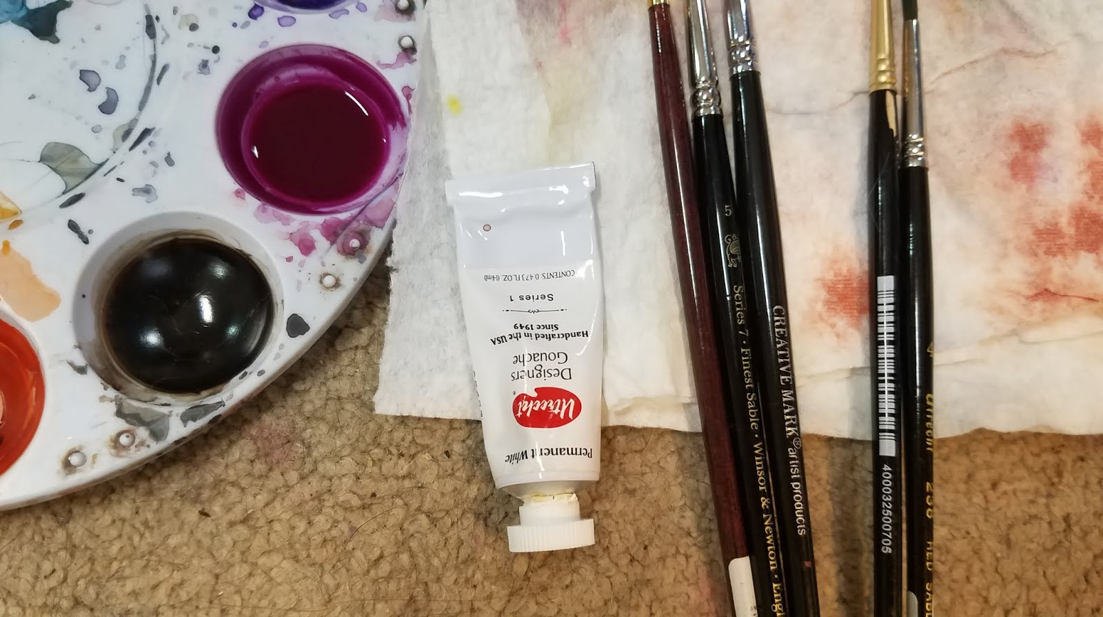
White Highlights:
White highlights can be added with white color pencil, white pastel, white watercolor pencil, gouache, or PH Martin's Bleedproof White, or any combination of the above that works well for you.


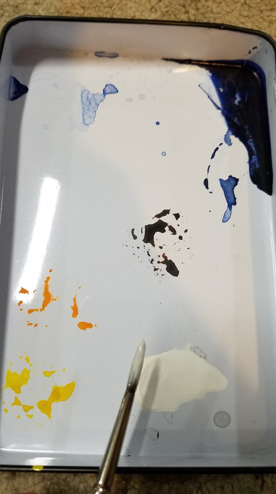
White Gouache
Gouache is an opaque watercolor that is mixed thickly with water, until it's the consistency of cream.


While fairly basic, all of these techniques go a long way towards a watercolor comic page feeling and looking finished. All of these additions are aimed at either:
- Cleaning up linework
- Increasing legibility
- Adding Interest
- Increasing Contrast
I think of the perfect combination of these elements as 'visual bounce', and this is when I know the page is finished and ready to remove from my stretcher boards.
Comments
Post a Comment